
Kaguci Typeface: Where Heritage Meets Digital Futurism
A New Era of Serif Expression
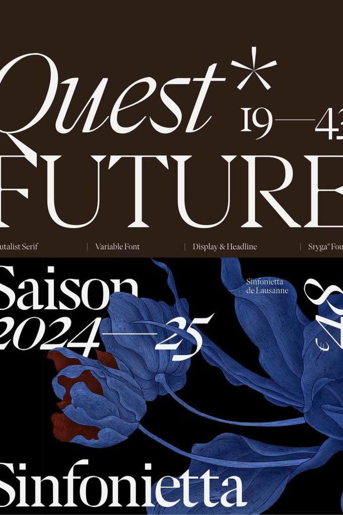
Kaguci redefines what a serif typeface can achieve in the modern design landscape. It actively bridges the gap between historical elegance and forward-thinking digital experimentation. Designers no longer need to choose between tradition and innovation—Kaguci delivers both in a single, cohesive system. By merging classical serif structures with disruptive glitch-inspired details, this typeface establishes a bold new direction for typography.
Inspired by the Past, Engineered for the Future
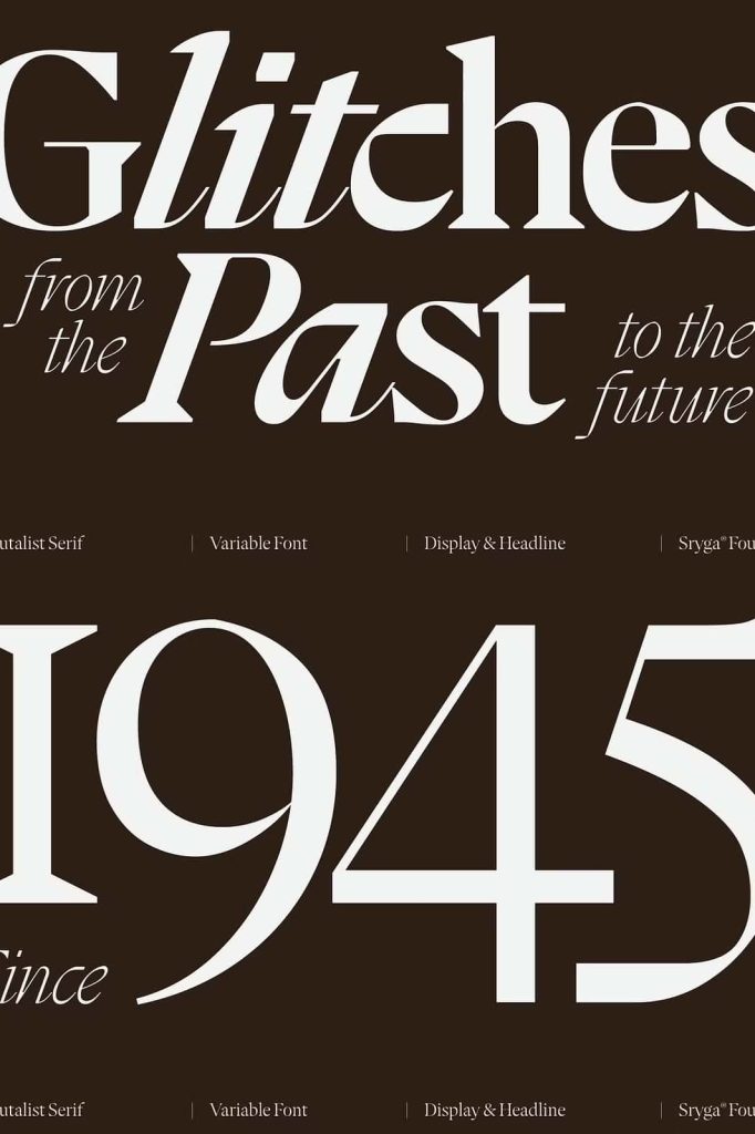
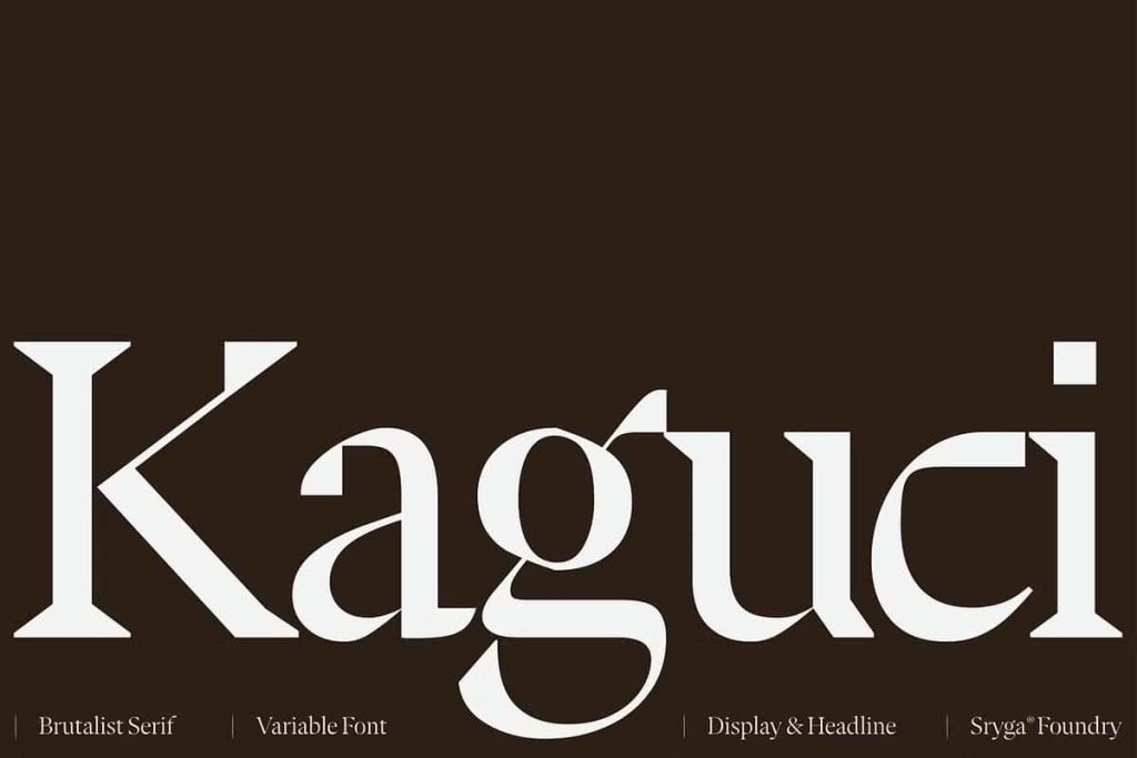
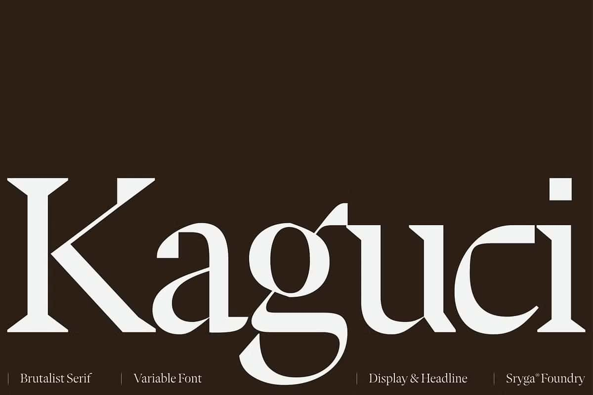
Kaguci draws deep inspiration from heritage typography, particularly the timeless qualities of traditional serif forms. However, it refuses to remain confined by convention. Instead, it pushes these foundations into a futuristic, almost experimental realm. Each character feels intentional, as if shaped by both human craftsmanship and digital interference.
This fusion creates a dynamic tension. On one side, you experience familiarity—graceful curves, recognizable proportions, and structured forms. On the other, you encounter disruption—unexpected cuts, subtle distortions, and a raw, glitch-driven attitude. This contrast gives Kaguci a distinctive personality that stands out in both print and digital environments.
A Balance of Brutalism and Warmth
Kaguci doesn’t simply follow trends; it actively reshapes them. The typeface embraces a brutalist approach with its strong presence and assertive structure. At the same time, it maintains warmth through carefully crafted organic curves and thoughtful spacing. This balance ensures that the typeface feels powerful without becoming cold or mechanical.
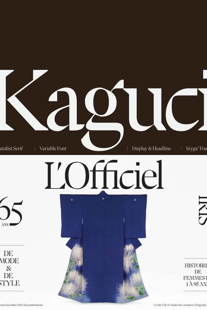
Designers can use Kaguci to create bold headlines, striking branding, and visually engaging layouts. Its structure commands attention, while its subtle human touch keeps it approachable. This duality makes Kaguci highly versatile across various creative disciplines.
An Evolving Typographic System
Kaguci is not just a static design—it behaves like a living system. It evolves within a glitch-infused digital landscape, adapting to different visual contexts while maintaining its identity. This concept transforms the typeface into more than just a tool; it becomes an active participant in the design process.
Every letterform contributes to a larger narrative. When used in compositions, Kaguci creates a sense of movement and progression, as if the typography itself is shifting and growing. This quality makes it especially effective for contemporary branding, editorial design, and experimental visual projects.
Complete Family with Maximum Flexibility
Ten Cuts for Total Control
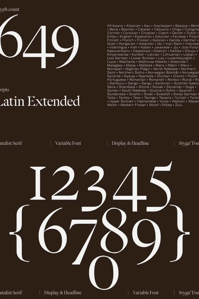
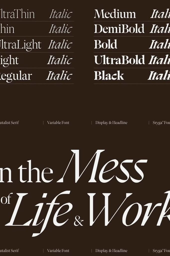
Kaguci offers a comprehensive range of 10 carefully developed cuts, spanning from ultra-thin to heavy black weights. This wide spectrum allows designers to control hierarchy, contrast, and visual rhythm with precision. Whether you need delicate elegance or bold impact, Kaguci provides the necessary tools.
True Italics for Authentic Expression
In addition to its upright styles, Kaguci includes matching true italics for every weight. These are not simply slanted versions but fully redesigned forms that enhance readability and stylistic consistency. The italics introduce fluidity and motion, complementing the rigidity of the roman styles.
Perfect for Modern Creative Projects
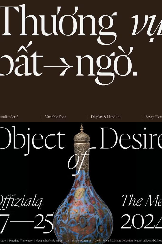
Kaguci adapts seamlessly across various applications. Use it for branding projects that demand originality, editorial layouts that require personality, or digital interfaces that benefit from a distinctive typographic voice. Its ability to blend structure with experimentation makes it a valuable asset for designers who want to stand out.
Conclusion: A Typeface Beyond Convention
Kaguci challenges traditional boundaries and invites designers to explore new visual possibilities. By combining heritage influences with futuristic disruption, it creates a unique typographic experience that feels both grounded and progressive. This typeface does not simply follow the evolution of design—it actively drives it forward.