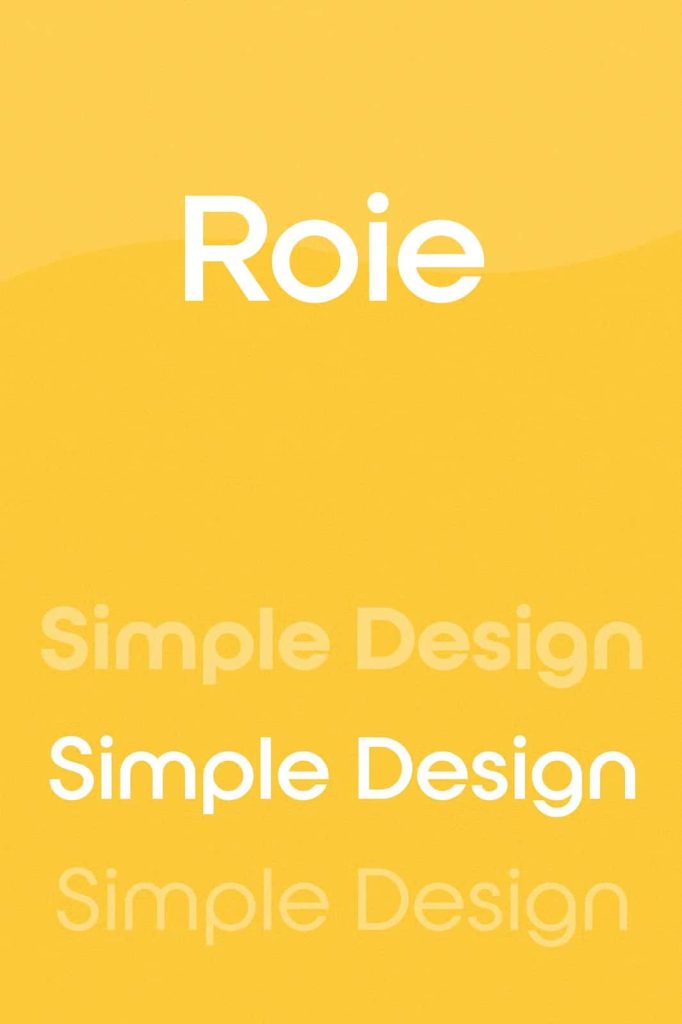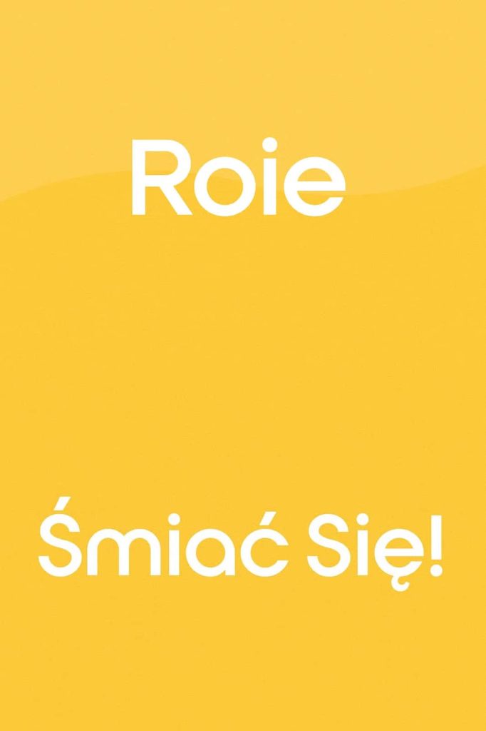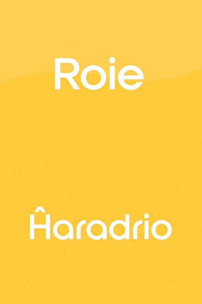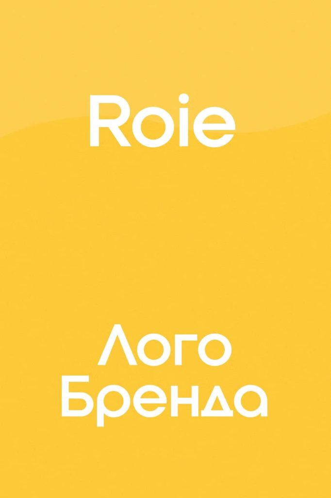

Roie Font: A Purpose-Built Typeface for Logo and Branding Design
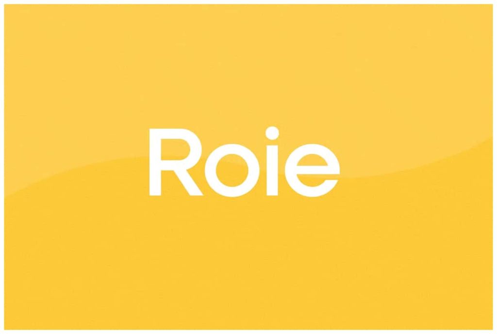
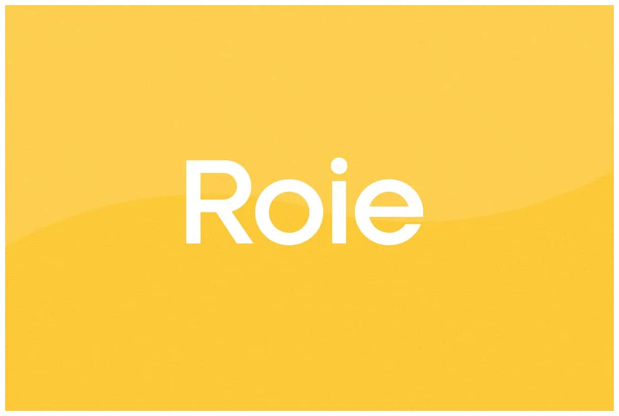
Roie is a carefully crafted font created with a singular focus: helping designers build strong, memorable logos and brand identities. Unlike general-purpose typefaces, Roie does not try to fit every scenario. Instead, it excels in a specific role by delivering character shapes that stand out, communicate personality, and strengthen visual branding.
Designed Specifically for Logos
Roie takes a focused approach to typography. Every letterform is intentionally shaped to support logo creation rather than long-form readability. This means the font emphasizes visual impact over extended reading comfort. Each character carries a distinct style that works best in short, bold applications such as brand names, titles, and identity marks.
Designers often struggle to find a typeface that feels unique without requiring heavy customization. Roie solves that problem by offering ready-to-use characters that already feel like part of a custom logo. You can immediately apply it to branding projects and achieve a refined, professional look.
Strong Character and Visual Identity
Roie stands out because of its strong personality. The shapes are not neutral or generic; they actively contribute to the tone of your design. Whether you aim to create a modern, playful, or slightly experimental identity, Roie provides a solid foundation.
Each letter is built to harmonize with the others while still maintaining individuality. This balance ensures that logos appear cohesive without losing uniqueness. As a result, brands can communicate more effectively through typography alone, even before adding color, icons, or additional design elements.
Optimized for Branding Impact
Roie performs best when used in high-visibility contexts. It works exceptionally well for:
- Logo design
- Brand identity systems
- Packaging titles
- Website headers
- Social media branding visuals
In these scenarios, Roie enhances recognition and strengthens brand recall. Its distinctive letterforms help businesses stand apart in crowded visual environments.
Not Intended for Long Text
Roie does not aim to replace traditional text fonts. Because of its expressive design, it is not suitable for paragraphs, articles, or long reading experiences. Using it for extended text may reduce readability and overwhelm the viewer.
Instead, Roie works best when paired with a clean, readable body font. This combination allows you to maintain clarity in long content while preserving strong branding through headings and logos.
Best Practice Pairing
To maximize Roie’s effectiveness, pair it with a simple sans-serif or serif font for body text. This contrast creates a balanced visual hierarchy. The logo or headline captures attention, while the supporting text remains easy to read.
Why Choose Roie for Your Project
Roie offers a practical solution for designers who need a reliable logo font without starting from scratch. It saves time while still delivering a custom-like appearance. Instead of modifying generic fonts extensively, you can rely on Roie to provide a polished starting point.
The font also supports creative exploration. Designers can adjust spacing, combine characters, or experiment with layouts to produce unique results. Even with minimal changes, Roie adapts well to different branding styles.
Key Advantages
- Distinctive character shapes designed for branding
- Ready-to-use for logo creation
- Strong visual personality
- Ideal for short text and headlines
- Flexible for creative customization
Conclusion
Roie is not just another font; it is a specialized tool for branding professionals. By focusing on logo design, it delivers stronger visual impact and clearer identity expression. When used correctly, Roie elevates branding projects and helps create memorable, recognizable designs.
If your goal is to build a bold and distinctive brand presence, Roie provides the foundation you need. Use it where it shines the most, and let it define the voice of your visual identity.