
Fifty Fifty Editorial Serif Font: Refined Typography for Modern Design
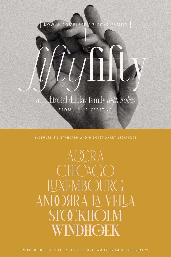
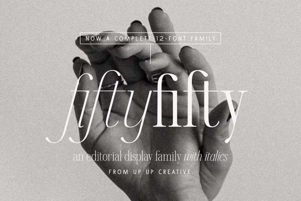
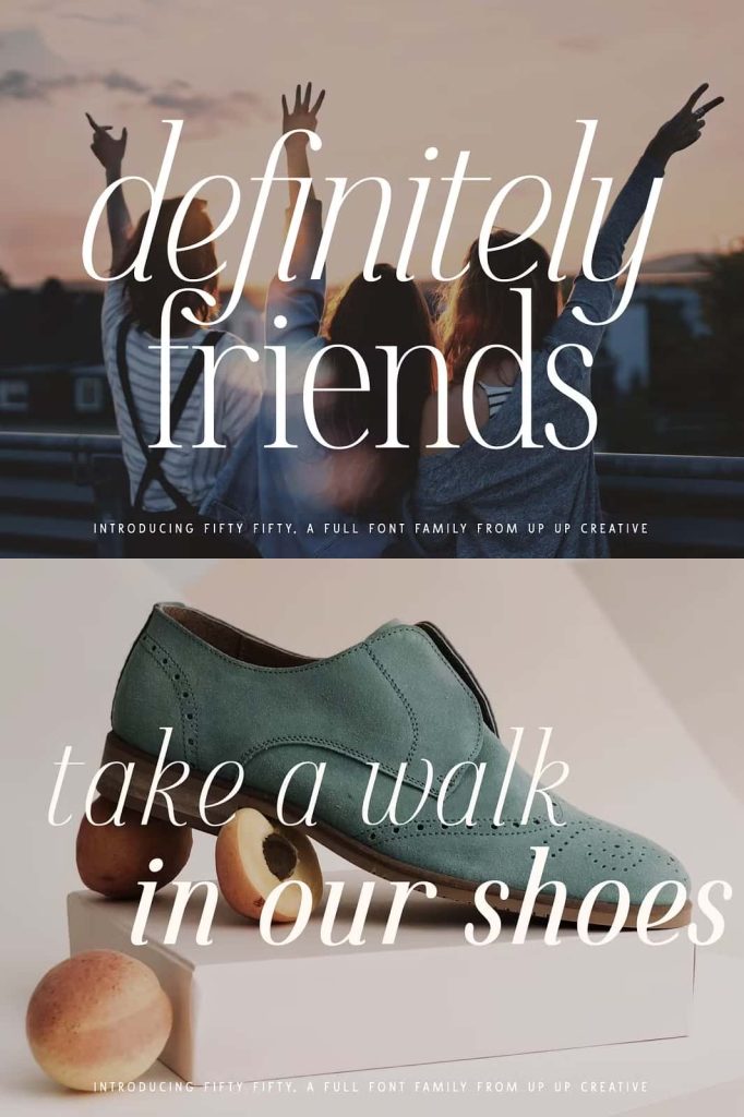
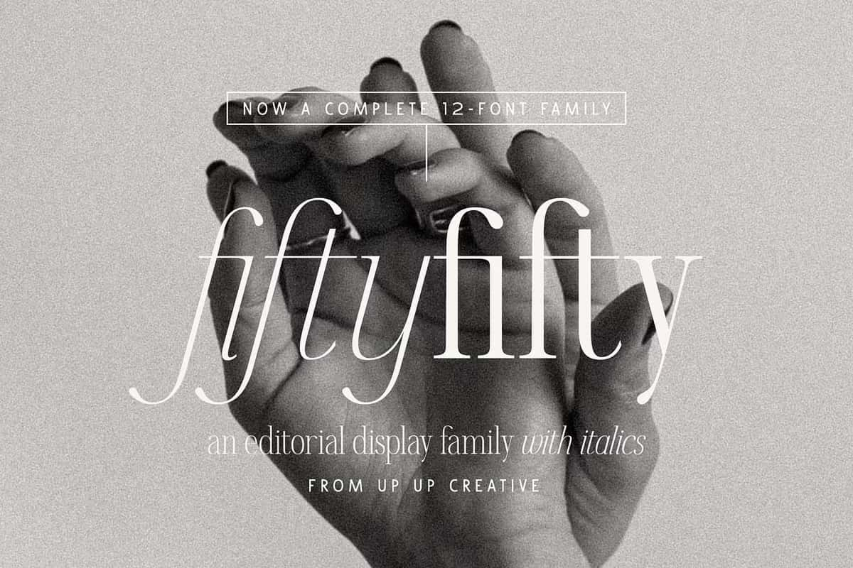
Fifty Fifty is a sophisticated editorial serif font family that brings clarity, elegance, and versatility into contemporary design. Built with six carefully crafted weights, each paired with a matching italic, this typeface gives designers the flexibility to create balanced and visually engaging compositions. It combines smooth curves with strong structural integrity, allowing every letterform to communicate with confidence and style.
Designed for Editorial Excellence
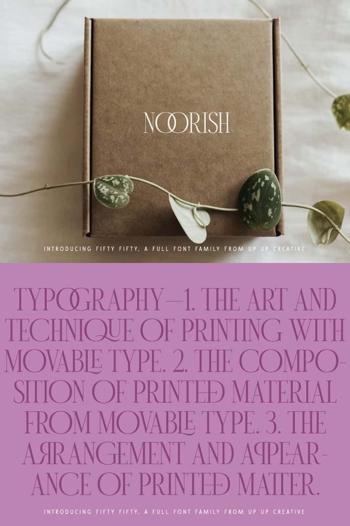
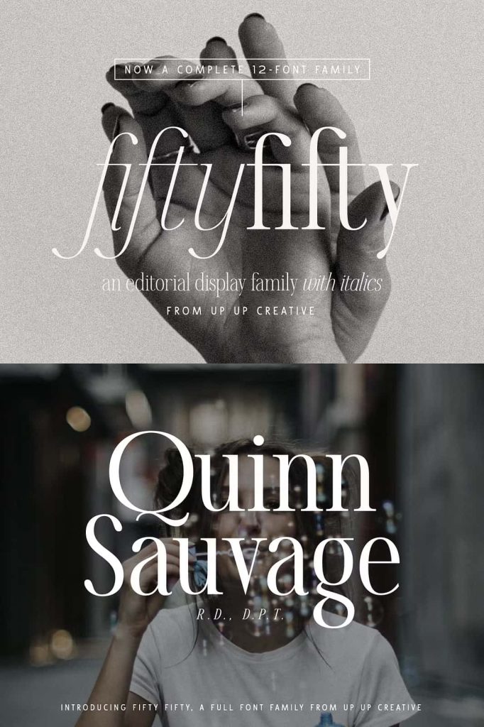
Fifty Fifty excels in editorial environments where typography plays a central role in storytelling. Its clean lines and refined curves create a polished look that enhances readability while maintaining a strong visual identity. Designers can use this font to build layouts that feel structured yet expressive, making it an excellent choice for magazines, articles, and high-end publications.
The font’s versatility allows it to perform equally well in both large headlines and supporting text. It captures attention without overpowering the content, ensuring that every element works together harmoniously. This balance makes Fifty Fifty a reliable choice for projects that demand both beauty and function.
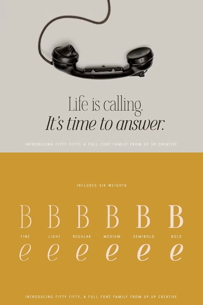
A Complete Font Family with Flexible Weights
Fifty Fifty includes six distinct weights, each designed to serve a specific purpose within a layout. From lighter styles that convey elegance to bolder weights that command attention, this font family gives designers full control over typographic hierarchy. The addition of matching italics further expands creative possibilities, allowing for emphasis, contrast, and variation within a single design system.
This range ensures that designers can maintain consistency across different formats while still introducing visual interest. Whether you are creating a minimalist layout or a complex editorial spread, Fifty Fifty adapts seamlessly to your needs.
Over 100 Ligatures for Seamless Typography
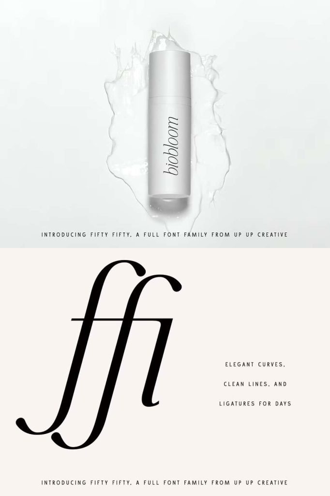
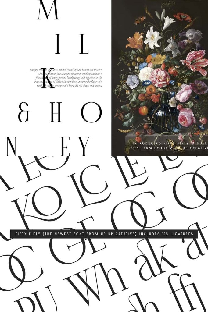
One of the defining features of Fifty Fifty is its extensive set of more than 100 ligatures. These carefully designed character combinations enhance the natural flow of text, eliminating awkward spacing and improving overall readability. The ligatures also add a subtle layer of sophistication, giving your typography a more refined and professional appearance.
- Create smoother word connections for a polished editorial look
- Add subtle stylistic detail without overwhelming the design
- Improve readability in both headlines and body text
- Achieve a more cohesive and harmonious typographic system
These ligatures allow designers to achieve high-quality results with minimal effort, making Fifty Fifty both practical and visually appealing.
Striking in Uppercase, Strong in Lowercase
Fifty Fifty delivers impressive results in all caps, making it ideal for bold headlines and impactful titles. The uppercase letters carry a sense of authority and elegance, helping your message stand out in any context. At the same time, the lowercase characters maintain their own strength and personality, ensuring that longer passages remain engaging and easy to read.
This dual capability allows designers to use the font consistently across different elements of a project. You can confidently combine uppercase and lowercase styles to create contrast, hierarchy, and visual rhythm.
Perfect for a Wide Range of Creative Projects
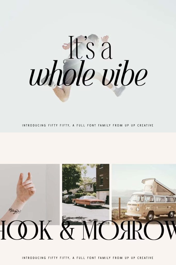
Fifty Fifty adapts effortlessly to various design applications, making it a valuable asset for both print and digital work. Its refined aesthetic and versatile structure allow it to enhance a wide range of creative outputs.
Use Fifty Fifty for:
- Headlines that demand attention and clarity
- Editorial layouts that require elegance and readability
- Brand identities that communicate sophistication
- Logos and monograms with a timeless appeal
- Poster designs that balance style and impact
Its adaptability ensures that it remains relevant across different industries and design styles.
Crafted for Modern Designers
Fifty Fifty meets the demands of modern design by combining classic serif traditions with contemporary refinement. It provides the tools needed to create visually compelling work while maintaining consistency and clarity. Designers can rely on this font to deliver strong results across a variety of projects.
The thoughtful design of each character ensures that every detail contributes to the overall aesthetic. This attention to detail allows designers to produce work that feels polished and intentional.
Elevate Your Typography with Fifty Fifty
Fifty Fifty empowers designers to create typography that feels both timeless and modern. Its combination of multiple weights, elegant italics, and extensive ligatures makes it a complete solution for editorial and branding projects. By incorporating this font into your work, you can achieve a refined and cohesive visual identity.
Choose Fifty Fifty editorial serif font to bring sophistication, versatility, and clarity into your designs. It transforms text into a powerful visual element that enhances every aspect of your creative work.