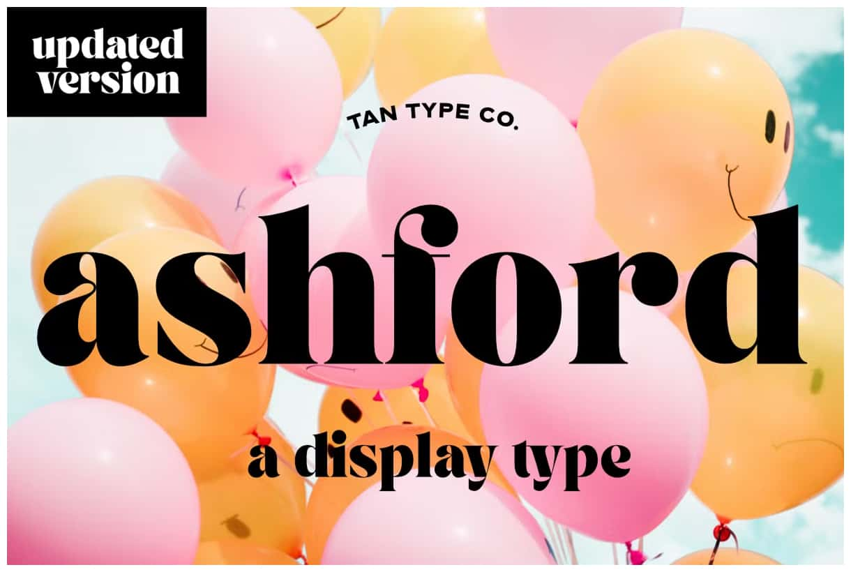

TAN Ashford: A Bold High-Contrast Serif with Vintage Elegance
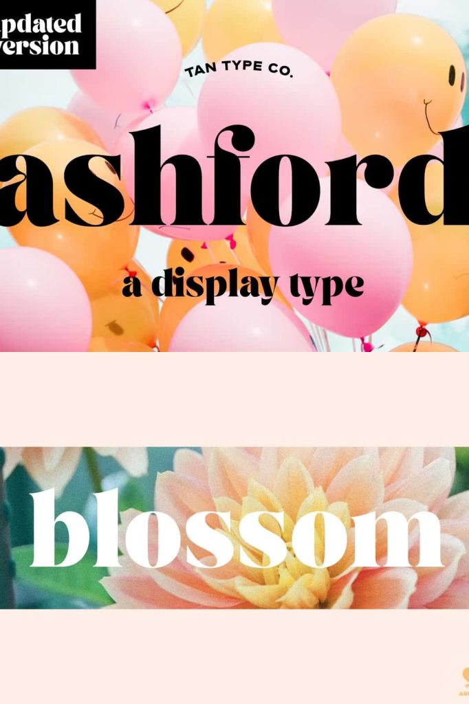
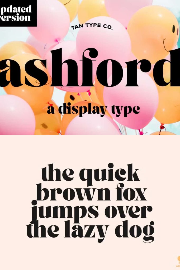
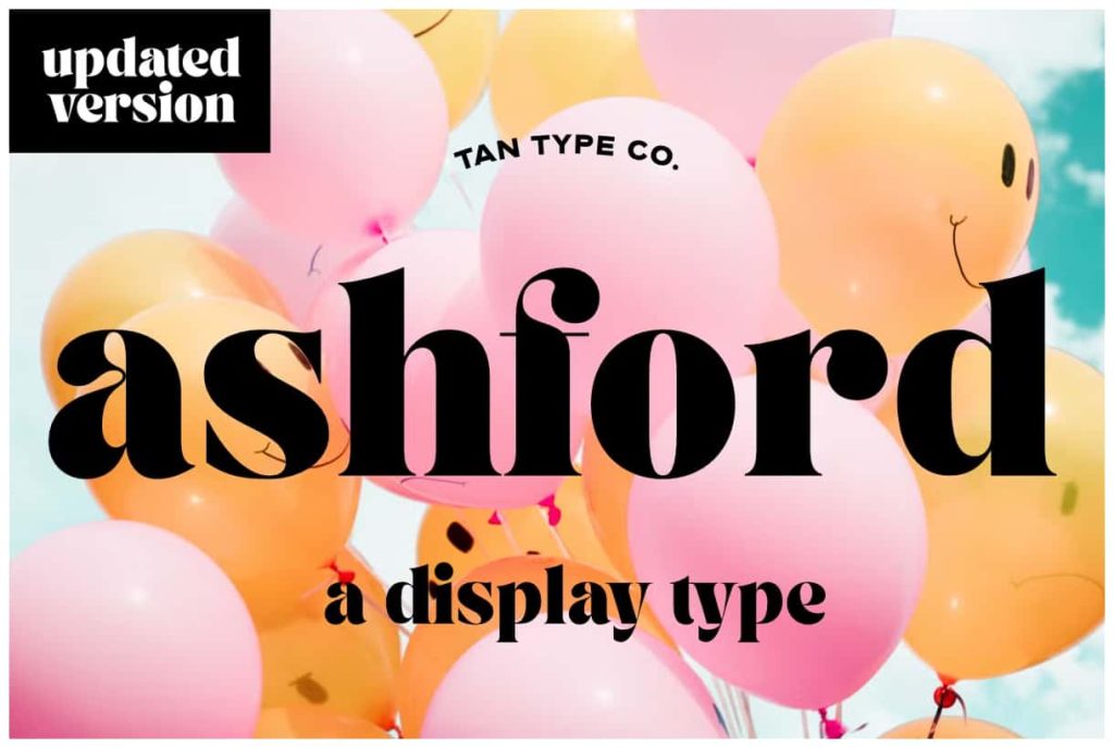
TAN Ashford delivers a striking combination of bold structure and refined elegance. This high-contrast serif typeface commands attention while maintaining a sophisticated and polished appearance. Designers who want to create strong visual impact without losing a sense of class will find TAN Ashford a powerful and reliable choice.
The typeface blends modern precision with subtle vintage influences. This balance allows it to feel both timeless and current, making it suitable for a wide range of design applications. Whether used in print or digital media, TAN Ashford enhances typography with confidence and clarity.
A Serif Typeface Defined by Contrast
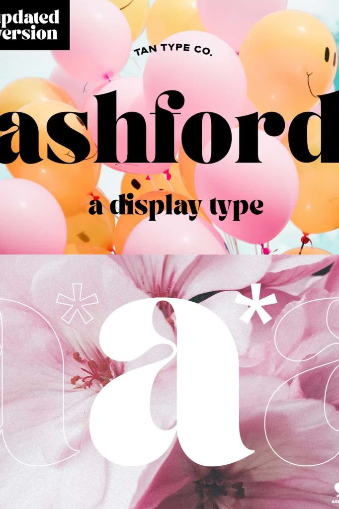
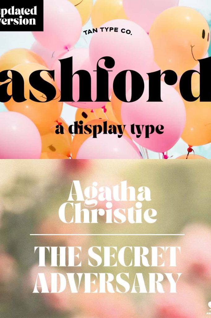
TAN Ashford builds its identity around high contrast between thick and thin strokes. This design approach creates dramatic letterforms that stand out immediately. The sharp transitions between strokes add visual tension and elegance, giving the typeface a distinctive and memorable presence.
This contrast not only enhances aesthetics but also improves hierarchy. Designers can use TAN Ashford to highlight key elements in a layout, guiding the viewer’s attention with precision. The result is typography that feels intentional, structured, and visually engaging.
Key Features of TAN Ashford
Bold and Confident Letterforms
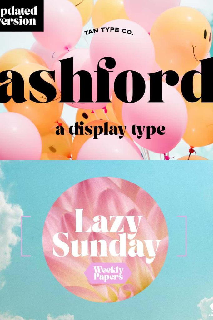
TAN Ashford uses strong, bold shapes to establish a commanding presence. Its letterforms project confidence, making it ideal for designs that need to stand out. This boldness allows designers to create impactful headlines and focal points with ease.
High Contrast for Dramatic Effect
The contrast between thick and thin strokes defines the font’s character. This feature adds elegance and sophistication, transforming simple text into a visual statement. It works particularly well in large sizes, where the details become more pronounced.
Vintage-Inspired Aesthetic
TAN Ashford incorporates subtle vintage elements that give it a timeless appeal. These influences add warmth and personality, making the typeface feel rich and expressive. Designers can use this quality to evoke a sense of heritage while maintaining a modern edge.
Versatile Applications Across Design Projects
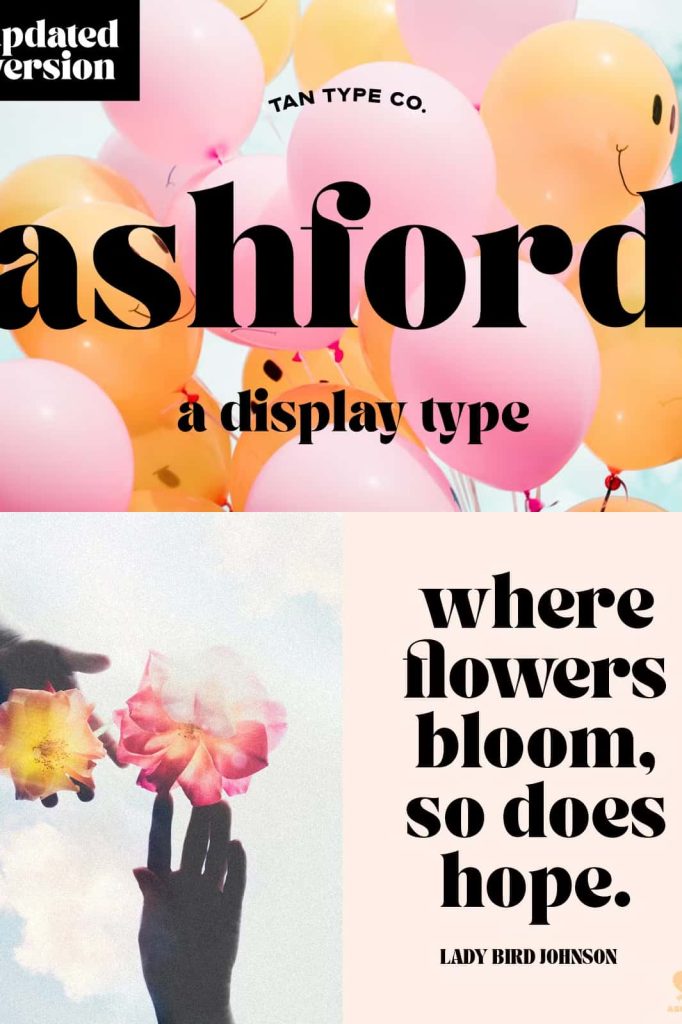
TAN Ashford adapts effortlessly to a variety of creative contexts. Its combination of boldness and elegance makes it suitable for both formal and expressive designs. Common use cases include:
- Headlines and editorial titles
- Invitations and event materials
- Advertising campaigns and promotional graphics
- Luxury branding and identity design
- Social media visuals and digital content
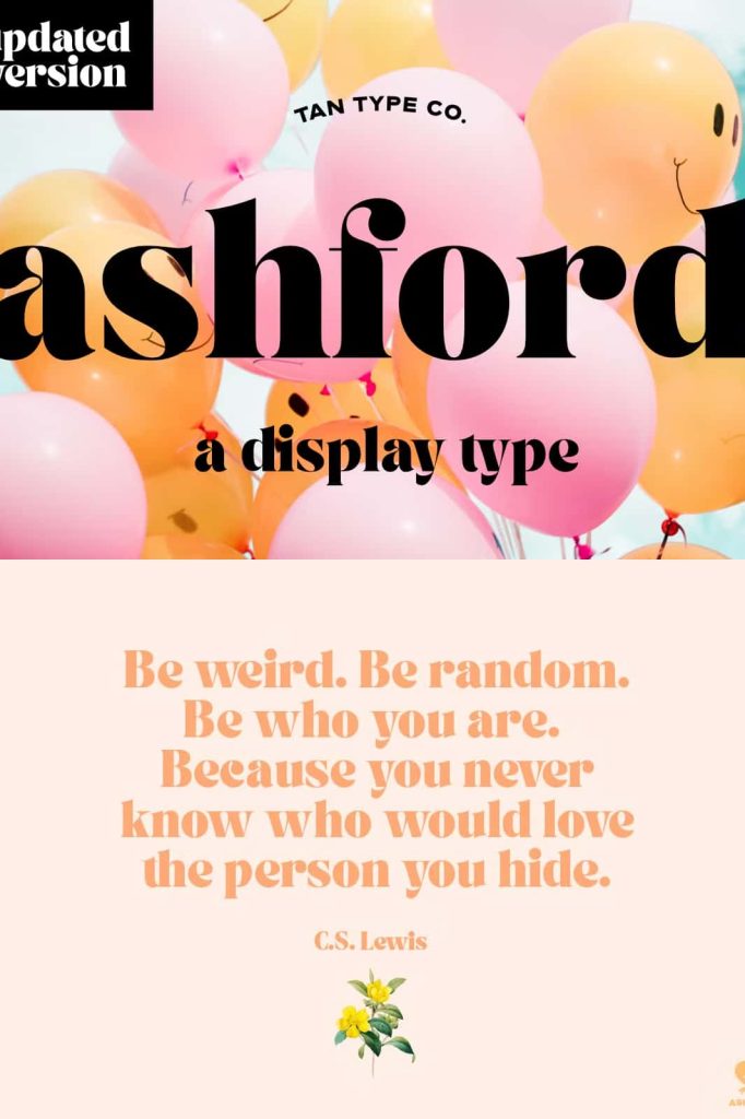
Because of its high contrast and decorative nature, TAN Ashford works best as a display font. Designers should use it for short text elements and pair it with simpler fonts for longer content to maintain readability.
Creating Strong Visual Impact
TAN Ashford allows designers to create bold and memorable compositions. Its dramatic letterforms naturally draw attention, making it an excellent choice for designs that need to communicate quickly and effectively. By adjusting size, spacing, and alignment, designers can explore a wide range of visual styles.
The typeface also supports creative experimentation. It works well with minimal layouts where typography takes center stage, as well as more complex designs that combine textures, images, and color. This flexibility ensures that TAN Ashford remains relevant across different creative directions.
Why Choose TAN Ashford for Your Design Projects
TAN Ashford offers a unique balance of strength and elegance. It allows designers to create work that feels bold without appearing overwhelming. Its vintage-inspired details add depth and character, while its modern execution ensures clarity and usability.
By choosing TAN Ashford, designers gain a typeface that enhances both visual impact and brand identity. It communicates sophistication, confidence, and creativity in a single glance, making it a valuable addition to any design toolkit.
Conclusion
TAN Ashford is more than just a bold serif font—it is a statement of style and intention. With its high-contrast structure, vintage influence, and versatile applications, it empowers designers to create compelling and elegant typography.
Whether used for headlines, invitations, or advertising, TAN Ashford transforms text into a powerful design element. It stands as a refined solution for projects that demand both visual strength and timeless appeal.