
Montreal: A Modern Geometric Sans Serif Typeface with Versatile Style
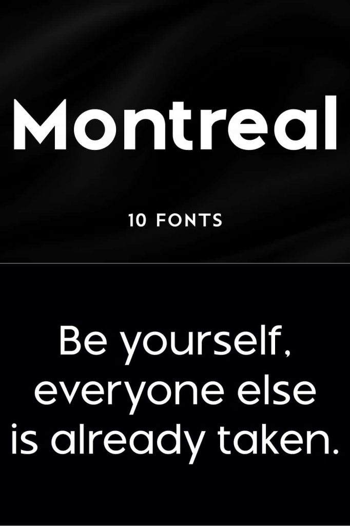
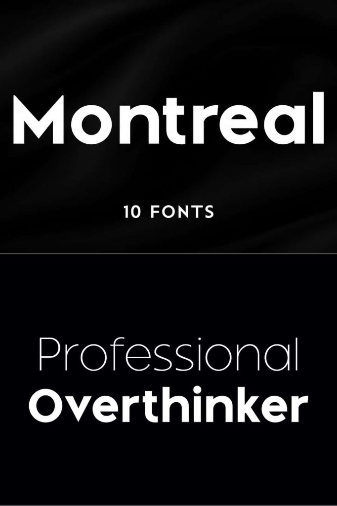
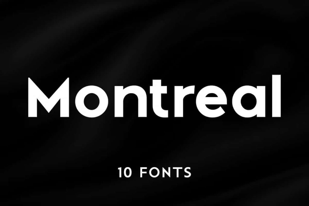
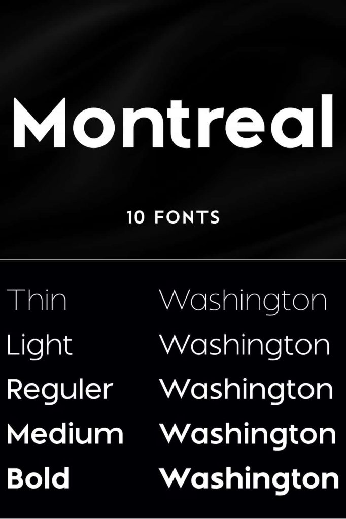
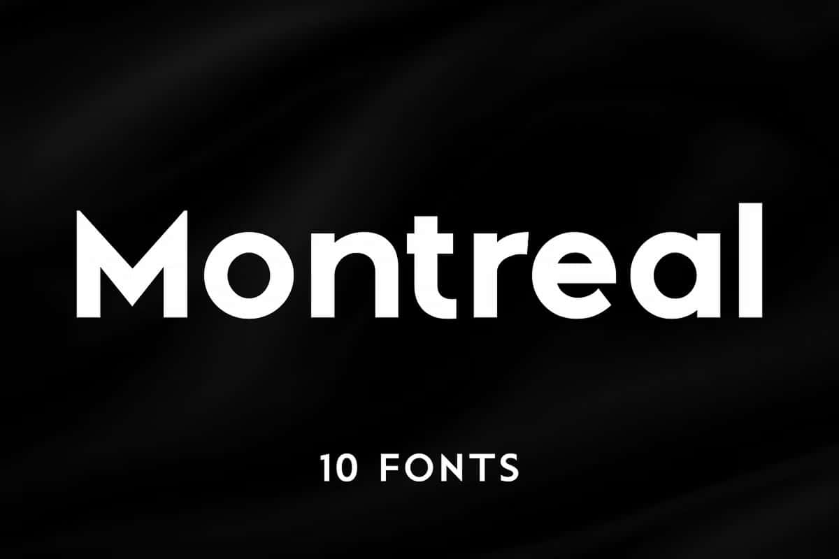
Montreal stands as a powerful example of modern typography, combining precision, clarity, and flexibility into one cohesive typeface family. As a geometric sans serif, it builds its identity on clean shapes and balanced proportions, allowing designers to create compositions that feel structured, contemporary, and highly readable. With a collection of 10 distinct styles, Montreal gives designers the freedom to experiment, adapt, and refine their visual language without compromising consistency.
A Typeface Rooted in Geometric Precision
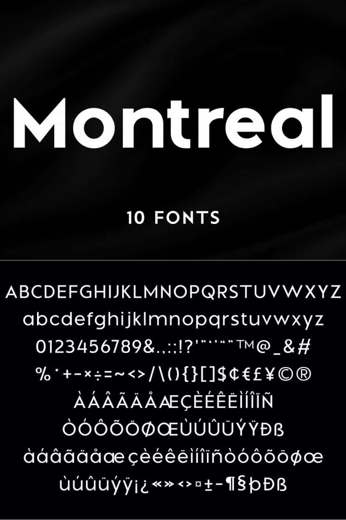
Montreal draws its strength from geometric construction. Each letterform follows a clear system of shapes, lines, and curves that create harmony across the entire typeface. This structured approach results in a clean and organized appearance that works exceptionally well in modern design environments.
Instead of relying on decorative elements, Montreal focuses on clarity and function. This makes it ideal for designers who want to communicate messages efficiently while maintaining a strong visual identity. The geometric foundation ensures that every character aligns seamlessly, creating a polished and professional look in both print and digital formats.
Ten Styles for Maximum Flexibility
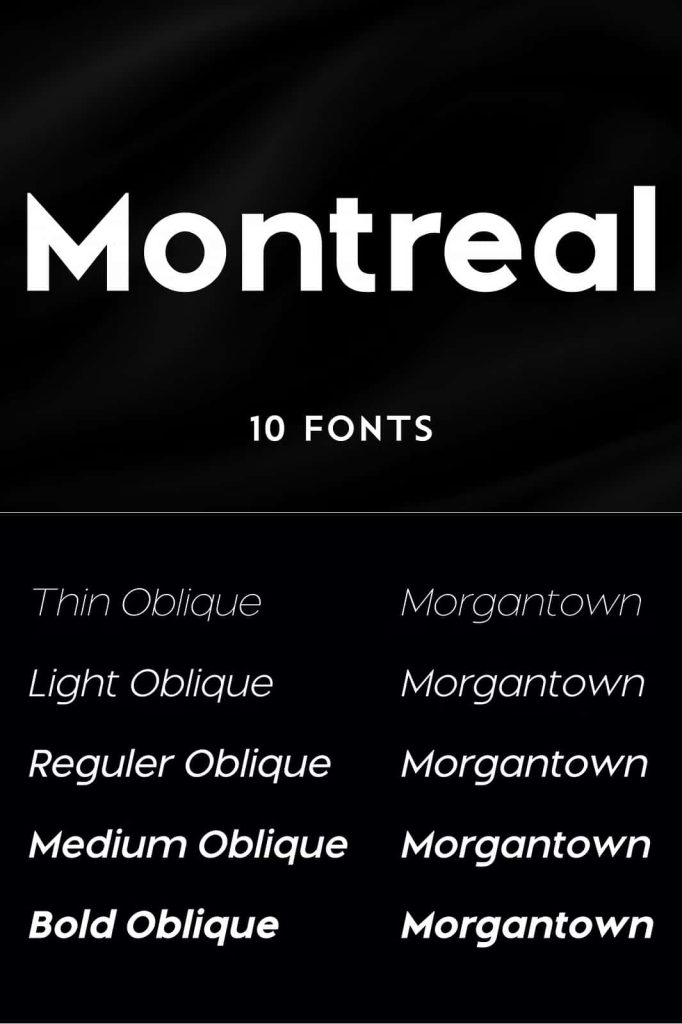
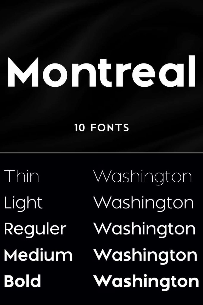
One of Montreal’s greatest strengths lies in its versatility. With 10 carefully designed styles, the typeface allows designers to build dynamic typographic systems. Each style offers a unique weight and tone, enabling smooth transitions between headings, subheadings, and body text.
Consistent Design Across All Weights
Every style within the Montreal family maintains consistent proportions and spacing. This consistency ensures that designers can switch between weights without disrupting the overall layout. Whether you use a lighter style for subtle text or a bold version for emphasis, the typeface remains cohesive and visually balanced.
Adaptable for Multiple Design Needs
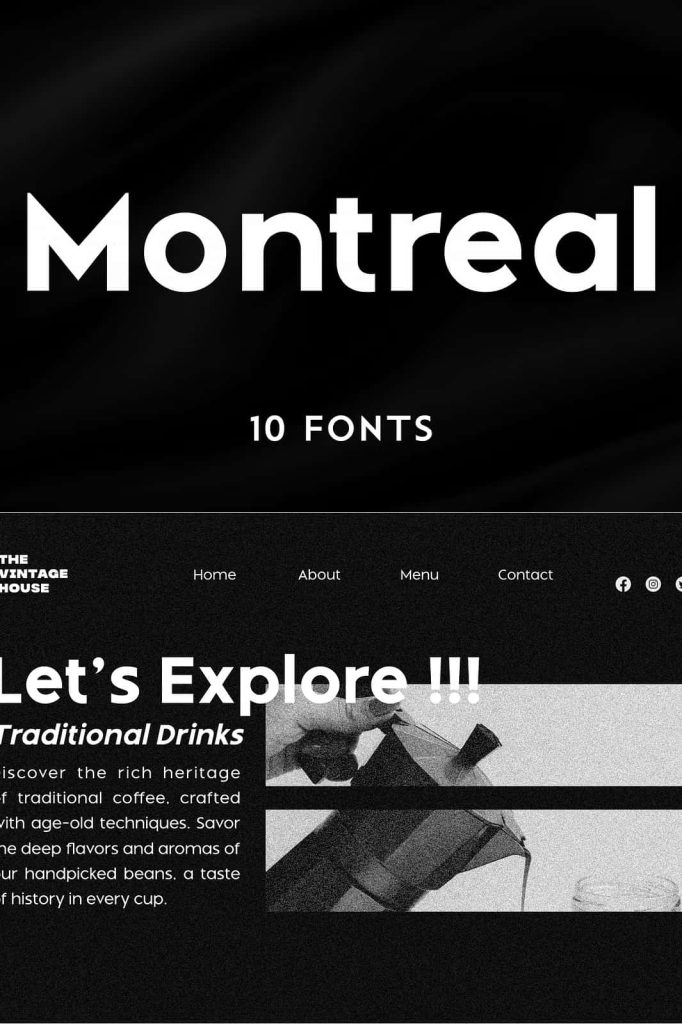
Montreal adapts easily to various design contexts. Designers can use lighter weights for minimal interfaces or heavier styles for strong visual impact. This flexibility makes it suitable for branding systems, editorial layouts, user interfaces, and advertising campaigns.
Modern and Minimalist Aesthetic
Montreal embraces a minimalist approach that reflects current design trends. Its clean lines and simple forms create a sense of openness and clarity, making it especially effective in modern layouts. The typeface avoids unnecessary complexity, allowing content to take center stage while still maintaining a distinct visual identity.
This modern aesthetic helps designers create work that feels fresh and relevant. Whether used in digital products or printed materials, Montreal consistently delivers a refined and contemporary appearance.
Ideal Use Cases for Montreal Typeface
Montreal performs exceptionally well across a wide range of applications. Its versatility and clarity make it a reliable choice for designers working on diverse projects, including:
- Branding and corporate identity systems
- Website design and user interfaces
- Editorial layouts and publications
- Advertising and marketing materials
- Signage and environmental graphics
Because of its strong readability, Montreal works effectively for both headlines and body text. Designers can build complete typographic hierarchies using a single typeface family, simplifying the design process while maintaining visual consistency.
Enhancing Readability and User Experience
Montreal prioritizes readability at every level. Its balanced spacing, clear letterforms, and consistent structure ensure that text remains legible across different sizes and formats. This makes it particularly valuable for digital environments, where clarity directly impacts user experience.
Designers can rely on Montreal to present information clearly without sacrificing style. Its geometric design supports efficient communication, helping users absorb content بسرعة and without distraction.
Why Choose Montreal for Your Design Projects
Montreal offers a combination of versatility, precision, and modern appeal that few typefaces can match. It empowers designers to create cohesive systems while exploring different visual expressions through its range of styles. This adaptability makes it an essential tool for professionals who demand both functionality and aesthetic quality.
By choosing Montreal, designers gain access to a typeface that performs consistently across multiple platforms and applications. Its minimalist design ensures longevity, allowing it to remain relevant even as design trends evolve.
Conclusion
Montreal is more than just a geometric sans serif typeface—it is a comprehensive typographic solution designed for modern creative work. With its 10 versatile styles, clean structure, and minimalist aesthetic, it enables designers to build strong, adaptable, and visually engaging designs. Whether you are developing a brand identity or crafting a digital interface, Montreal provides the clarity and flexibility needed to bring your vision to life.