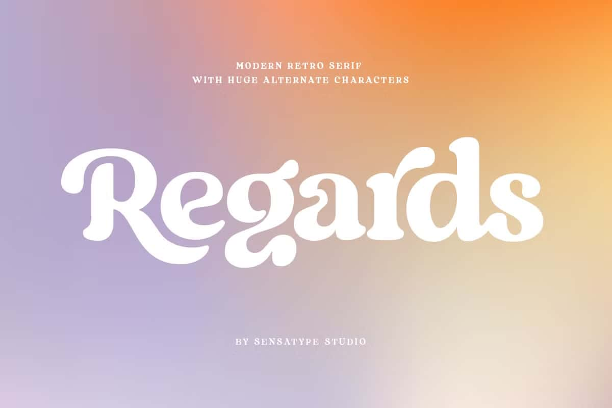

Regards Font: A Retro Modern Vintage Serif with Playful Elegance
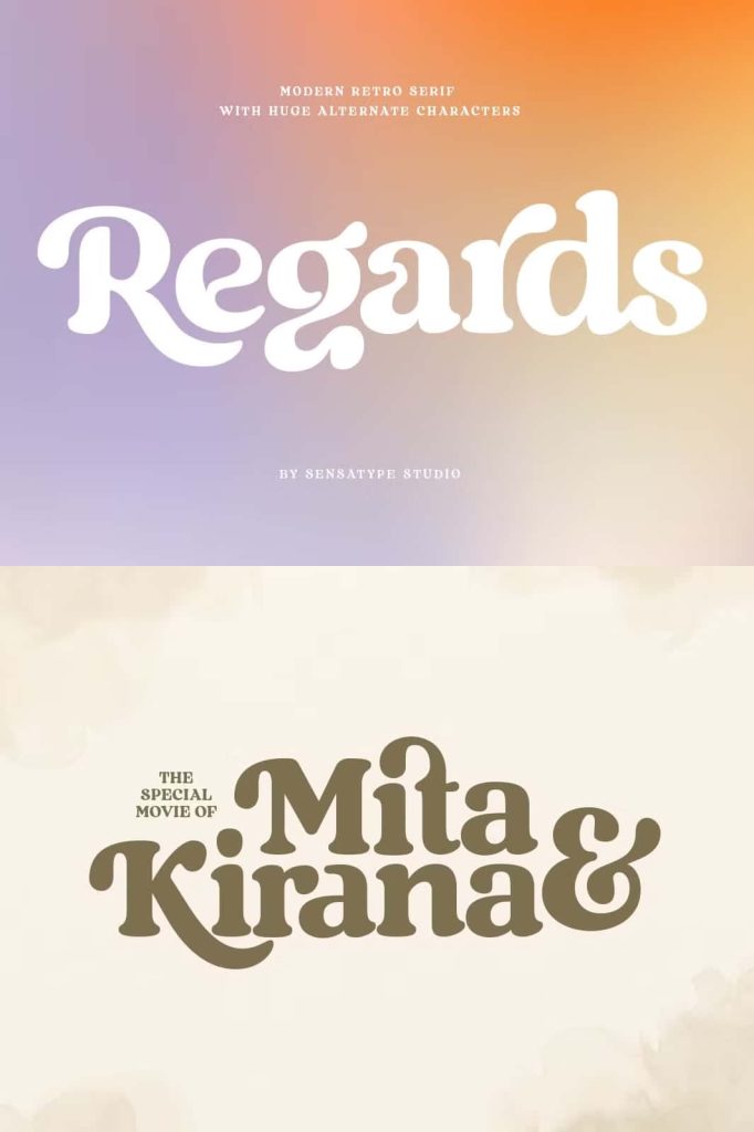
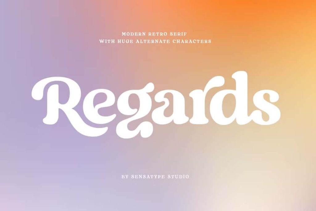
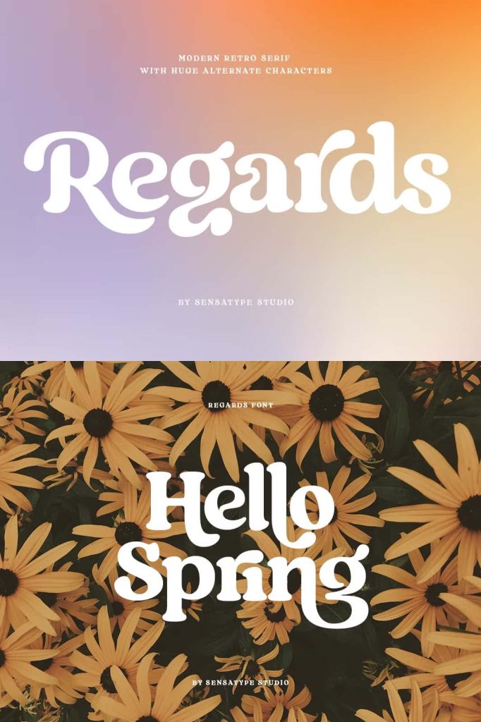
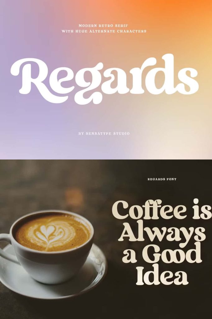
Regards is a carefully designed vintage serif display font that balances retro charm with modern usability. It blends classic inspiration with a fresh, playful attitude, resulting in a typeface that feels both familiar and exciting. Every letterform carries personality while maintaining clarity, making Regards an excellent choice for designers who want expressive typography without sacrificing legibility.
This font family stands out through its well-balanced proportions, moderate contrast, and refined curves. It delivers a fancy and unique appearance while remaining versatile enough to adapt to a wide range of creative projects. Whether used for bold headlines or refined branding elements, Regards brings visual confidence and timeless appeal.
A Retro Modern Approach to Vintage Serif Design
Regards draws its strength from the harmony between retro aesthetics and modern structure. The vintage serif influence appears in its elegant curves and classic letter shapes, while the modern touch ensures clean lines and consistent spacing. This combination allows the font to feel nostalgic without appearing outdated.
The moderate contrast between thick and thin strokes enhances readability and adds sophistication. This careful balance helps the font perform well across different sizes and formats, making it suitable for both print and digital use.
Well-Balanced Letterforms with Lasting Impact
Each character in Regards is crafted with attention to proportion and flow. The serif details feel decorative yet controlled, creating a playful rhythm that guides the eye smoothly across words and phrases. This structure ensures that the font remains readable even when used in complex layouts.
Designers can rely on Regards to deliver visual impact without overwhelming the surrounding design elements.
Over 100 Alternates for Creative Freedom
One of the most powerful features of the Regards font family is its collection of more than 100 alternates. These alternates allow designers to easily customize letterforms and create unique typographic compositions. With just a few clicks, curves and decorative shapes can transform standard text into something truly distinctive.
The alternates are designed to work seamlessly with the main characters, making experimentation fast and intuitive. This flexibility encourages creative exploration while maintaining consistency and polish.
Create Beautiful Shapes in Seconds
Thanks to its extensive alternate set, Regards makes it easy to achieve elegant curves and custom lettering styles without complex manual adjustments. Designers can quickly switch between alternates to find the perfect balance between playfulness and refinement.
This feature is especially valuable for logo design, branding systems, and decorative headlines where uniqueness matters.
Perfect for Display and Branding Projects
Regards is a display font designed to shine in attention-grabbing applications. Its expressive character makes it ideal for branding projects, logos, and advertising materials. The font communicates personality and confidence, helping brands establish a memorable visual identity.
In wedding designs and invitations, Regards adds a sense of elegance and charm. Its decorative qualities enhance romantic and celebratory themes while remaining readable and polished.
Versatile Across Print and Digital Media
Beyond branding and events, Regards performs beautifully in social media posts, advertisements, and product packaging. The font’s clarity ensures messages remain easy to read, even in fast-scrolling digital environments.
It also works well for labels, product designs, photography watermarks, stationery, and invitations. The consistent structure and high legibility make it suitable for both large display text and smaller supporting elements.
High Legibility with Decorative Appeal
Despite its fancy and playful nature, Regards maintains a high level of legibility. The letter spacing, stroke contrast, and serif details are carefully balanced to ensure comfortable reading. This makes the font practical for real-world design applications where clarity is essential.
Designers can confidently use Regards across various formats without worrying about readability issues.
A Vintage Serif Font Built for Creative Versatility
Regards proves that a vintage serif display font can be both decorative and functional. Its retro modern style, extensive alternates, and thoughtful design make it a powerful tool for creative professionals. The font adapts easily to different moods and themes, from playful and expressive to elegant and refined.
For designers seeking a versatile vintage serif with strong character and modern reliability, Regards offers a complete and inspiring typographic solution.