
Editor’s Note Family: A Complete Minimalist Font System
Expanding the Vision of Editor’s Note
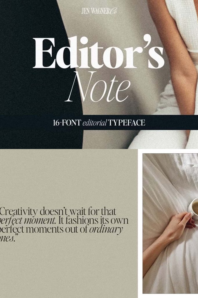
Editor’s Note Family builds upon the original Editor’s Note typeface and transforms it into a fully developed typographic system. This expansion introduces a broader range of styles while preserving the clean, refined identity that made the original so appealing. Designers now gain more control, more flexibility, and more creative freedom without sacrificing consistency.
Rather than acting as a simple extension, Editor’s Note Family strengthens the foundation of the original design. It actively enhances usability across multiple design contexts, making it a powerful choice for both digital and print applications. Every style in the family aligns with the same core principles: clarity, precision, and modern simplicity.
A Full Range of Styles for Creative Control
16 Fonts for Maximum Versatility
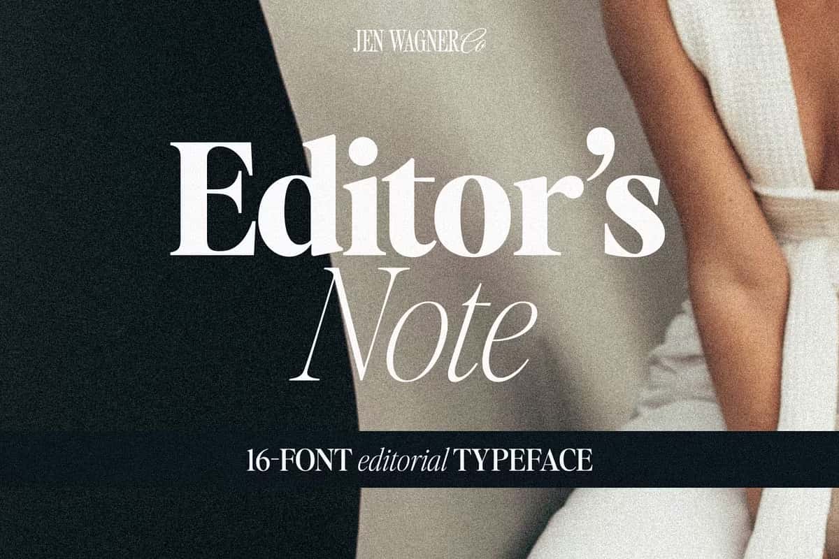
Editor’s Note Family includes 16 carefully crafted fonts, offering both regular and italic versions across a wide weight spectrum. The range stretches from an ultra-light Hairline to a confident Bold, allowing designers to build strong typographic hierarchies with ease.
This variety empowers users to move seamlessly between subtle elegance and bold emphasis. Use lighter weights for refined editorial layouts or minimalist branding, and shift to heavier styles when you need impact and clarity. Each weight maintains visual harmony, ensuring a consistent look across all applications.
True Italics That Enhance Expression
The italic styles in Editor’s Note Family are not simple slanted versions of the regular fonts. Designers crafted them as true italics, giving each character its own unique structure and rhythm. These italics introduce a sense of motion and sophistication, making them ideal for highlighting key information or adding stylistic contrast.
Defined by Clean Lines and Tight Curves
Editor’s Note Family stands out through its disciplined design approach. It uses clean lines and tight curves to create a polished and highly readable typeface. Every detail feels intentional, from the spacing between letters to the precise shaping of each character.
This attention to detail ensures excellent legibility at various sizes, whether used in large headlines or smaller body text. The typeface communicates clearly without unnecessary ornamentation, making it a reliable choice for modern design needs.
Modern Minimalism with a Trend-Driven Edge
Minimalism drives the aesthetic of Editor’s Note Family, but it does not feel generic or overused. Instead, it captures a contemporary visual language that resonates with current design trends. The typeface balances simplicity with personality, allowing it to remain both functional and visually engaging.
Designers can use this family to create layouts that feel clean, stylish, and current. Its understated elegance works particularly well in branding, editorial design, fashion projects, and digital interfaces where clarity and sophistication matter.
Built for Consistency Across Platforms
Editor’s Note Family adapts effortlessly to different mediums. Whether you design for web, mobile, print, or social media, the typeface maintains its integrity and visual clarity. Its consistent structure ensures that your typography looks cohesive across all touchpoints.
This reliability makes it an excellent choice for brands that require a unified identity. By using a single font family with multiple weights and styles, designers can create diverse compositions while maintaining a strong visual system.
Ideal for Contemporary Design Applications
Editor’s Note Family supports a wide range of creative uses. It works effectively in editorial layouts that demand readability, branding projects that require elegance, and user interfaces that prioritize clarity. Its versatility allows designers to experiment while staying within a structured typographic framework.
From minimalist posters to sophisticated websites, this typeface adapts to the needs of modern design without losing its core identity. It encourages designers to think creatively while providing the tools to execute ideas with precision.
Conclusion: A Modern Typeface That Delivers Clarity and Style
Editor’s Note Family goes beyond being a simple font collection. It acts as a complete design system that supports modern creativity with clarity and consistency. By combining clean lines, tight curves, and a full range of styles, it delivers both functionality and aesthetic appeal.
Designers who choose Editor’s Note Family gain a reliable, versatile, and visually refined tool that elevates their work. It does not just follow minimalist trends—it actively defines them.