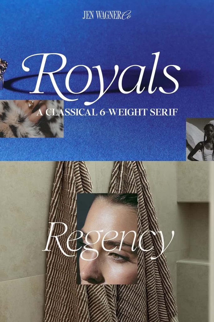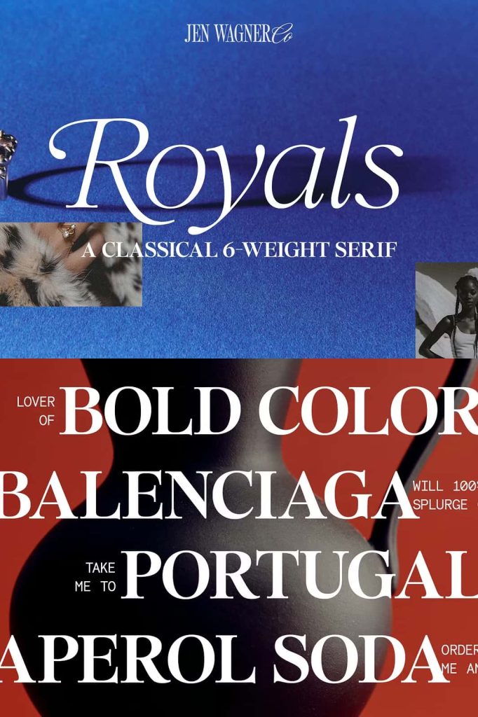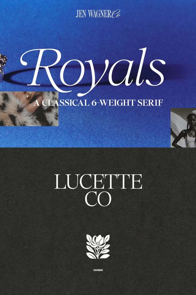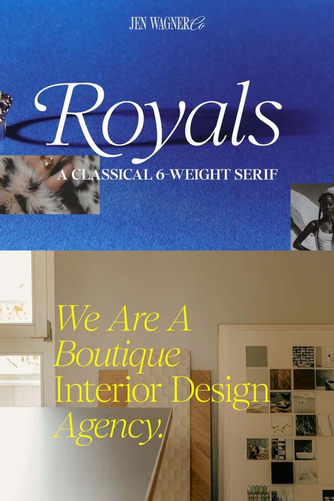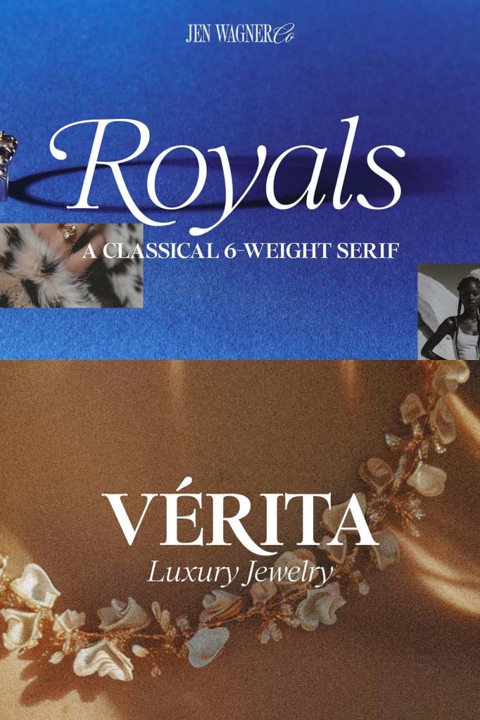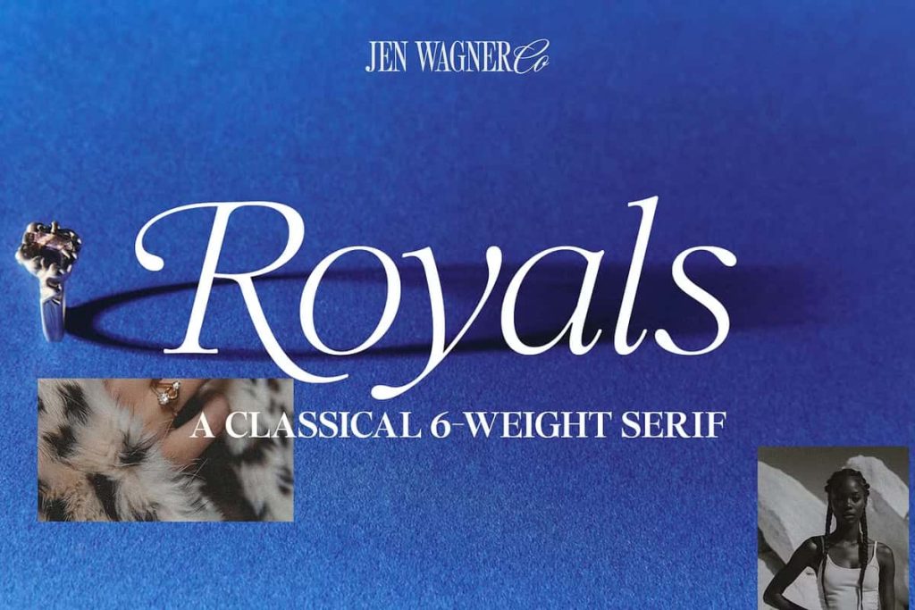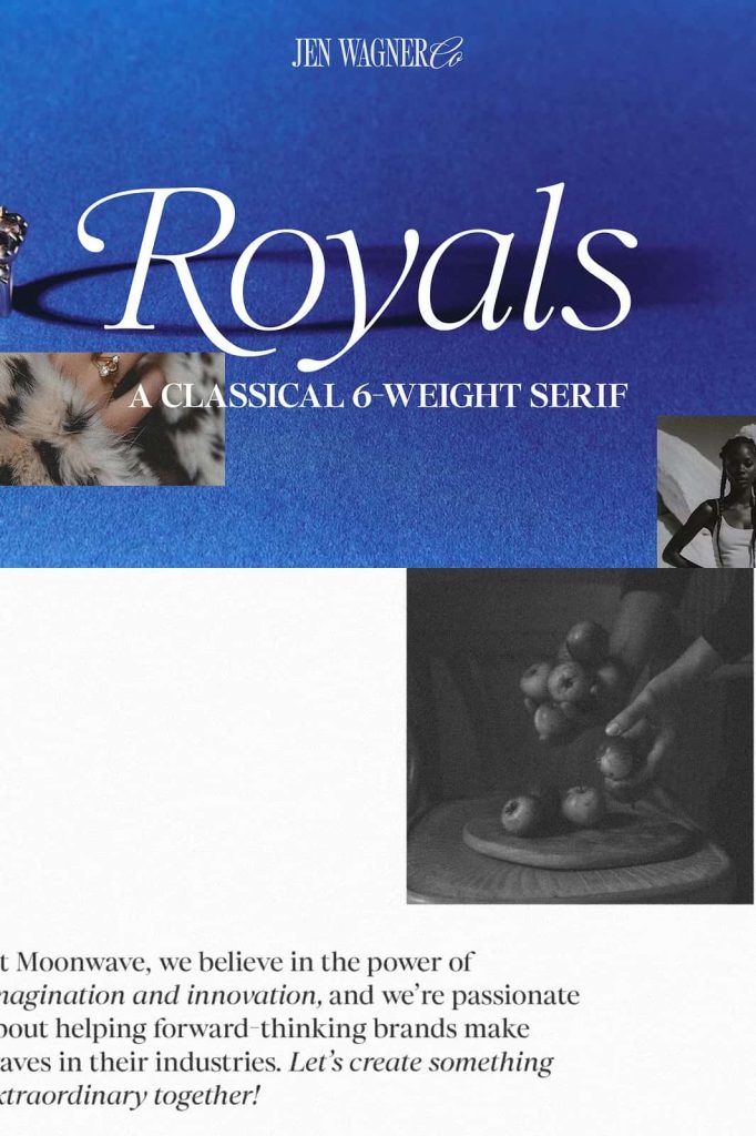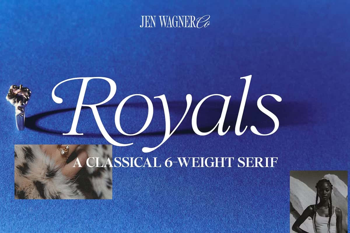

Royals Serif – A Romantic and Classic Serif Font Family for Elegant Typography
Royals Serif is a beautifully crafted serif font family that embodies romance, sophistication, and timeless design. Built with a strong foundation in classical typography, this typeface delivers refined letterforms that elevate any visual composition. It brings together elegance and clarity, making it a powerful choice for designers who want to create impactful and memorable typography.
A Classic Serif with Timeless Appeal
Royals Serif draws inspiration from traditional serif styles that have defined typography for centuries. Its structure reflects balance, proportion, and precision, allowing it to maintain a sense of authority while still feeling graceful. The font captures the essence of classic design while adapting seamlessly to modern creative needs.
This timeless quality ensures that Royals Serif remains relevant across different projects and industries. Whether used in print or digital formats, it consistently delivers a polished and professional appearance that stands the test of time.
Designed for Romantic and Elegant Expression
Royals Serif carries a subtle romantic tone that sets it apart from more neutral typefaces. Its refined curves and carefully shaped serifs introduce softness and charm without compromising structure. This balance allows the font to communicate emotion while maintaining clarity and readability.
The typeface works particularly well in designs that aim to evoke elegance and beauty. It enhances the visual experience by adding a sense of depth and personality to the text, making it ideal for expressive and meaningful compositions.
Perfect for Quotes and Emotional Messaging
Royals Serif excels in presenting quotes and statements that require emphasis and style. Its graceful forms give words a sense of importance, allowing messages to resonate more strongly with the viewer. Whether used in print materials or digital graphics, it transforms simple text into a visually engaging focal point.
Optimized for Large-Scale Typography
Royals Serif performs best when used at larger sizes. Its details become more pronounced in headlines, titles, and display text, allowing the font to fully express its elegance. The contrast between thick and thin strokes adds visual interest and helps guide the viewer’s attention.
Designers can use Royals Serif to create strong focal points within their layouts. It draws attention naturally, making it an excellent choice for key design elements that need to stand out.
Ideal for Headers and Big Text Moments
Royals Serif shines in applications where typography takes center stage. It works especially well for:
- Large-scale headers and titles
- Editorial and magazine layouts
- Luxury branding and identity design
- Posters and promotional materials
- Elegant quotes and typographic artwork
In these contexts, the font enhances readability while delivering a strong visual presence.
A Versatile Serif Family for Creative Projects
As a serif family, Royals Serif offers flexibility across different design needs. It allows designers to build consistent layouts while maintaining a cohesive visual identity. The font adapts well to various styles, from minimal and modern to decorative and expressive.
This versatility makes it a valuable asset for both small and large-scale projects. Designers can use it across multiple touchpoints while preserving a unified look and feel.
Maintaining Consistency in Design
Using a cohesive serif family like Royals Serif helps create harmony across design elements. It ensures that every piece of text contributes to the overall composition, resulting in a more professional and polished outcome.
Enhancing Visual Hierarchy and Composition
Royals Serif supports strong visual hierarchy by clearly distinguishing between primary and secondary elements. Its bold presence makes it ideal for headlines, while its refined structure allows it to complement supporting text when used carefully.
For best results, pair Royals Serif with a clean sans-serif or a subtle secondary serif for body text. This combination maintains readability while allowing the main typography to stand out.
Effective Pairing Strategies
Combining Royals Serif with simpler fonts creates contrast and balance. The serif font draws attention to key messages, while supporting fonts handle detailed information. This approach results in a well-structured and visually appealing design.
Conclusion
Royals Serif is a romantic and classic serif font family that delivers elegance, clarity, and versatility. Its refined letterforms and timeless design make it an excellent choice for large-scale typography, headers, and expressive quotes.
By incorporating Royals Serif into your projects, you can create designs that feel sophisticated, engaging, and memorable. It provides the perfect foundation for typography that communicates both beauty and professionalism.