Elisabeth Darlington – A Natural Flowing Handwritten Script Typeface
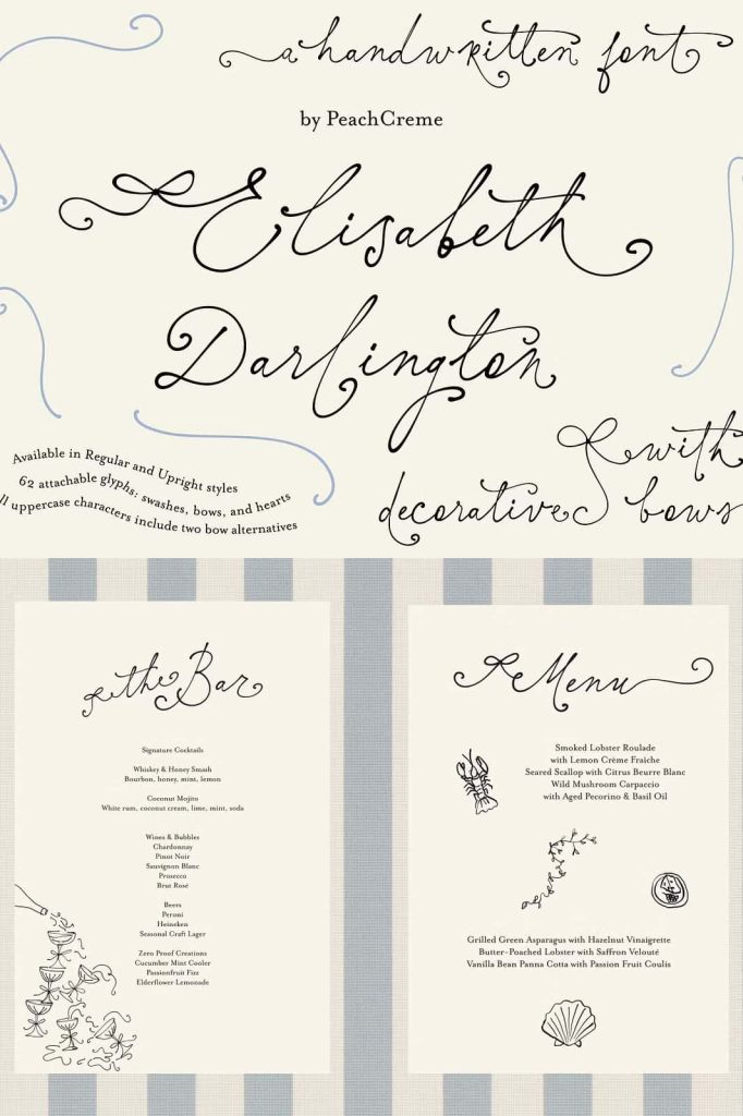
Elisabeth Darlington is a thoughtfully crafted script typeface designed to capture the beauty of natural handwriting. Built over time with careful attention to detail, this font reflects a deliberate effort to balance elegance, spontaneity, and readability. It does not rely on rigid structure or mechanical repetition. Instead, it delivers a fluid writing style that feels organic, expressive, and visually engaging.
A Script Font Designed with Purpose
The development of Elisabeth Darlington began with a clear objective: to create a script typeface where letters connect seamlessly while preserving the authentic qualities of handwritten text. Many script fonts struggle to achieve this balance. They either prioritize uniformity at the expense of personality or embrace expression while sacrificing consistency.
Elisabeth Darlington addresses this challenge by carefully shaping each character to connect naturally with the next. The transitions between letters feel smooth and intentional, allowing words to flow as they would in real handwriting. This design approach creates a cohesive look without removing the subtle imperfections that give handwritten styles their charm.
Natural Connections and Continuous Flow
One of the defining features of Elisabeth Darlington is its ability to maintain a continuous flow across words and phrases. The letters do not simply sit next to each other; they interact and connect in a way that mimics real pen movement. This results in a more dynamic and lifelike appearance.
The connecting strokes are designed to guide the eye effortlessly from one letter to the next. This creates a rhythm that enhances readability while also adding visual interest. Designers can use this natural flow to create compositions that feel smooth, balanced, and cohesive.
Authentic Handwritten Character
Despite its structured connections, Elisabeth Darlington retains a spontaneous and handwritten quality. The font avoids looking overly polished or mechanical. Instead, it embraces slight variations in shape and stroke, which contribute to its authenticity.
This handwritten character makes the typeface ideal for projects that require a personal and human touch. It communicates warmth, creativity, and individuality, making it a strong choice for expressive design work.
Designed for Movement and Expression
Elisabeth Darlington introduces a sense of movement that sets it apart from static script fonts. Each stroke feels intentional, as if it follows the natural motion of a hand writing on paper. This movement adds energy to the design, making text appear more alive and engaging.
The flowing structure allows designers to create compositions that feel dynamic rather than rigid. Whether used in a logo, headline, or decorative text, the typeface brings a sense of motion that enhances the overall visual experience.
Enhancing Visual Storytelling
Movement in typography plays a key role in storytelling. Elisabeth Darlington supports this by guiding the viewer’s eye through the text in a smooth and engaging way. This quality makes it particularly effective in designs where emotion and narrative are important.
Ideal for Elegant and Personal Design Projects
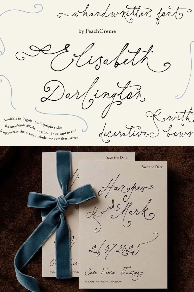
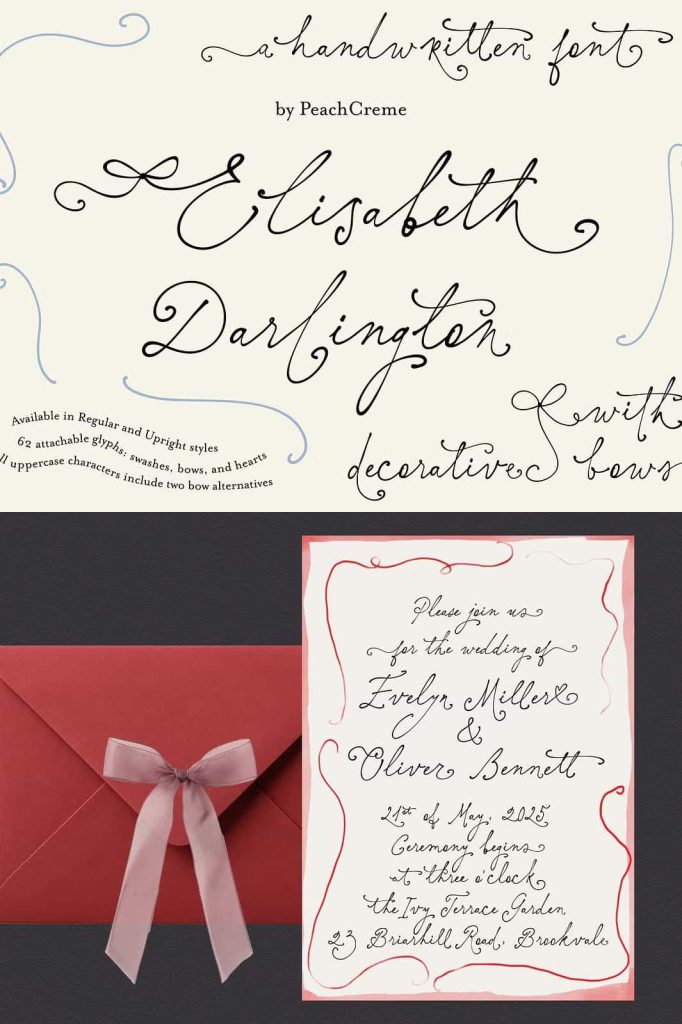
Elisabeth Darlington works best in applications where style and personality take center stage. Its elegant yet approachable appearance makes it suitable for a variety of creative uses, including:
- Wedding invitations and stationery
- Branding and logo design
- Social media graphics and quotes
- Packaging with a personal touch
- Editorial accents and decorative typography
In these contexts, the font adds a refined yet human element that enhances the overall design. It helps communicate emotion and intention more effectively than standard typefaces.
Balancing Elegance and Readability
While Elisabeth Darlington emphasizes expression, it does not ignore readability. The letterforms are carefully designed to remain clear even in connected script form. This balance ensures that the text remains legible while still delivering strong visual impact.
For longer text, designers may choose to pair it with a simpler font to maintain clarity. However, in short phrases and display settings, Elisabeth Darlington performs exceptionally well on its own.
Effective Pairing Strategies
To create a balanced composition, combine Elisabeth Darlington with clean sans-serif or minimal serif fonts. This contrast allows the script to stand out while supporting text remains easy to read. The result is a harmonious design that blends style with functionality.
Conclusion
Elisabeth Darlington is more than a script font; it is a carefully developed typeface that captures the essence of natural handwriting. Through its flowing connections, authentic character, and sense of movement, it offers designers a powerful tool for creating expressive and elegant typography.
By using Elisabeth Darlington, you can bring warmth, personality, and sophistication into your designs. It transforms simple text into a visual experience, making every word feel intentional and alive.