
The Picnic Club – Nostalgic Serif Font for Retro and Modern Branding
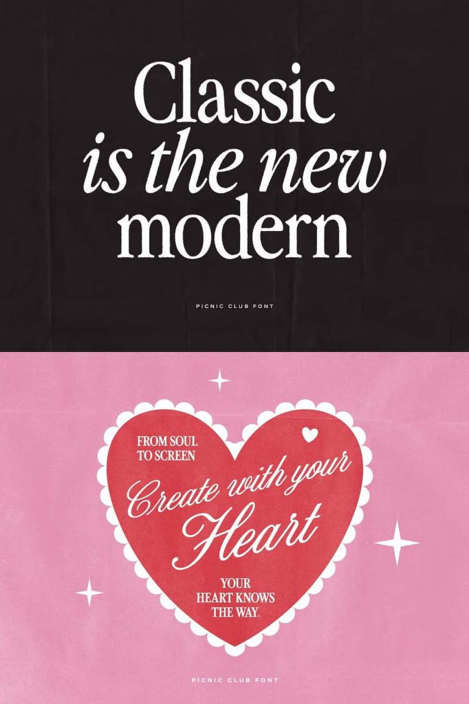
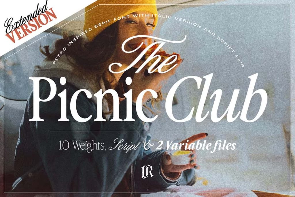
The Picnic Club is a distinctive serif font that captures the essence of vintage design while maintaining a refined, modern edge. Inspired by the expressive and groovy aesthetic of the 1980s, this typeface delivers a strong visual identity that feels both nostalgic and relevant. It brings together bold character shapes and elegant detailing, allowing designers to create memorable work with a clear stylistic direction.
A Vintage Serif with 80s Influence
The Picnic Club draws heavy inspiration from the visual culture of the 80s, a time when typography embraced personality and artistic freedom. The font reflects that era through its expressive curves, confident serifs, and dynamic proportions. These features give each letter a sense of rhythm and movement, making the font highly engaging in display settings.
At the same time, The Picnic Club avoids feeling outdated. It refines retro elements with modern design principles, resulting in a balanced typeface that works across contemporary branding projects. This combination makes it a reliable choice for designers who want to evoke nostalgia without sacrificing clarity or professionalism.
Designed for Impactful Display Use
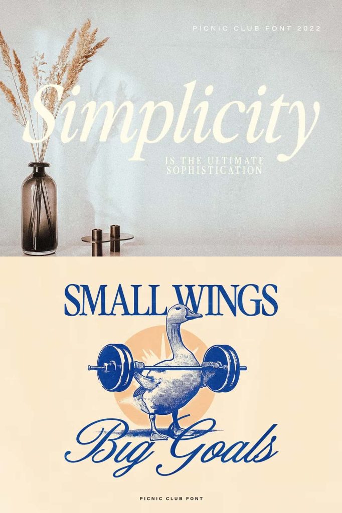
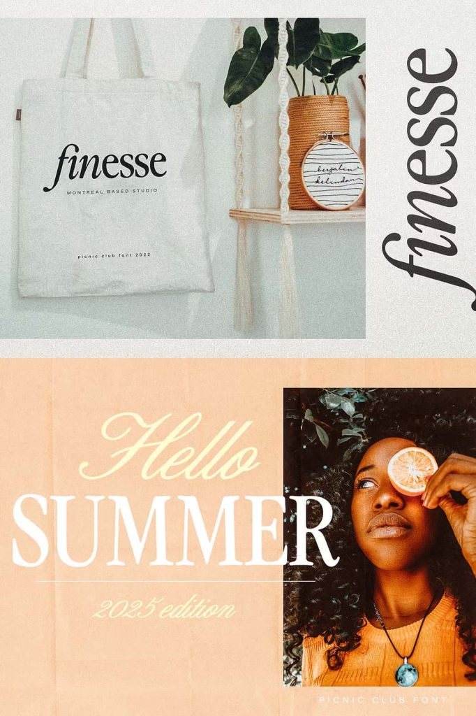
Originally developed as a display serif, The Picnic Club excels in large-scale applications. It performs best in headlines, titles, and branding elements where visual impact matters most. The font commands attention without overwhelming the design, thanks to its structured yet expressive letterforms.
Whether you are designing a logo, editorial headline, or promotional material, this typeface provides a strong focal point. Its presence enhances composition and guides the viewer’s attention directly to key messages.
Perfect for Creative Branding
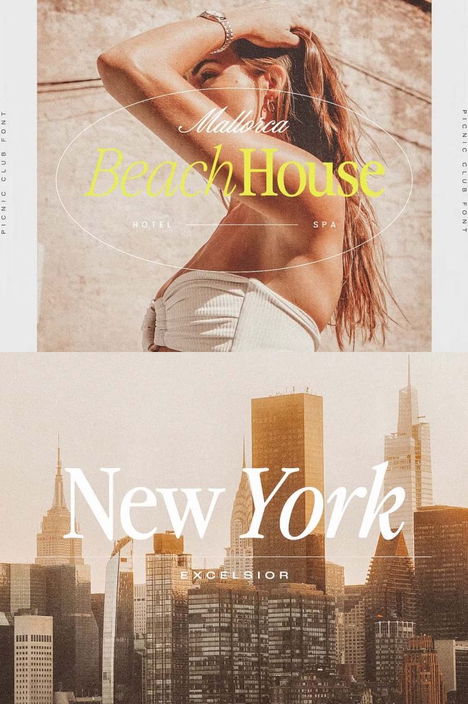
The Picnic Club fits naturally into a wide range of creative projects. Its nostalgic tone and stylish execution make it especially effective for:
- Retro and vintage branding
- Logo design and identity systems
- Editorial layouts and magazine headlines
- Packaging design with a nostalgic theme
- Posters and promotional graphics
In each of these uses, the font adds character and depth, helping brands communicate a distinct visual story.
Evolved into a Complete Type System
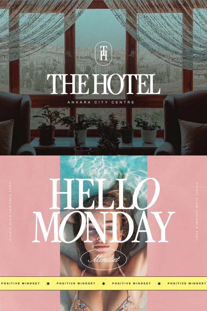
What started as a display serif has now grown into a more versatile type system. The Picnic Club expands beyond a single style, offering additional variations that support broader design needs. This evolution allows designers to maintain consistency across different touchpoints while still using one cohesive type family.
With multiple styles available, you can build hierarchy more effectively. Headlines, subheadings, and supporting text can all work together while preserving the font’s core identity. This flexibility makes The Picnic Club suitable not only for standalone designs but also for full branding systems.
Consistency Across Design Elements
A unified type system simplifies the design process. Instead of combining unrelated fonts, you can rely on The Picnic Club to deliver harmony across your project. This consistency strengthens brand recognition and ensures that every visual element feels intentional.
Balancing Nostalgia and Modern Elegance
The strength of The Picnic Club lies in its ability to balance two distinct qualities: nostalgic charm and modern sophistication. The retro influence adds warmth and familiarity, while the refined structure ensures clarity and usability in current design contexts.
This balance allows the font to adapt to different creative directions. It can feel playful and expressive in one project, then polished and elegant in another. Designers can push its personality in various ways depending on layout, spacing, and color choices.
Best Practices for Use
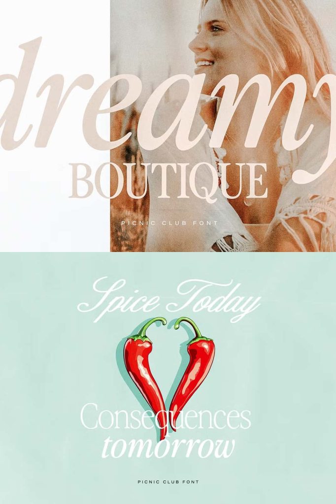
To get the most out of The Picnic Club, use it primarily in display settings where its details can shine. Large sizes allow the curves and serifs to remain clear and impactful. For body text, consider pairing it with a clean and simple font to maintain readability.
This approach creates a strong visual hierarchy. The Picnic Club draws attention to key elements, while supporting typography keeps longer content accessible and easy to read.
Typography Pairing Suggestions
Pair The Picnic Club with minimalist sans-serif fonts or subtle serif companions. This contrast highlights the font’s personality without creating visual clutter. The result is a balanced and professional composition that supports both branding and usability.
Conclusion
The Picnic Club is more than just a retro-inspired font. It is a thoughtfully designed serif typeface that combines the expressive energy of the 80s with modern elegance and structure. Its evolution into a complete type system makes it a valuable tool for designers who want both style and flexibility.
By using The Picnic Club in the right context, you can create designs that feel distinctive, engaging, and timeless. It offers a clear path to building strong visual identities rooted in nostalgia while remaining relevant in today’s design landscape.