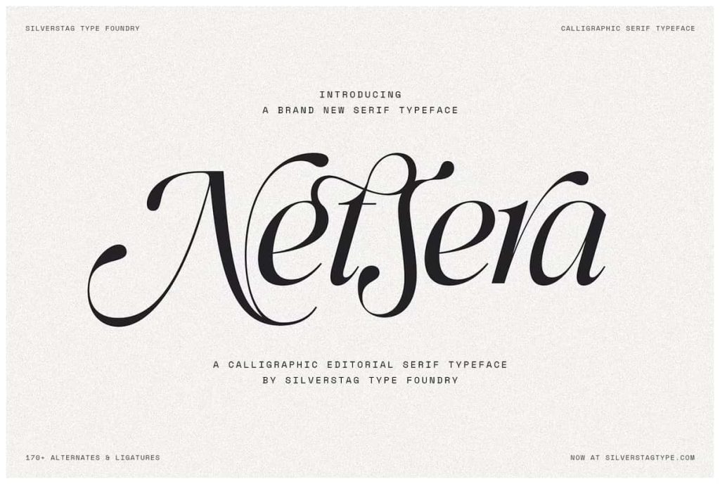
Netsera – Calligraphic Serif Typeface with Italic and 170+ Alternates
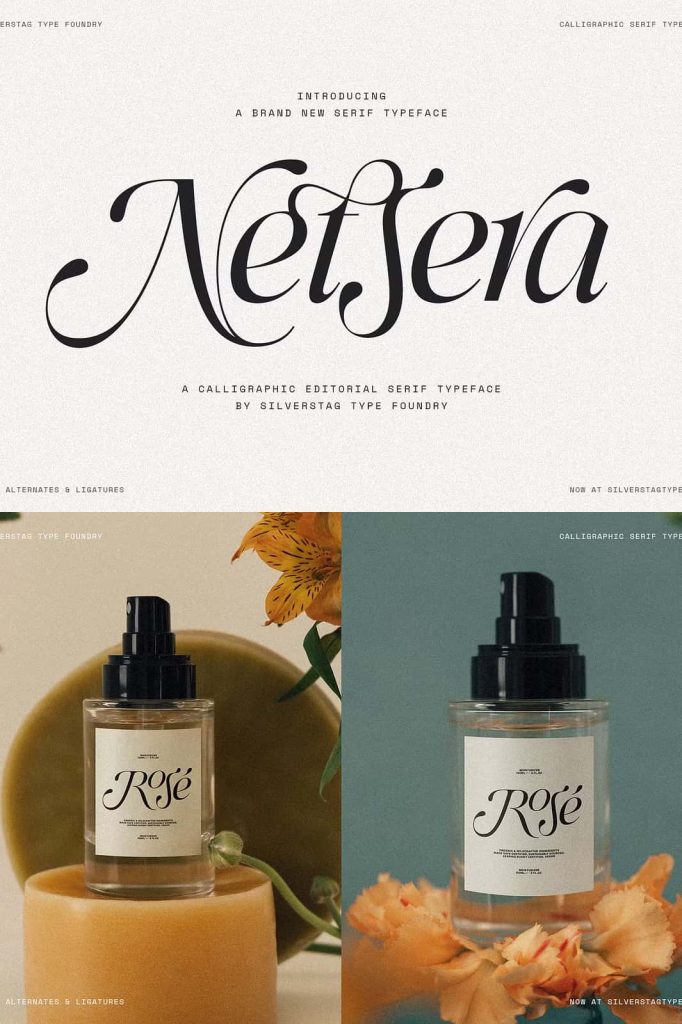
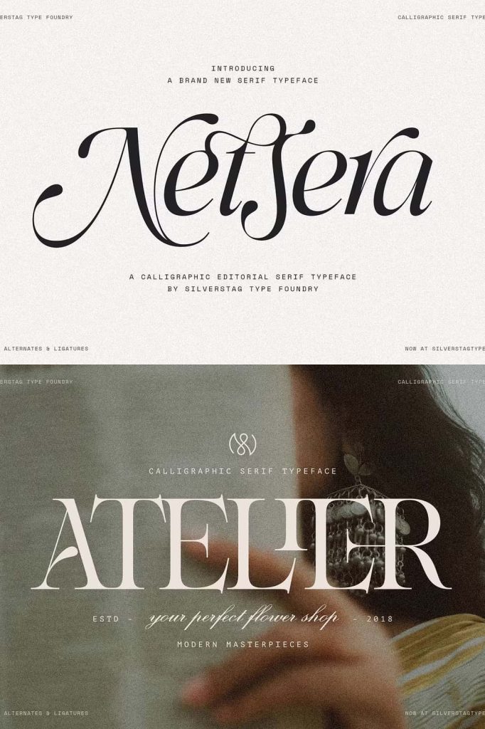
Netsera is a refined calligraphic serif typeface designed to bring elegance, expression, and versatility into modern design work. It blends classical serif traditions with contemporary detailing, resulting in a font that feels both timeless and current. With a rich set of features and an extensive character library, Netsera gives designers the tools to create distinctive typography without compromising consistency.
A Fusion of Classical Elegance and Modern Precision
Netsera draws its core identity from traditional calligraphic serif styles. The letterforms reflect graceful strokes, balanced proportions, and subtle contrast that evoke a sense of sophistication. At the same time, the design introduces modern refinements that improve clarity and adaptability across different media.
This combination allows Netsera to perform well in both classic and contemporary settings. Whether you are building a luxury brand, designing editorial layouts, or crafting digital experiences, the typeface adapts with confidence and clarity.
Expanded Character Set for Creative Freedom
One of Netsera’s strongest advantages lies in its extensive character collection. The typeface includes more than 900 glyphs, giving designers a wide range of options to explore. This large set ensures that you can handle complex typography needs, including multilingual support and stylistic variations.
The availability of numerous alternates allows you to customize your text without losing cohesion. Instead of repeating the same shapes, you can introduce variation and rhythm into your designs. This flexibility helps create more natural and visually engaging compositions.
170+ Alternates and Ligatures
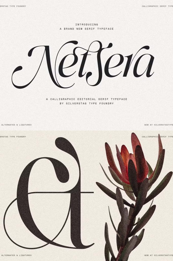
Netsera features over 170 alternates and ligatures that expand its expressive potential. Each alternate is carefully drawn to maintain harmony with the core design while offering a unique twist. These elements allow you to refine wordmarks, enhance logos, and add personality to headlines.
Ligatures improve letter connections and flow, especially in display settings. They help create smoother transitions between characters, resulting in more polished and professional typography. With these features, Netsera supports both subtle refinement and bold experimentation.
Elegant Italic Style for Dynamic Typography
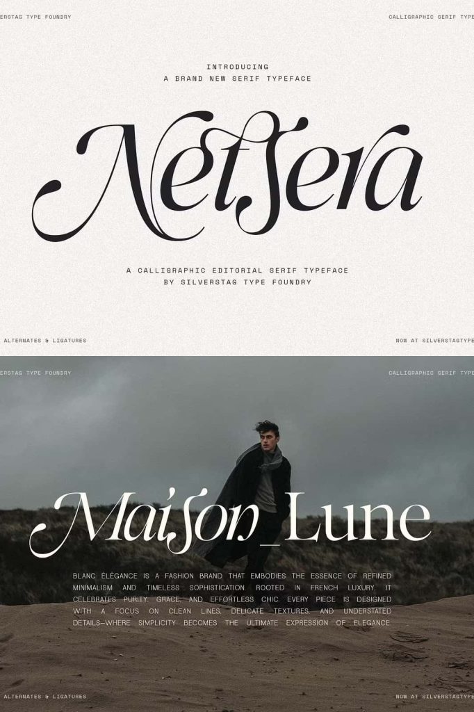
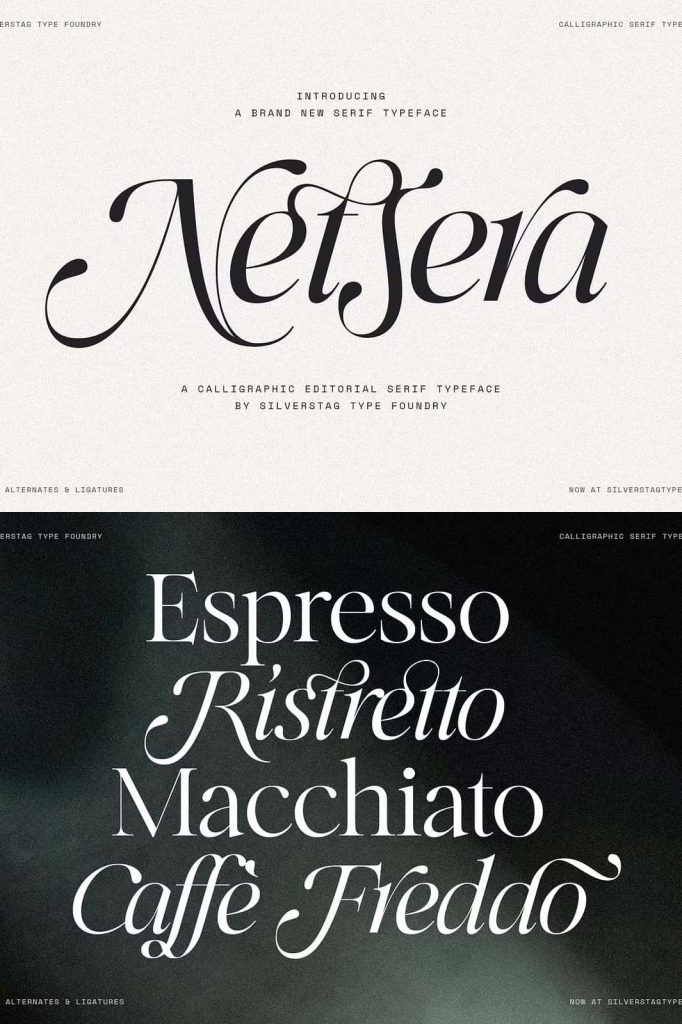
The inclusion of a dedicated italic style adds another layer of versatility to Netsera. The italic version is not simply a slanted form; it is thoughtfully designed with its own calligraphic character. This gives it a natural flow that works beautifully in both decorative and functional contexts.
You can use the italic style to create emphasis, contrast, or hierarchy within your design. It pairs seamlessly with the regular style, allowing you to build cohesive layouts while introducing variation. This makes Netsera suitable for projects that require both structure and expressiveness.
Enhancing Visual Hierarchy
With both upright and italic styles available, you can guide the viewer’s attention more effectively. Use the regular style for primary headings and the italic for secondary highlights or accents. This approach creates a clear visual structure that improves readability and overall design quality.
Ideal for High-End and Creative Applications
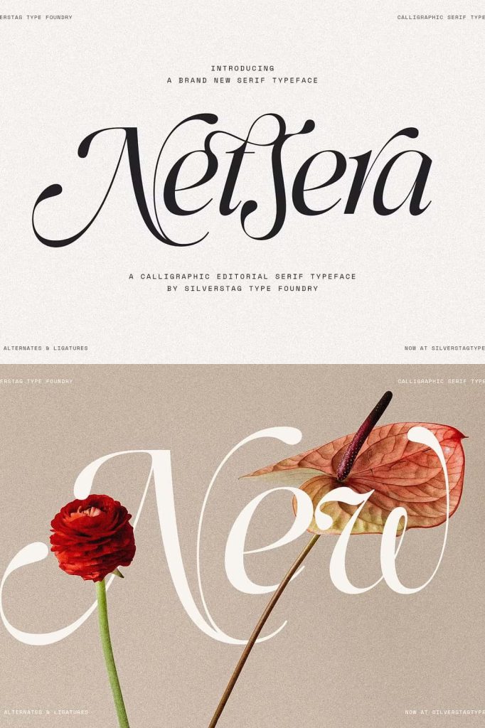
Netsera performs exceptionally well in projects that demand elegance and attention to detail. Its calligraphic influence and rich feature set make it a strong choice for:
- Luxury branding and identity design
- Editorial layouts and magazine typography
- Logo design and wordmarks
- Wedding invitations and stationery
- Packaging design with a premium feel
In each of these applications, Netsera elevates the visual experience. It communicates quality, refinement, and creativity through its carefully constructed letterforms.
Flexible and Consistent Design System
Despite its expressive nature, Netsera maintains strong consistency across all characters. This balance ensures that even with extensive alternates and ligatures, your designs remain cohesive. You can experiment freely while still preserving a unified visual identity.
The typeface also supports efficient workflows. Designers can quickly switch between alternates, test different combinations, and refine compositions without needing additional fonts. This efficiency makes Netsera a practical tool for both small and large-scale projects.
Streamlined Creative Process
By offering a complete set of typographic options within a single family, Netsera reduces the need for external resources. This allows you to focus more on creativity and less on managing multiple typefaces. The result is a smoother design process and more consistent output.
Conclusion
Netsera stands as a powerful calligraphic serif typeface that combines elegance, versatility, and technical depth. With over 900 characters, 170+ alternates, and a beautifully crafted italic style, it provides everything needed to create expressive and refined typography.
Whether you are designing for print or digital platforms, Netsera adapts to your needs while maintaining its distinctive identity. Use it to craft compelling visuals, enhance branding, and bring a sophisticated voice to your design work.