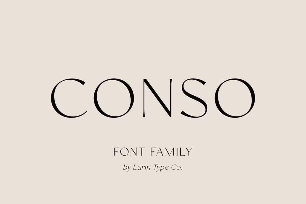
CONSO: A Modern Contrast Sans Serif Font Family for Versatile Design
CONSO delivers a refined blend of elegance, clarity, and flexibility. This modern contrast sans serif font family brings together sharp structure and smooth readability, allowing designers to create work that feels both contemporary and professional. With its carefully crafted letterforms and balanced proportions, CONSO stands as a reliable choice for projects that demand both visual impact and functional performance.
Designed as a complete type system, CONSO includes upright and italic styles, each available in seven weights ranging from thin to bold. This wide range of options empowers designers to build consistent typographic hierarchies while exploring different visual tones. Whether creating subtle layouts or bold statements, CONSO adapts seamlessly to the task.
A Typeface Built on Contrast and Clarity
CONSO defines its identity through contrast. The variation between thick and thin strokes introduces a dynamic rhythm that enhances visual interest without sacrificing readability. This contrast gives the font a modern and elegant appearance, making it suitable for both high-end and everyday design applications.
At the same time, CONSO maintains clarity across all sizes. Its clean letterforms and open spacing ensure that text remains legible in both print and digital formats. This balance between style and function allows designers to communicate effectively while maintaining a strong visual identity.
Key Features of CONSO Font Family
Seven Weights for Complete Flexibility
CONSO offers seven distinct weights, from thin to bold. This range allows designers to create layered and dynamic compositions. Lighter weights provide elegance and subtlety, while heavier weights deliver emphasis and strength. This flexibility supports a wide variety of design needs.
Upright and Italic Styles
Each weight in the CONSO family comes with a corresponding italic version. These italic styles add movement and contrast within layouts, making it easier to highlight specific elements or create visual variety. Designers can use them to enhance storytelling and guide the viewer’s attention.
Modern and Readable Design
CONSO prioritizes readability without compromising style. Its balanced proportions and clear structure ensure that text remains easy to read, even in longer passages. This makes it suitable for both display and body text applications.
Versatile Applications Across Design Projects
CONSO functions as a true multi-purpose typeface. Its adaptability allows designers to use it across a wide range of creative disciplines, including:
- Logo design and brand identity systems
- Advertising and marketing campaigns
- Packaging and product design
- Book covers and editorial layouts
- Websites, user interfaces, and digital content
Because of its extensive weight range and strong readability, CONSO enables designers to build complete typographic systems using a single font family. This consistency simplifies the design process while maintaining a cohesive visual language.
Enhancing Visual Hierarchy and Communication
CONSO helps designers establish clear visual hierarchy. By combining different weights and styles, they can create structured layouts that guide the viewer through content naturally. Headlines can stand out with bold weights, while lighter styles support secondary information.
The italic variants add another layer of flexibility. Designers can use them to emphasize key points or introduce variation within text blocks. This ability to control emphasis improves both readability and engagement.
Why Choose CONSO for Your Design Projects
CONSO offers a balanced combination of elegance, versatility, and performance. It allows designers to create work that feels modern and polished while remaining practical and easy to use. Its contrast-driven design adds visual interest, while its clarity ensures effective communication.
By choosing CONSO, designers gain a comprehensive typeface family that adapts to different creative challenges. It performs consistently across print and digital platforms, making it a valuable tool for professionals who need reliability and flexibility.
Conclusion
CONSO is more than just a sans serif font—it is a complete typographic system designed for modern design. With its seven weights, upright and italic styles, and strong readability, it provides everything needed to create dynamic and cohesive layouts.
Designers who use CONSO can build visuals that feel elegant, structured, and engaging. It stands as a versatile solution for projects that demand both style and functionality, making it an essential addition to any design toolkit.