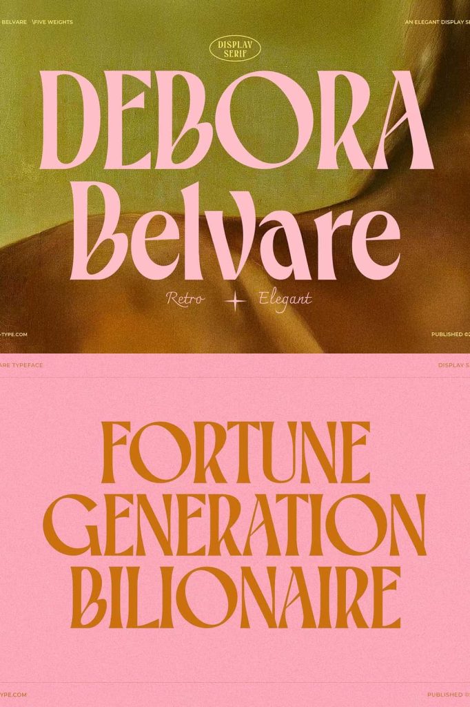
Belvare: A Retro-Inspired Serif Font with Timeless Elegance
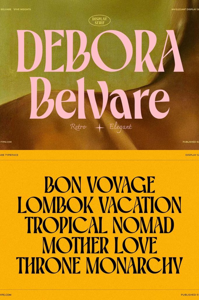
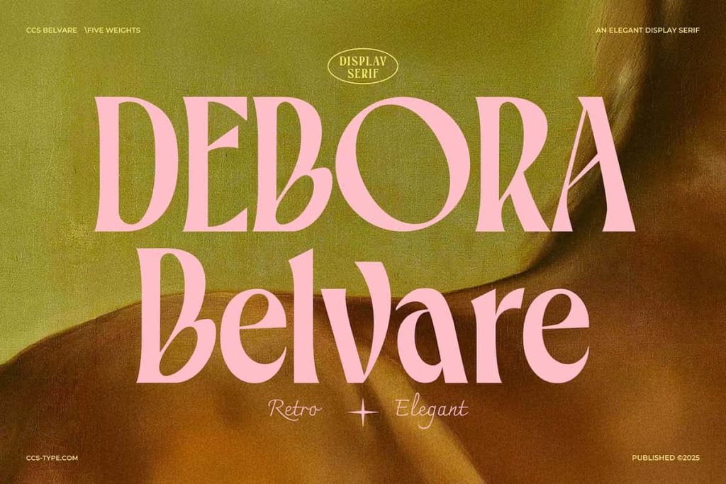
Belvare delivers a refined blend of vintage charm and modern usability. This sophisticated serif font captures the essence of retro typography while maintaining a polished and contemporary presence. Designers who seek elegance without losing personality will find Belvare an exceptional choice for a wide variety of creative projects.
With three carefully crafted weights—Light, Regular, and Bold—Belvare offers the flexibility needed to build strong and cohesive typographic systems. Each weight maintains the same core identity while providing subtle variations in tone and emphasis. This allows designers to move seamlessly between delicate details and bold statements within a single typeface family.
A Typeface Rooted in Retro Elegance
Belvare draws inspiration from classic serif styles that defined earlier eras of design. Instead of replicating those styles directly, it refines them with a modern sensibility. This approach allows the font to feel nostalgic while still meeting the expectations of contemporary design standards.
The retro influence appears in its distinctive shapes and proportions. At the same time, its clean execution ensures readability and clarity across different applications. This balance makes Belvare suitable for both traditional and modern visual identities.
Key Features of Belvare Font
Three Versatile Weights
Belvare includes Light, Regular, and Bold styles, giving designers the tools to create dynamic visual hierarchies. The Light weight works well for subtle and elegant text, while the Regular weight provides balance for general use. The Bold version delivers strong emphasis, making it ideal for headlines and key messaging.
Rounded Letter Proportions
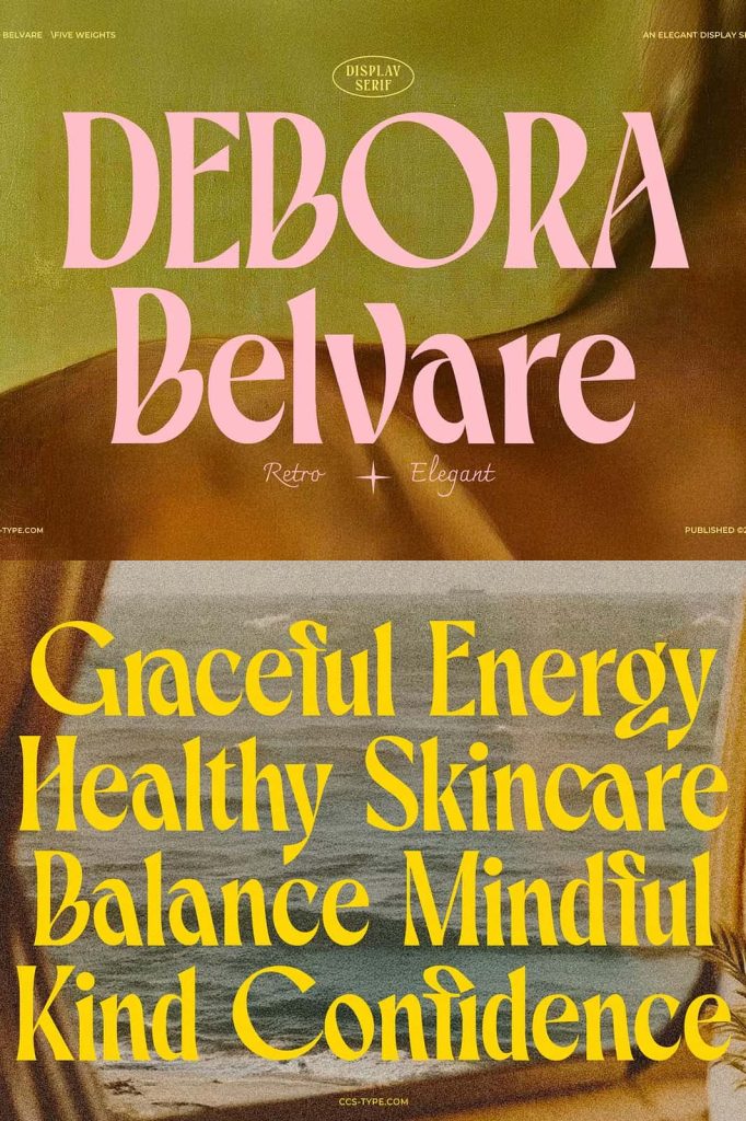
One of Belvare’s most distinctive features lies in its rounded letterforms. These soft curves create a friendly and approachable tone, reducing the rigidity often associated with serif fonts. This design choice helps the typeface feel more inviting while maintaining its sophisticated character.
Condensed and Efficient Structure
Belvare uses slightly condensed glyphs, allowing designers to fit more text into limited space without sacrificing readability. This makes it particularly useful for layouts where space efficiency matters, such as editorial designs or packaging.
Unique Character Details
The font stands out through its distinctive letterforms, especially the large, rounded shapes of characters like “O” and “C.” These elements add personality and visual interest, helping designs feel unique and memorable. Such details ensure that Belvare does not fade into the background but instead enhances the overall composition.
Ideal Use Cases for Belvare
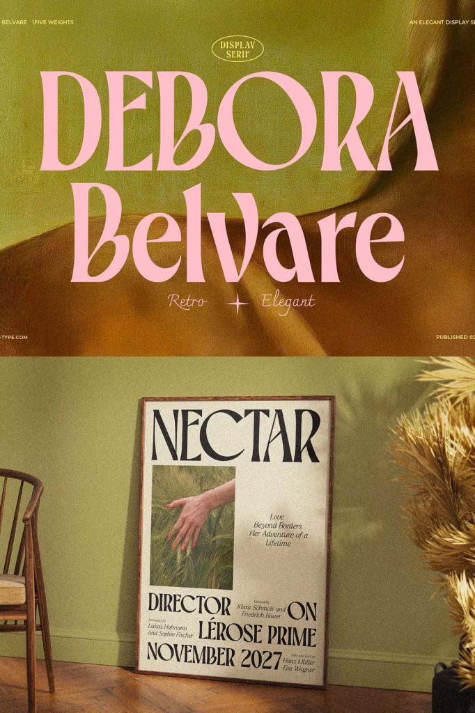
Belvare adapts easily to a wide range of design scenarios. Its combination of elegance and versatility makes it a valuable asset in both print and digital projects. Designers frequently use it for:
- Luxury branding and identity design
- Editorial layouts and magazine headlines
- Packaging for premium or artisanal products
- Website headers and hero sections
- Invitations and event materials
While Belvare performs well in display settings, it can also support short body text when used carefully. Pairing it with a complementary sans serif font can further enhance readability and create a balanced design.
Creating Visual Harmony and Impact
Belvare helps designers establish strong visual hierarchy and harmony. Its range of weights allows for clear differentiation between headings, subheadings, and supporting text. By adjusting size, spacing, and weight, designers can guide the viewer’s attention effectively.
The rounded proportions and condensed structure also contribute to a cohesive layout. These features allow the typeface to integrate smoothly into various design styles, from minimal compositions to more decorative and expressive layouts.
Why Choose Belvare for Your Design Projects
Belvare offers a unique combination of retro inspiration and modern refinement. It allows designers to create work that feels both timeless and distinctive. Its elegant appearance communicates professionalism, while its friendly curves make it approachable and engaging.
By choosing Belvare, designers gain access to a versatile serif font that adapts to different creative needs. Whether used in branding, editorial design, or digital interfaces, it consistently delivers a polished and memorable result.
Conclusion
Belvare stands as a sophisticated serif font that brings retro elegance into contemporary design. With its three versatile weights, rounded letterforms, and distinctive character details, it provides both flexibility and visual impact.
Designers who use Belvare can create compositions that feel refined, balanced, and full of personality. It transforms typography into a central design element, helping projects stand out with clarity and timeless appeal.