
Altone: A Clean Geometric Sans Serif Typeface with Bold Simplicity
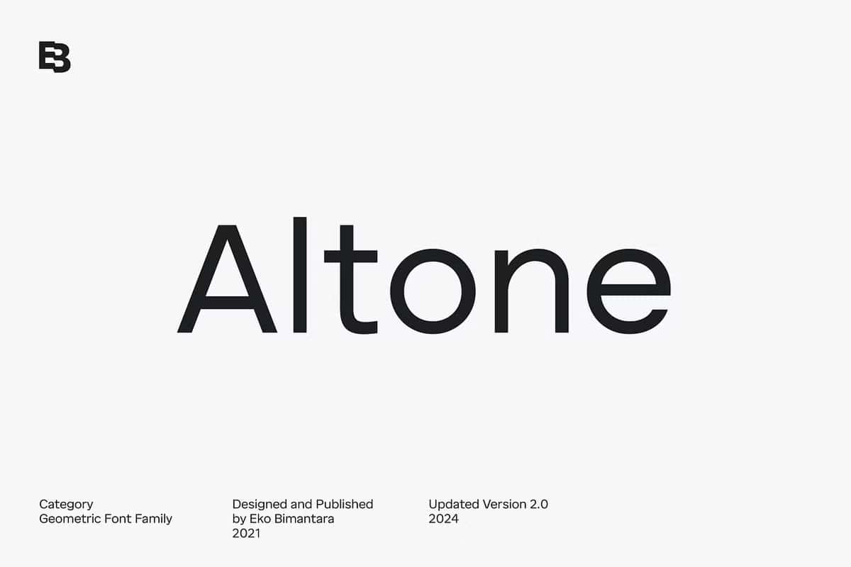
Altone represents a focused pursuit of clarity, balance, and usability in modern typography. This geometric sans serif typeface embraces structure and consistency, allowing designers to communicate ideas with precision and confidence. It does not rely on excessive decoration or stylistic complexity. Instead, Altone delivers a straightforward visual language that feels accessible, strong, and highly adaptable.
Designers often need a typeface that performs well across different platforms and audiences. Altone answers this need by offering a familiar and approachable form. Its design follows conventional geometric principles, making it easy for readers to recognize and process. This readability gives Altone a significant advantage in both digital and print environments.
Built on Geometric Consistency
Altone draws its strength from geometric construction. Each letterform follows a clear system of shapes and proportions, resulting in a uniform and harmonious appearance. This consistency allows the typeface to maintain visual stability, even when used in complex layouts.
By focusing on regularity, Altone ensures that every character aligns seamlessly with the next. This creates a smooth reading experience and helps designers build structured compositions. The geometric foundation also gives the typeface a modern and professional tone, making it suitable for a wide range of industries.
Key Characteristics of Altone
Simple and Clear Design
Altone prioritizes simplicity. Its clean lines and minimal details make it easy to read and visually appealing. This simplicity allows content to take center stage while the typography supports it without distraction. Designers can use Altone to create layouts that feel organized and easy to navigate.
Bold and Strong Personality
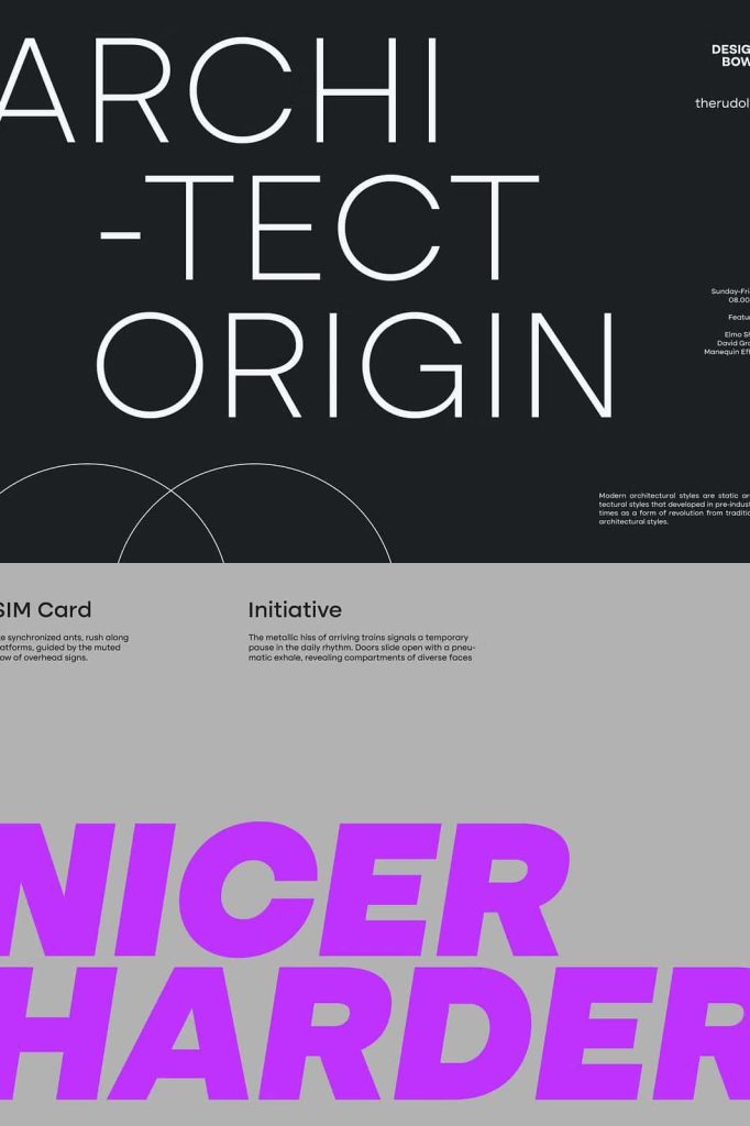
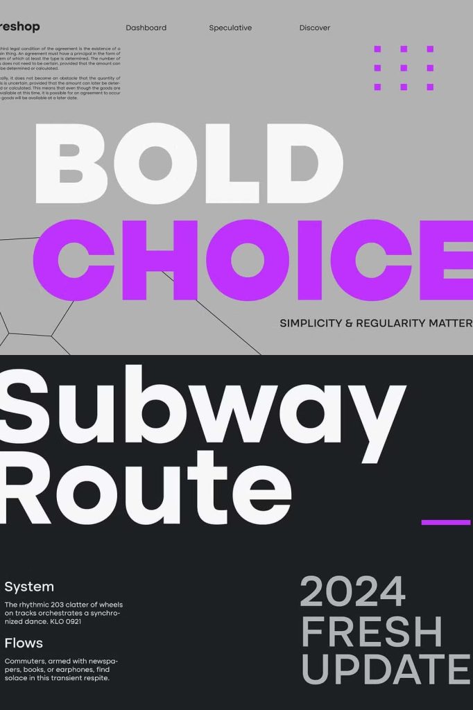
Despite its minimal approach, Altone delivers a confident and assertive presence. The balanced proportions and solid structure give it a bold character that stands out without appearing aggressive. This makes it effective for headlines, branding, and key messaging elements.
Highly Versatile Application
Altone adapts easily to different design contexts. Its neutral yet distinctive appearance allows it to function well in both creative and corporate environments. Designers can use it for a variety of purposes without worrying about stylistic conflicts.
Wide Range of Use Cases
Altone supports a broad range of design applications. Its clarity and adaptability make it a reliable choice for professionals working across multiple disciplines. Common uses include:
- Corporate branding and identity systems
- Website and user interface design
- Editorial layouts and publications
- Advertising and marketing materials
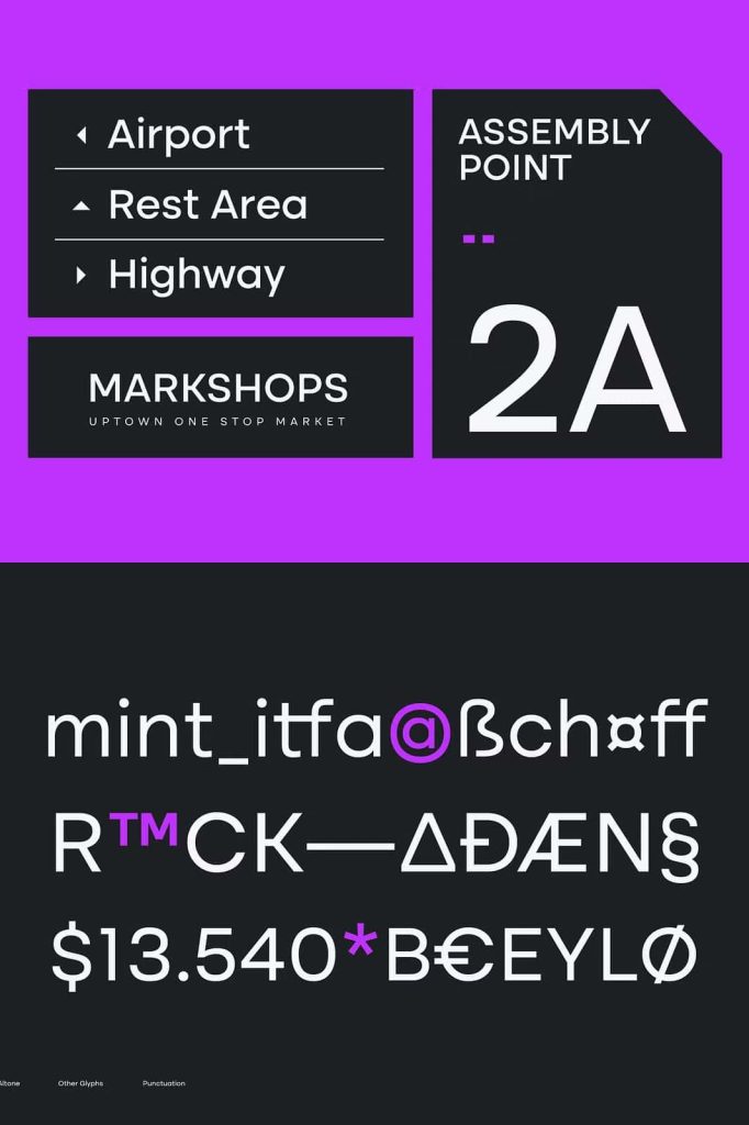
- Signage and wayfinding systems
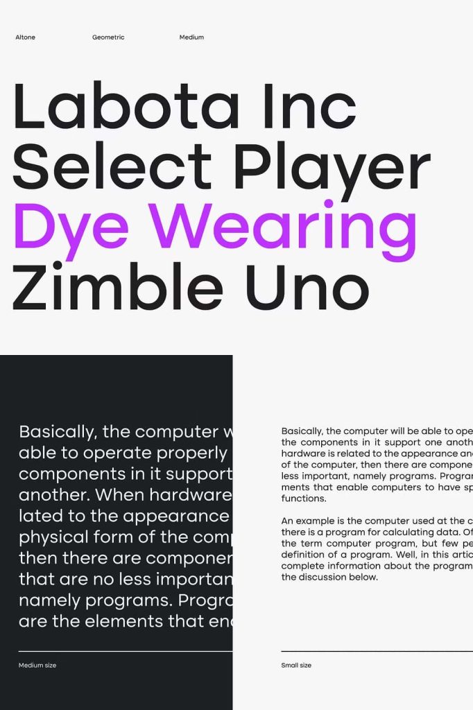
Because of its strong readability, Altone works effectively for both headings and body text. Designers can create cohesive typographic systems using a single typeface, simplifying the design process while maintaining consistency.
Enhancing Communication Through Typography
Altone actively improves communication by presenting information in a clear and structured way. Its geometric forms guide the reader’s eye smoothly across the text, reducing confusion and enhancing comprehension. This makes it especially valuable in digital environments where users need to process information quickly.
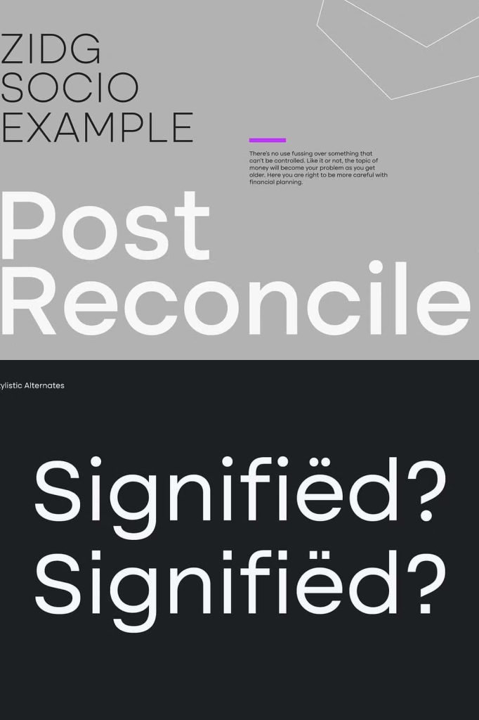
Designers can also use Altone to establish visual hierarchy. By adjusting size, weight, and spacing, they can highlight key elements and create a logical flow within the layout. This flexibility allows for both minimal and complex compositions.
Why Choose Altone for Your Design Projects
Altone offers a practical and effective solution for modern typography. It combines simplicity with strength, allowing designers to create work that feels both professional and approachable. Its conventional geometric structure ensures that it remains familiar to readers, while its refined execution adds a layer of sophistication.
By choosing Altone, designers gain a typeface that performs consistently across different media and applications. Its versatility reduces the need for multiple fonts, streamlining workflows and improving overall design cohesion.
Conclusion
Altone is more than just a geometric sans serif typeface—it is a tool for clear, confident communication. With its focus on regularity, simplicity, and bold character, it enables designers to create structured and visually engaging designs.
Whether used in branding, digital interfaces, or print materials, Altone delivers reliable performance and a strong visual identity. It stands as a modern solution for designers who value clarity, versatility, and timeless design principles.