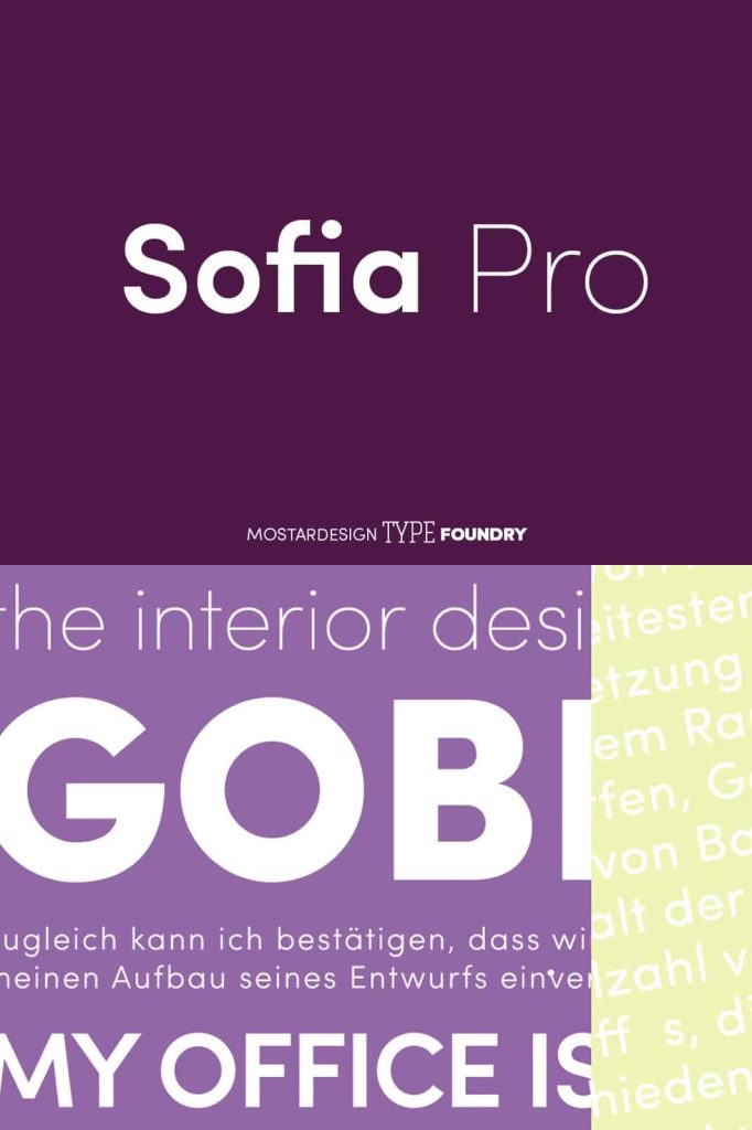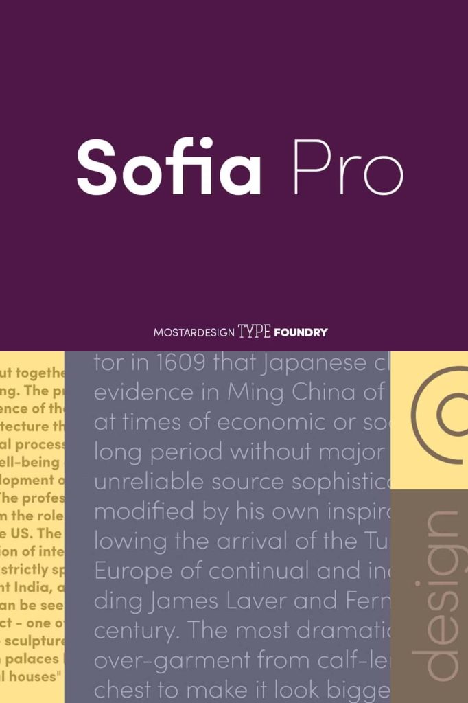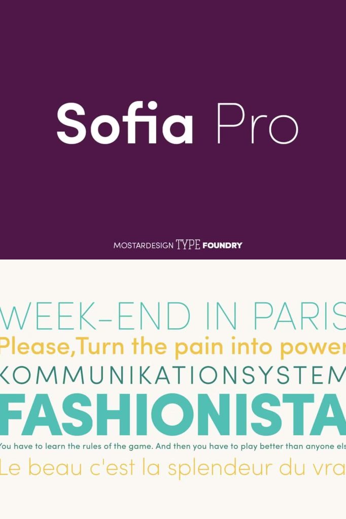

Sofia Pro: A Modern Geometric Sans Serif with Elegant Curves
Sofia Pro stands out as one of the most recognizable geometric sans serif font families in modern design. It combines precision with warmth, offering a clean yet friendly tone that adapts effortlessly to a wide range of creative projects. Designers value Sofia Pro not only for its visual appeal but also for its versatility and consistent performance across different media.
Originally created in 2009 and later redesigned in 2012, Sofia Pro evolved into a refined and highly functional typeface. This redesign strengthened its structure, improved readability, and enhanced its overall aesthetic. Over time, it has gained strong recognition within the design community and continues to receive praise from graphic professionals around the world.
A Typeface That Embraces Modernism
Sofia Pro actively embraces modern design principles. Its geometric foundation ensures clarity and balance, while its smooth curves introduce a sense of harmony and approachability. This combination allows designers to create layouts that feel both structured and inviting.
Unlike rigid geometric fonts that may appear cold or mechanical, Sofia Pro softens its appearance through carefully crafted curves. These design decisions make it ideal for brands and projects that want to communicate professionalism without losing a human touch.
Key Features of Sofia Pro
Rounded Curves for a Friendly Appearance
Sofia Pro features highly rounded curves that give it a soft and approachable personality. These curves reduce visual tension and create a welcoming tone, making the font suitable for both corporate and creative applications. The smooth shapes also enhance readability, especially in digital environments.
Open Terminals for Improved Clarity
The font incorporates open terminals, which allow each letterform to breathe. This openness improves legibility and ensures that text remains clear even at smaller sizes. Designers can rely on this feature when creating user interfaces, websites, and mobile applications where readability plays a critical role.
Balanced Geometry and Harmony
Sofia Pro maintains a strong geometric structure while preserving visual harmony. Each character aligns with a consistent system, resulting in a cohesive and polished look. This balance allows designers to build layouts that feel organized and aesthetically pleasing.
Versatility Across Design Applications
Sofia Pro adapts easily to a wide range of design contexts. Its flexibility makes it a preferred choice for professionals who need a reliable typeface for multiple purposes. Designers frequently use it in:
- Branding and corporate identity design
- Website and mobile interface design
- Editorial layouts and publications
- Advertising and marketing materials
- Packaging and product design
Because of its balanced design, Sofia Pro performs well in both headlines and body text. Designers can create complete typographic systems using this single font family, ensuring consistency throughout their projects.
Why Designers Choose Sofia Pro
Sofia Pro continues to gain popularity because it delivers both style and functionality. Its elegant curves and modern structure allow designers to communicate messages clearly while maintaining a strong visual identity. The font’s friendly tone also helps brands connect with audiences in a more approachable way.
Another key advantage lies in its adaptability. Whether used in minimalist layouts or more expressive compositions, Sofia Pro maintains its integrity and readability. This reliability makes it a valuable asset for designers working across different industries and platforms.
A Proven Typeface with Industry Recognition
Over the years, Sofia Pro has earned recognition and accolades from graphic design professionals. Its widespread use in high-quality projects reflects its effectiveness and appeal. Designers trust it because it consistently delivers polished and professional results.
The redesign in 2012 played a significant role in solidifying its reputation. By refining its structure and enhancing its usability, the updated version ensured that Sofia Pro could meet the demands of modern design workflows.
Conclusion
Sofia Pro is more than just a geometric sans serif font family—it is a carefully crafted design tool that balances elegance, clarity, and versatility. With its rounded curves, open terminals, and harmonious structure, it provides designers with the flexibility to create engaging and professional visuals.
By choosing Sofia Pro, designers gain access to a typeface that adapts to modern needs while maintaining a timeless appeal. Its proven performance and widespread recognition make it an essential addition to any typographic toolkit.