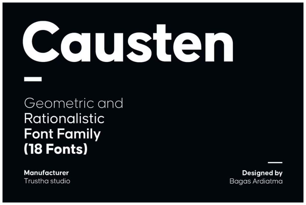

Causten: A Precise Geometric Sans Serif Font Family
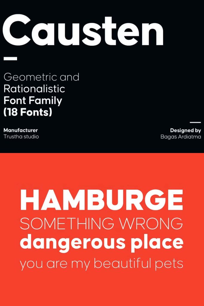
Causten presents a modern geometric sans serif font family built on precision, clarity, and rational design principles. Every character reflects careful construction, where each curve, angle, and proportion follows a logical system. This disciplined approach results in a typeface that feels clean, balanced, and highly professional. Designers can rely on Causten to create structured and visually consistent work across a wide range of applications.
Designed with Logic and Precision
Causten focuses on rational design, ensuring that each letterform maintains consistency and harmony. The design process emphasizes sharp visual judgment and mathematical balance, allowing every character to align seamlessly with the overall structure. This method produces a typeface that feels intentional and refined, without unnecessary decoration.
The geometric foundation ensures that shapes remain clear and easy to recognize. Straight lines, smooth curves, and precise spacing work together to create a cohesive system. This attention to detail allows Causten to perform exceptionally well in both small text and large display settings.
Clean and Minimal Aesthetic
Causten delivers a clean and minimal appearance that fits perfectly into modern design trends. Its simplicity enhances readability while maintaining a strong visual identity. Designers can use this font to create layouts that feel organized, professional, and easy to navigate.
The balanced proportions ensure that no element feels out of place. Each character contributes to a unified look, making Causten an excellent choice for projects that require clarity and consistency. Whether used in digital interfaces or printed materials, it maintains its crisp and polished appearance.
Key Characteristics of Causten
- Geometric sans serif structure with precise proportions
- Clean and minimal design for modern applications
- Balanced letterforms for improved readability
- Consistent spacing and alignment across characters
- Professional and versatile visual style
Perfect for Branding and Corporate Identity
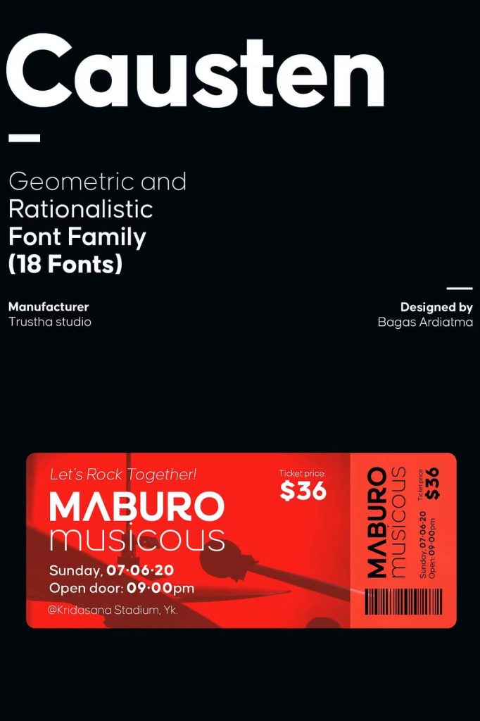
Causten works exceptionally well in branding projects that require a modern and professional look. Its clean geometry and balanced forms help establish trust and credibility, making it ideal for corporate identities, technology brands, and startups.
Designers can use Causten to create logos, brand guidelines, and marketing materials that communicate clarity and confidence. Its structured design ensures that every element aligns with a cohesive visual language, resulting in a strong and recognizable brand presence.
Branding Applications
- Corporate logos with a clean and modern aesthetic
- Brand identity systems with consistent typography
- Business presentations and reports
- Marketing materials with a professional tone
Optimized for User Interface and Digital Design
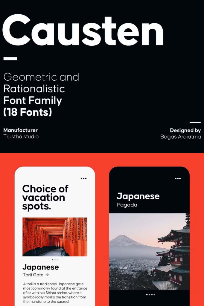
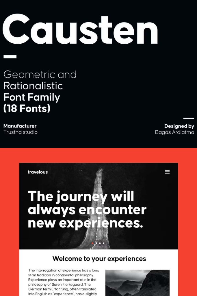
Causten excels in user interface and digital design projects. Its clarity and readability make it a reliable choice for websites, mobile apps, and software interfaces. The geometric structure ensures that text remains legible across different screen sizes and resolutions.
Designers can use Causten to create intuitive and visually appealing interfaces. Its clean lines help guide users through content, improving the overall user experience. This makes it a valuable tool for UI and UX designers who prioritize functionality and aesthetics.
Versatility Across Print and Editorial Projects
Causten adapts seamlessly to print and editorial design. Its balanced forms and consistent spacing make it suitable for magazines, brochures, and corporate publications. Designers can use it for headlines, subheadings, and body text, creating a cohesive layout that feels organized and professional.
The font’s minimal style allows it to pair well with other typefaces, giving you the flexibility to build complex typographic systems. Whether you aim for a modern editorial look or a clean corporate layout, Causten provides a strong foundation.
Why Choose Causten?
Causten stands out as a geometric sans serif font family that prioritizes precision, balance, and usability. Its rational design approach ensures that every character contributes to a cohesive and functional system. This makes it an excellent choice for designers who value clarity and structure.
If you want a typeface that delivers clean lines, perfect proportions, and modern appeal, Causten offers a reliable solution. It helps you create designs that feel professional, organized, and visually refined, making it a valuable addition to any design toolkit.