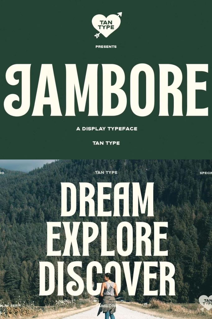
Jambore Display Serif Font: Bold, Retro, and Full of Character
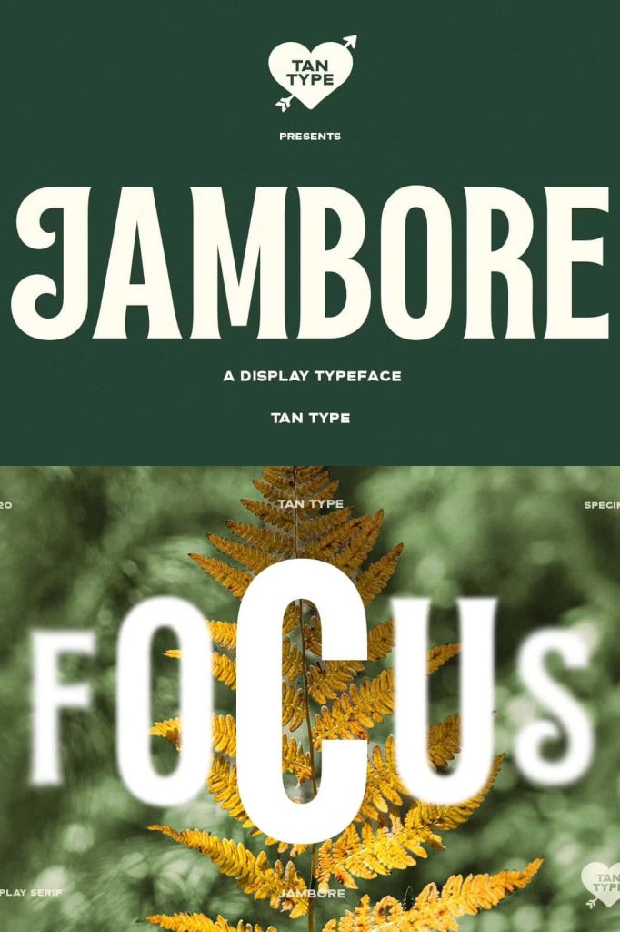
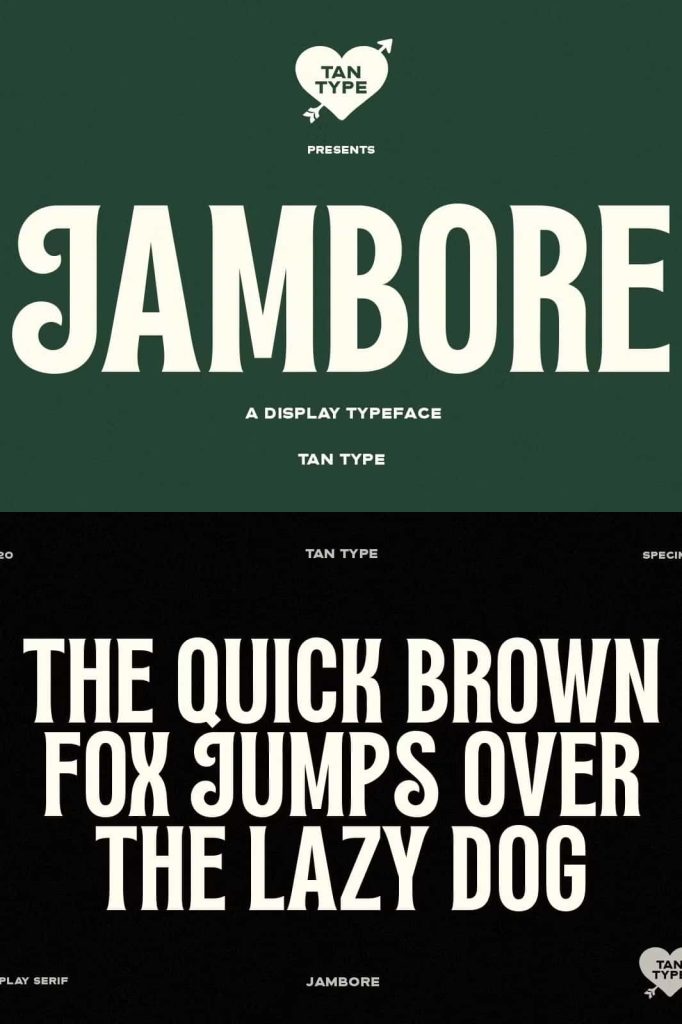
Jambore is a bold display serif font that blends classic structure with a distinctive retro flair. It delivers strong visual impact while maintaining a refined and balanced design. This typeface gives designers the ability to create typography that feels both familiar and refreshingly unique, making it an excellent choice for projects that demand attention and personality.
With its confident letterforms and carefully crafted details, Jambore stands out as a versatile display font. It draws inspiration from traditional serif styles while introducing subtle retro elements that enhance its overall appeal. The result is a font that feels timeless yet expressive, allowing you to create designs that leave a lasting impression.
Bold Serif Structure with Retro Influence
Jambore builds on the foundation of conventional serif typography. It uses strong vertical strokes and defined serifs to create a sense of stability and clarity. These characteristics ensure that your text remains highly readable, even when used in large display settings.
At the same time, the font introduces a touch of retro styling that adds personality. This influence appears in the proportions, curves, and subtle detailing of each character. The combination of classic and retro elements creates a unique visual identity that feels both nostalgic and modern.
Designed for Impactful Display Typography
Jambore excels in situations where typography needs to stand out. Its bold structure ensures that headlines and titles capture attention immediately. This makes it ideal for projects where visual hierarchy plays a key role.
The font maintains clarity even at larger sizes, allowing you to create strong focal points in your designs. Whether you use it for print or digital media, Jambore delivers consistent and powerful results.
Key Features of Jambore
- Bold display serif design for strong visual impact
- Retro-inspired details that add character
- Clear and readable letterforms
- Balanced combination of classic and modern style
Perfect for Headlines, Branding, and More
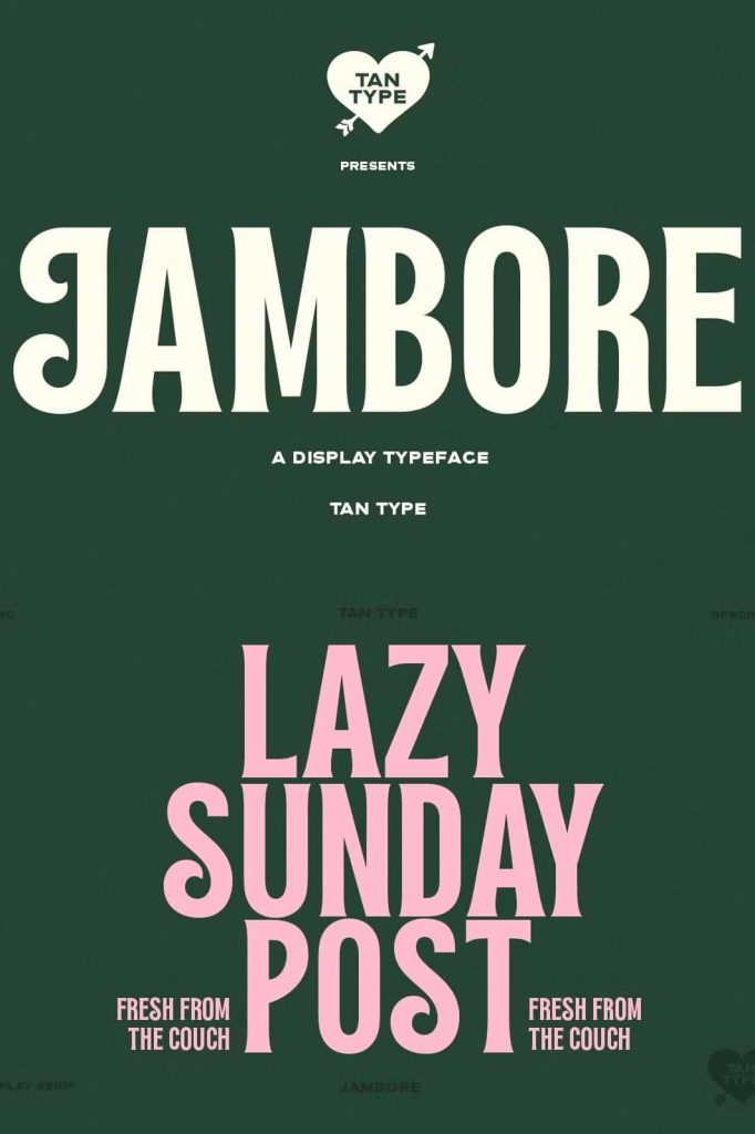
Jambore adapts easily to a wide range of creative applications. Its bold and stylish appearance makes it a reliable choice for designers who want to create eye-catching visuals. You can use it across different mediums while maintaining a cohesive and professional look.
The font works especially well in projects that require a strong identity. Its distinctive style helps you communicate confidence and creativity, making your designs more memorable.
Best Use Cases for Jambore
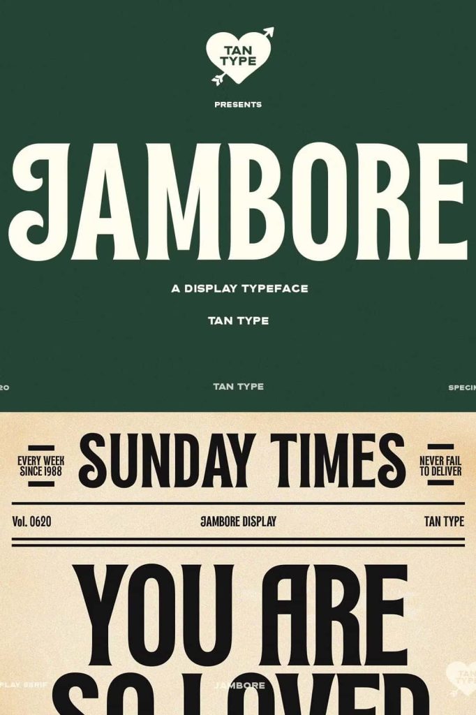
- Headlines and editorial titles
- Branding and logo design
- Book covers and publication layouts
- Advertising and promotional materials
- Posters and large-format designs
Create Strong Branding with Retro Character
Jambore helps you build a brand identity that feels bold and distinctive. Its retro influence adds personality, while its serif foundation communicates reliability and professionalism. This combination makes it suitable for brands that want to stand out while maintaining a sense of trust.
By using this font, you can design logos and visual elements that feel unique and engaging. Its strong presence ensures that your branding captures attention and leaves a lasting impression.
Pairing Jambore with Other Fonts
To create a balanced and effective design, pair Jambore with complementary typefaces. Clean sans serif fonts work well as supporting text because they provide contrast and improve readability. This pairing allows Jambore to remain the focal point while maintaining a clear structure.
Use Jambore for headlines, titles, or key elements, and combine it with a simpler font for body text. This approach ensures your design remains both visually appealing and easy to read.
Enhance Your Creative Workflow
Jambore simplifies the process of creating bold and stylish typography. Its strong design reduces the need for additional decorative elements, allowing you to achieve a polished look quickly. This efficiency helps you focus on composition and creativity.
The font encourages experimentation with layout and hierarchy. Try different sizes, alignments, and combinations to discover new possibilities. Its versatility makes it a valuable addition to any designer’s toolkit.
Key Advantages of Jambore
- Bold and attention-grabbing display font
- Retro flair that enhances visual appeal
- Highly versatile for various design projects
- Improves branding with a distinctive style
- Easy to pair with other typefaces
Conclusion
Jambore is more than just a display serif font; it is a powerful design tool that combines tradition with creativity. Its bold structure, retro influence, and versatile application make it an excellent choice for designers who want to create impactful and memorable visuals. By incorporating Jambore into your projects, you can produce typography that feels confident, stylish, and full of character.