Baroness Beatrice Blackletter Font: Contemporary Elegance Meets Gothic Mystique
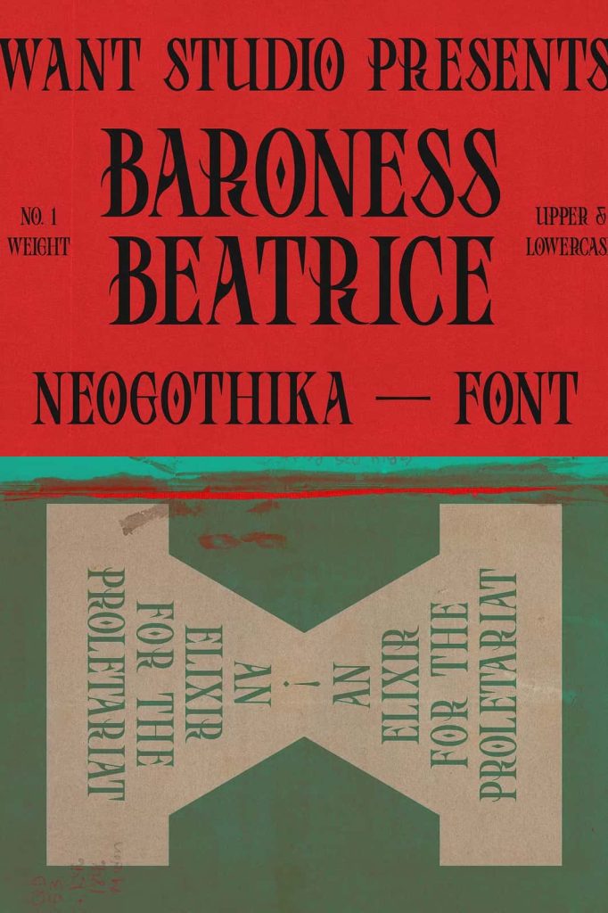
Baroness Beatrice is a striking blackletter font that blends modern elegance with the timeless allure of gothic design. It reimagines traditional blackletter forms by introducing refined curves, balanced proportions, and a contemporary aesthetic. This unique combination allows designers to create bold, expressive typography that feels both classic and current.
With its dramatic presence and artistic detail, Baroness Beatrice transforms ordinary text into a captivating visual statement. It offers a sophisticated approach to blackletter typography, making it suitable for a wide range of creative projects that demand both character and elegance.
A Modern Take on Classic Blackletter
Baroness Beatrice draws inspiration from historical blackletter scripts while updating them for modern design needs. It maintains the strong vertical strokes and intricate forms that define traditional gothic typography. At the same time, it softens rigid elements with smoother transitions and refined details.
This modern interpretation improves readability and usability. Designers can confidently use the font in both digital and print applications without sacrificing clarity. The result is a typeface that respects tradition while embracing innovation.
Elegant Details with a Dramatic Edge
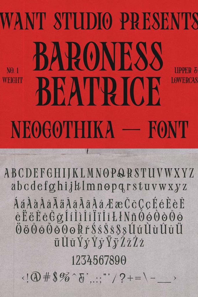
Every letter in Baroness Beatrice features carefully crafted details that enhance its visual appeal. Sharp angles, flowing curves, and decorative elements work together to create a sense of depth and movement. These features give the font its distinctive personality and make it stand out in any composition.
The font’s dramatic style adds intensity and emotion to your designs. It captures attention instantly and communicates a sense of sophistication and mystery. This makes it ideal for projects that aim to leave a strong and lasting impression.
Key Features of Baroness Beatrice
- Elegant blackletter design with modern refinement
- Balanced letterforms for improved readability
- Decorative details that add depth and character
- Versatile for both classic and contemporary projects
- Free updates to enhance functionality and features
Perfect for Bold and Artistic Design Projects
Baroness Beatrice excels in projects that require a dramatic and artistic touch. Its unique blend of elegance and gothic style makes it suitable for a variety of creative applications. Whether you design for branding, editorial layouts, or digital content, this font helps you create visually compelling results.
The font adapts well to different styles and themes. It can enhance dark, moody compositions or add contrast to lighter, more minimal designs. This flexibility allows you to explore a wide range of creative directions.
Best Use Cases for Baroness Beatrice
- Luxury branding and logo design
- Editorial headlines and magazine layouts
- Posters and artistic typography
- Album covers and creative media
- Social media graphics and visual campaigns
Create Distinctive Branding with Gothic Elegance
Baroness Beatrice helps you build a brand identity that feels unique and memorable. Its blackletter roots communicate tradition and authenticity, while its modern refinements add sophistication. This combination makes it ideal for brands that want to stand out with a bold and elegant visual style.
By using this font, you can design logos and branding elements that capture attention and convey a strong sense of identity. Its distinctive look ensures your brand remains recognizable and impactful.
Pairing Baroness Beatrice with Other Fonts
To achieve a balanced design, pair Baroness Beatrice with clean and minimal typefaces. Sans serif fonts work especially well as companions because they provide contrast and improve readability. This pairing allows the blackletter style to remain the focal point without overwhelming the overall composition.
Use Baroness Beatrice for headlines, titles, or decorative elements, and combine it with a simpler font for body text. This approach creates a harmonious layout that feels both stylish and functional.
Enhance Your Creative Workflow
Baroness Beatrice simplifies the process of creating bold and elegant typography. Its detailed design reduces the need for additional embellishments, allowing you to achieve a complete look with minimal effort. This efficiency helps you focus on creativity and composition.
The font encourages experimentation with layouts, spacing, and visual hierarchy. You can explore different combinations to create unique and engaging designs. Its versatility makes it a valuable tool for both experienced designers and beginners.
Key Advantages of Baroness Beatrice
- Combines gothic tradition with modern elegance
- Highly distinctive and visually striking
- Suitable for a wide range of creative projects
- Improves branding with a unique identity
- Includes free updates for continued improvement
Conclusion
Baroness Beatrice is more than just a blackletter font; it is a refined design tool that merges history with modern creativity. Its elegant details, dramatic presence, and versatile style make it an excellent choice for designers who want to create impactful and memorable visuals. By incorporating Baroness Beatrice into your projects, you can produce designs that feel sophisticated, bold, and truly distinctive.