
Benzin: A Versatile Geometric Sans Serif Font Family for Modern Design
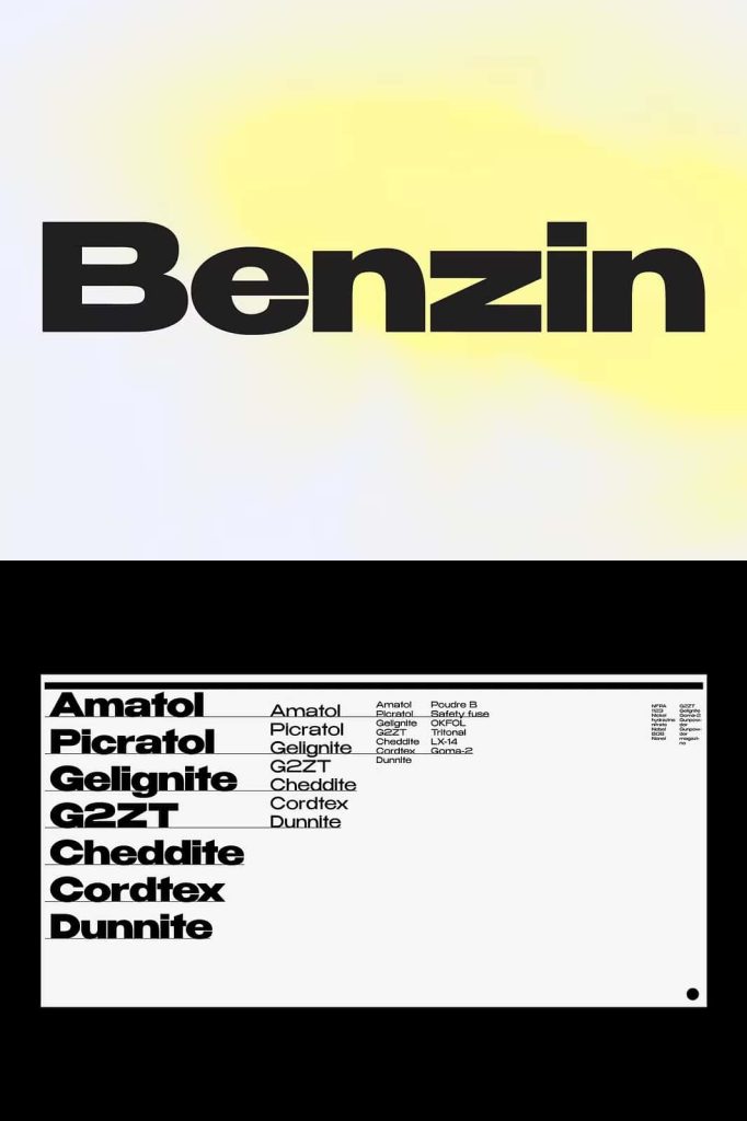
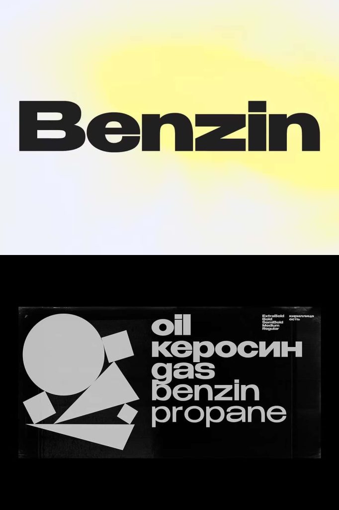
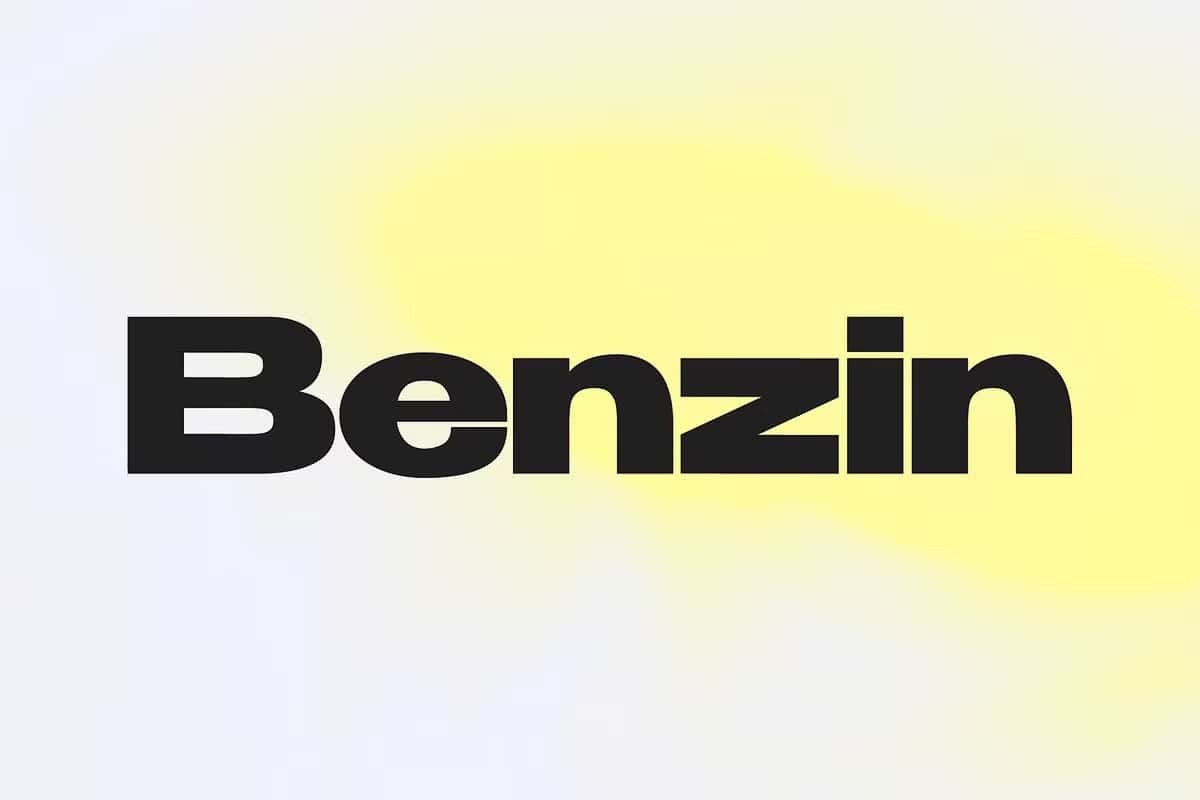
Benzin is a carefully designed geometric sans serif font family created to deliver clarity, balance, and efficiency across a wide range of design applications. With five distinct weights and intelligent kerning adjustments built into each style, Benzin removes complexity from typographic decision-making while maintaining a clean and modern aesthetic. This makes it an ideal choice for designers who need a universal typeface that performs equally well in headlines and body text.
The font is engineered to adapt seamlessly to different text sizes and design contexts, allowing designers to focus on creativity rather than technical adjustments.
Geometric Letterforms with Modern Precision
Benzin is built on a strong geometric foundation. Each letterform is constructed using simple, precise shapes that create a sense of order and consistency. The geometry gives the typeface a contemporary look that feels professional and neutral, making it suitable for a wide range of industries and creative styles.
The clean structure ensures readability while maintaining a modern visual tone that aligns with current design trends.
Balanced Shapes for Clear Communication
The proportions of Benzin are carefully balanced to ensure clarity at both large and small sizes. The open forms and consistent stroke widths support smooth reading, while the geometric construction keeps the typography visually cohesive. This balance allows Benzin to communicate information effectively without drawing unnecessary attention to the type itself.
The result is typography that feels confident, reliable, and easy to work with.
Five Weights for Flexible Typography
Benzin includes five weights, providing designers with the flexibility to build clear typographic hierarchies. From thin styles suited for paragraphs and supporting text to bold weights designed for impactful headlines, the font family supports a wide range of design needs.
This variety allows for consistent use across entire projects while maintaining visual contrast and emphasis where needed.
Designed for Headlines and Body Text
Unlike many display-focused fonts, Benzin is intentionally designed to work equally well in headings and paragraphs. The thin styles remain legible in smaller sizes, while the bold styles deliver strong visual presence in large formats. This makes Benzin a practical choice for layouts that require typographic consistency across multiple text levels.
Designers can confidently use one font family for both expressive and functional typography.
Customized Kerning for Effortless Use
One of Benzin’s most valuable features is its customized kerning across different weights. The kerning is intentionally adjusted to suit the visual needs of each style. In the thin weights, the spacing between letters is more open, improving readability in small text. In the bold weights, the spacing becomes more compact, enhancing visual impact in large headlines.
This built-in intelligence eliminates the need for manual kerning adjustments.
Smart Spacing That Saves Time
The thoughtful kerning design allows designers to switch between weights without worrying about spacing issues. This efficiency is especially beneficial in fast-paced design workflows where consistency and speed are essential. By handling kerning internally, Benzin ensures that text always looks polished and balanced.
This convenience makes the font especially appealing for both beginners and experienced designers.
Ideal for Print and Digital Design Projects
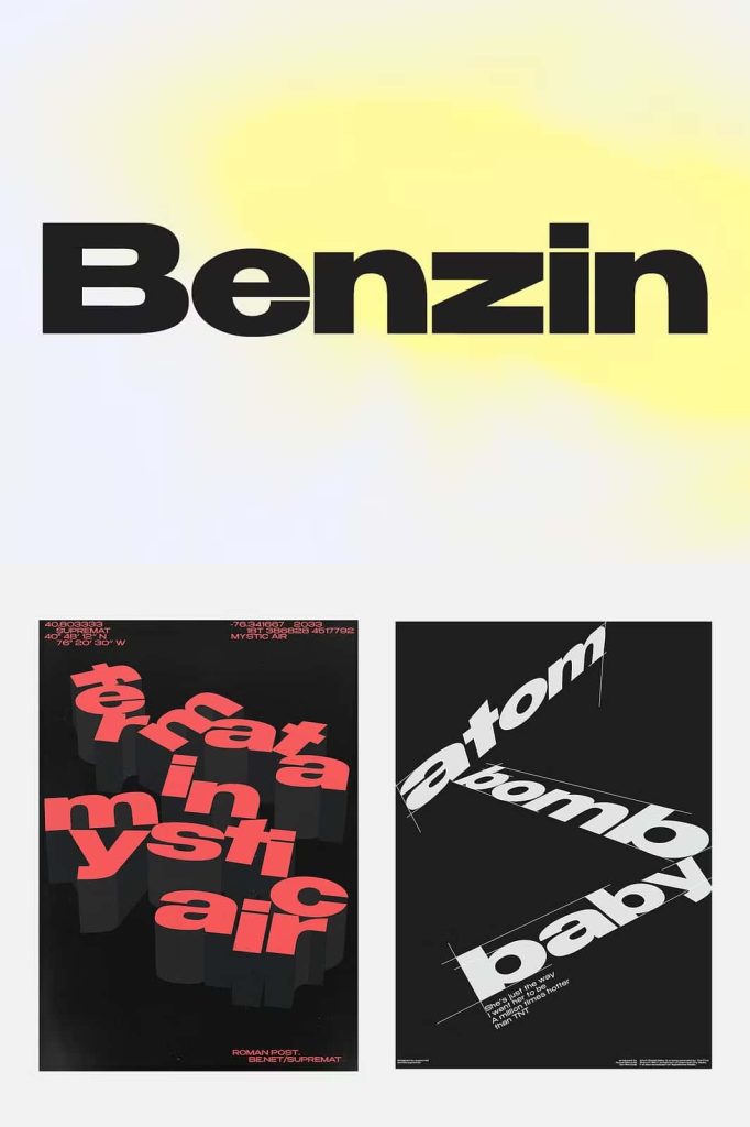
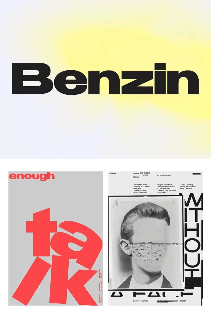
Benzin performs reliably across print and digital media. In posters and large-format designs, the bold weights create strong, attention-grabbing headlines. In editorial layouts, the thinner weights support comfortable reading in paragraphs and captions.
On digital platforms, the font remains clear and legible, making it suitable for websites, applications, and user interfaces.
A Universal Font for Consistent Visual Identity
Because of its versatility and neutral character, Benzin works well as a core typeface in branding systems. It supports consistent visual identity across different materials while adapting easily to various content types. This universality makes it a dependable choice for long-term projects and evolving design needs.
Designers can rely on Benzin to maintain clarity and cohesion across all touchpoints.
A Geometric Sans Serif Built for Practical Creativity
Benzin combines modern geometric design with practical functionality. Its five weights, intelligent kerning, and balanced letterforms make it a powerful tool for designers who value efficiency without sacrificing style. The font simplifies typographic decisions while delivering consistent, professional results.
For those seeking a geometric sans serif font family that performs seamlessly in both headlines and paragraphs, Benzin offers a smart, reliable, and modern typographic solution.