
Gilmer: A Fresh Geometric Sans-Serif Font with Modern Clarity
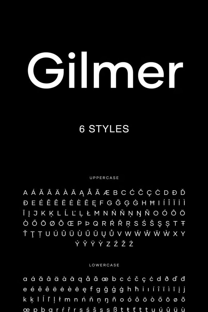
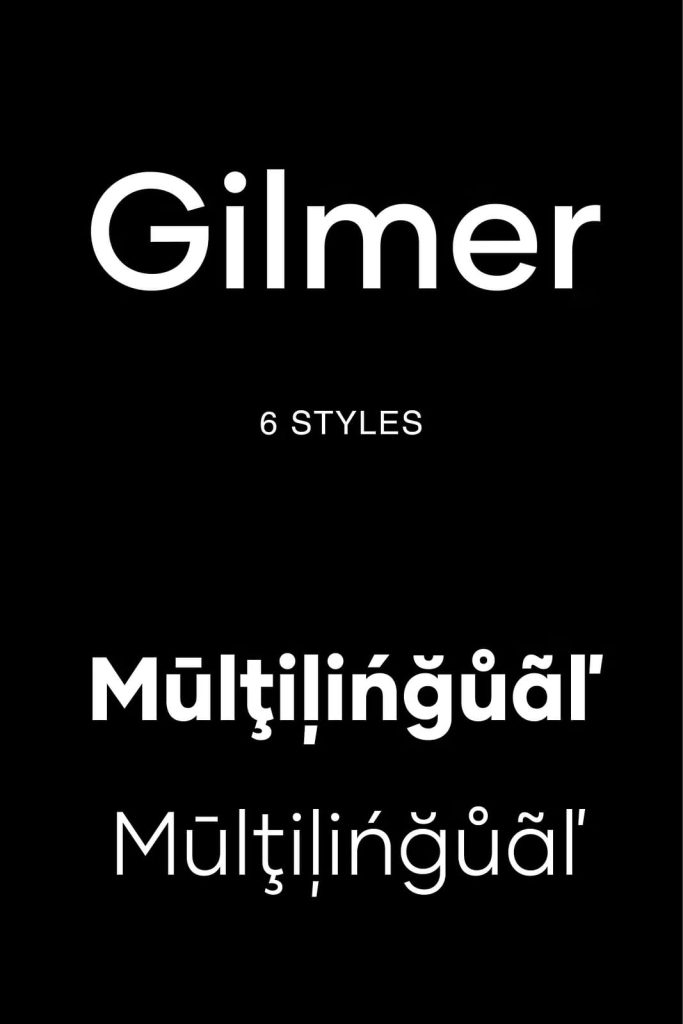
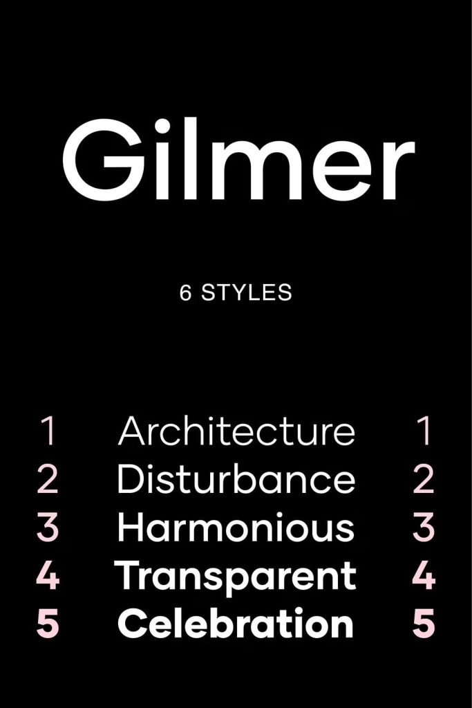
Gilmer is a contemporary geometric sans-serif font family designed to deliver clarity, balance, and modern precision. Inspired by iconic typefaces such as Futura and Avant Garde, Gilmer builds on the foundations of classic geometric typography while refining it for today’s design needs. The result is a font that feels familiar yet fresh, structured yet flexible, and perfectly suited for modern visual communication.
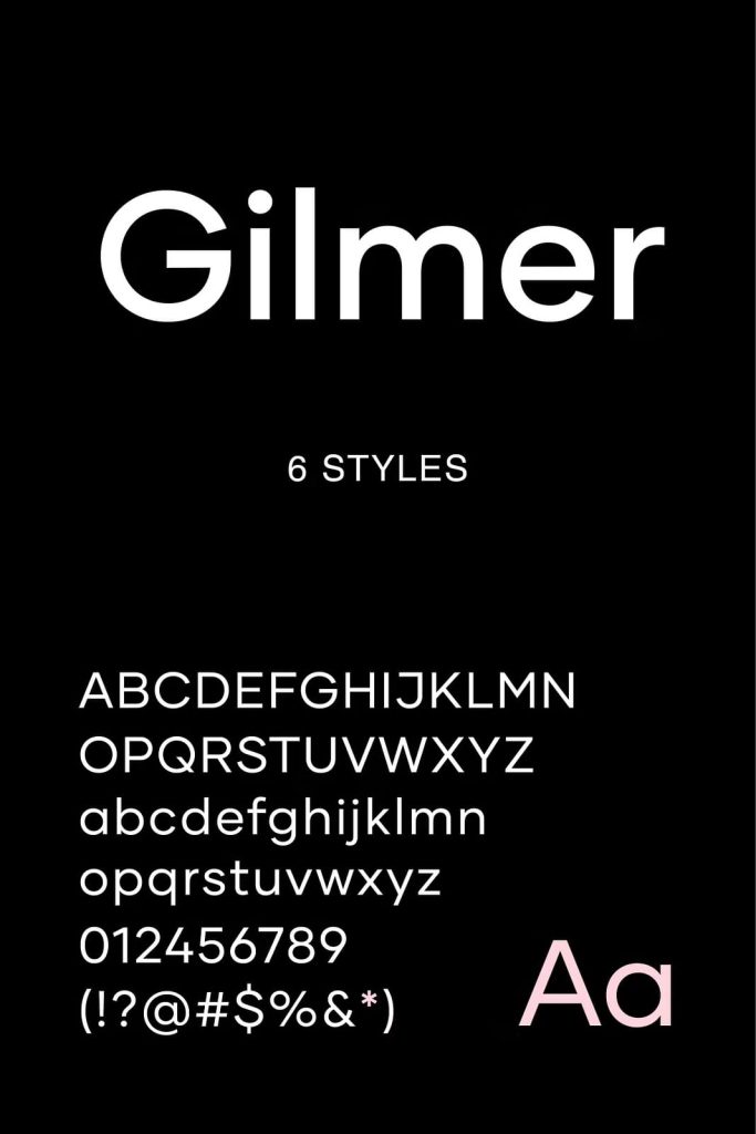
With its clean geometry, large x-height, and minimal stroke contrast, Gilmer offers excellent readability and a confident visual presence across a wide range of applications.
Inspired by Timeless Geometric Classics
Gilmer draws inspiration from some of the most influential typefaces of the twentieth century. Like Futura and Avant Garde, it embraces geometric construction and rational design principles. Circles, straight lines, and precise angles shape the letterforms, creating a sense of order and harmony.
While rooted in classic design, Gilmer updates these ideas with sharper edges and refined proportions, giving it a distinctly modern tone.
Neo-Grotesk Influence with a Contemporary Edge
The font reflects the neo-grotesk tradition through its restrained stroke contrast and functional approach to form. Gilmer avoids unnecessary ornamentation, focusing instead on efficiency and clarity. This influence ensures that the typeface performs reliably in both display and text settings.
The clean structure allows designers to communicate messages clearly without visual noise.
Large X-Height for Enhanced Readability
One of Gilmer’s defining features is its large x-height. This design choice improves legibility, especially at smaller sizes and on digital screens. Lowercase letters remain open and clear, making long passages of text comfortable to read.
The generous x-height also gives the font a friendly and approachable appearance while maintaining a professional tone.
Sharp Edges and Precise Geometry
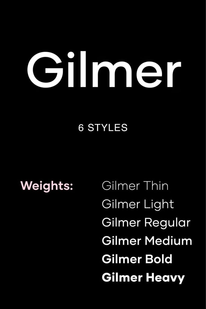
Gilmer’s sharp edges and well-defined shapes contribute to its crisp, modern aesthetic. Each letterform feels intentional and precise, reinforcing the geometric foundation of the typeface. The minimal stroke contrast keeps the font visually consistent and stable across different weights and sizes.
This precision makes Gilmer an excellent choice for clean, contemporary layouts.
Versatility Across Design Applications
Gilmer is designed to be highly versatile. Its balanced proportions and neutral character allow it to adapt easily to various design contexts. In magazines, the font provides a clean and editorial look that supports both headlines and body text.
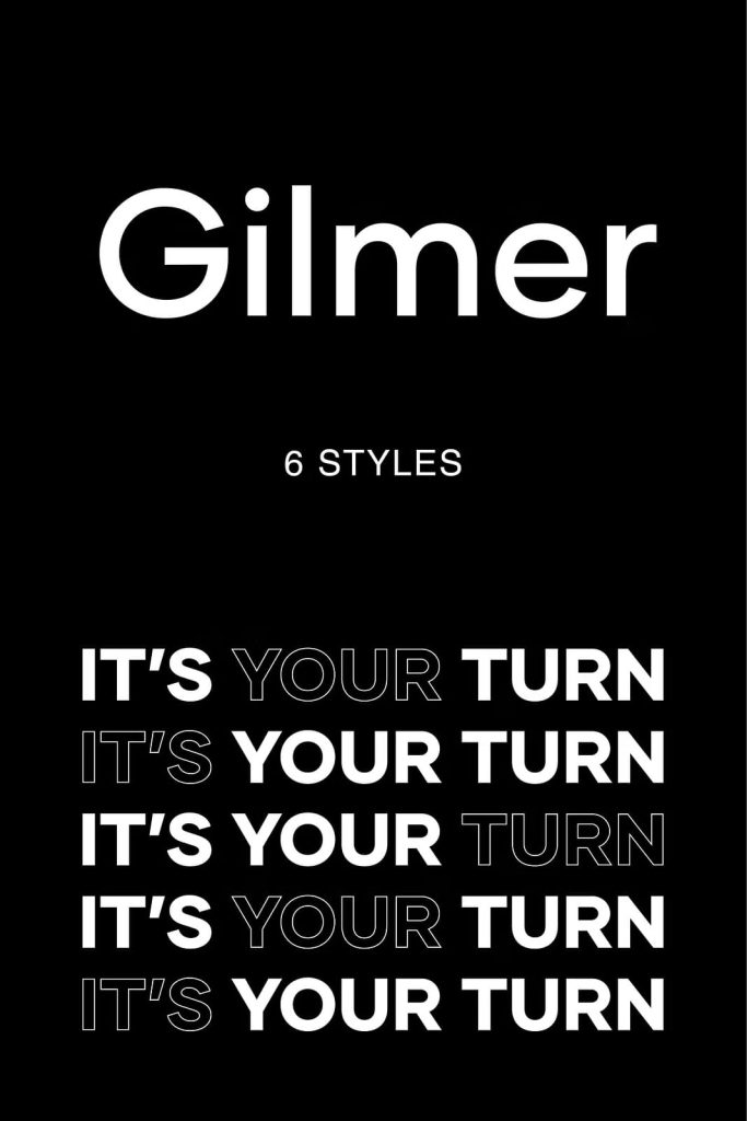
For posters and advertising, Gilmer delivers strong visual impact while maintaining clarity. Its geometric structure ensures that messages remain bold and direct.
Effective for Branding and Digital Design
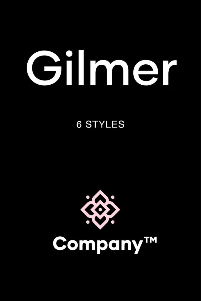
In branding projects, Gilmer helps establish a modern and reliable identity. Its timeless geometric style conveys professionalism and confidence, making it suitable for logos, brand systems, and corporate materials.
On websites and digital platforms, Gilmer performs exceptionally well. The large x-height and clear letterforms enhance readability on screens, while the clean design supports user-focused layouts.
A Sans-Serif Font Built for Modern Use
Gilmer combines the best qualities of classic geometric sans-serif typefaces with contemporary refinements. Its inspiration from Futura and Avant Garde gives it historical credibility, while its sharp edges, minimal contrast, and large x-height make it practical for modern design challenges.
Whether used in print or digital media, for branding or editorial work, Gilmer offers a dependable and stylish typographic solution. For designers seeking a fresh geometric sans-serif font with clarity, versatility, and modern appeal, Gilmer delivers consistent performance and timeless design.