Grack: An Ultrabold Squarist Typeface with Modern Power
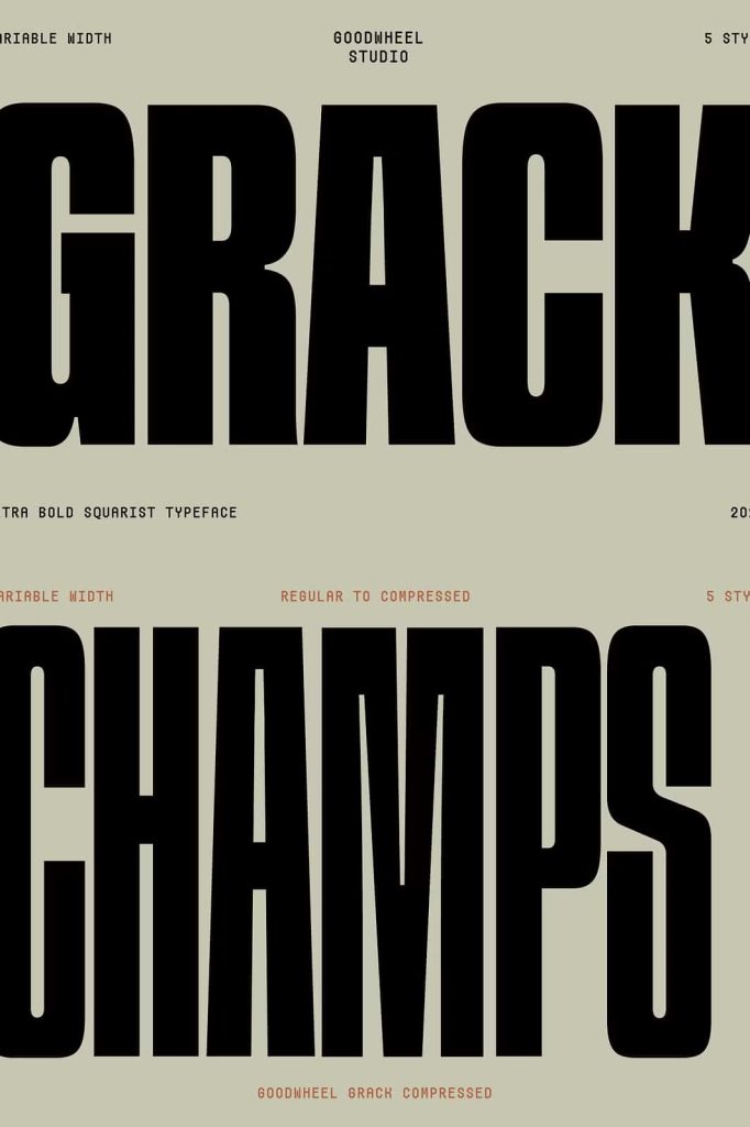
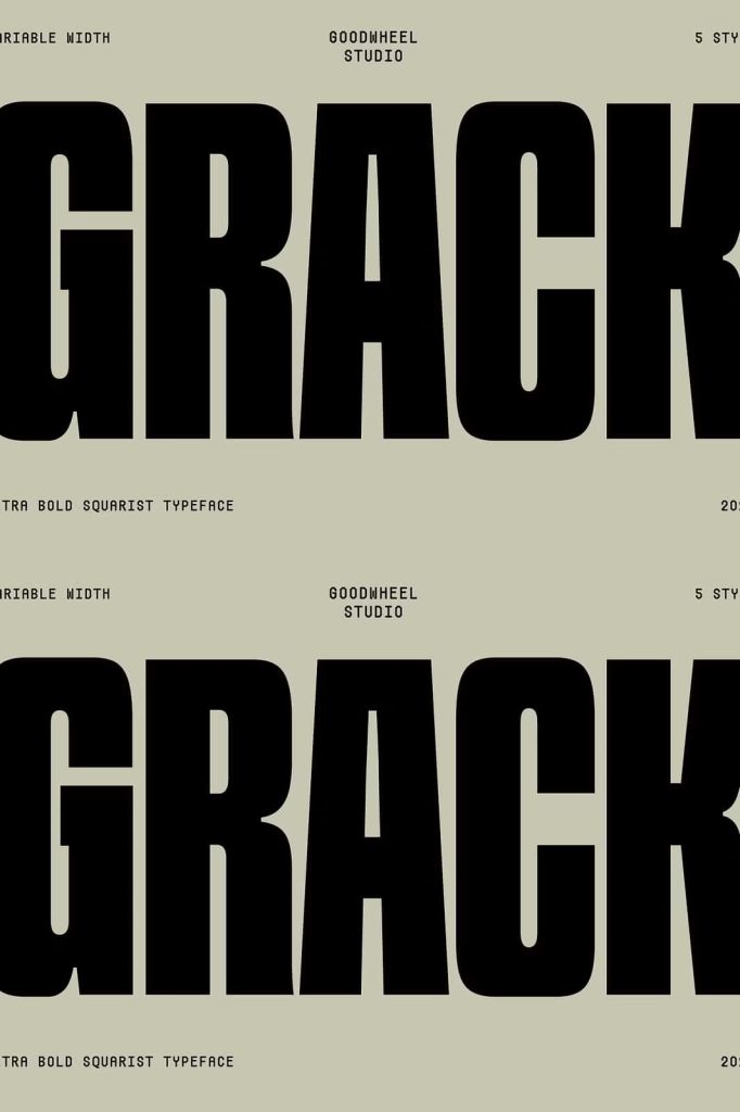
Grack is an ultrabold squarist typeface built to deliver maximum visual impact. Designed with very thick characters and rigid geometric shapes, this typeface commands attention from the first glance. Its strong structure and modern attitude make it a powerful choice for designers who want typography that feels confident, contemporary, and unmistakably bold.
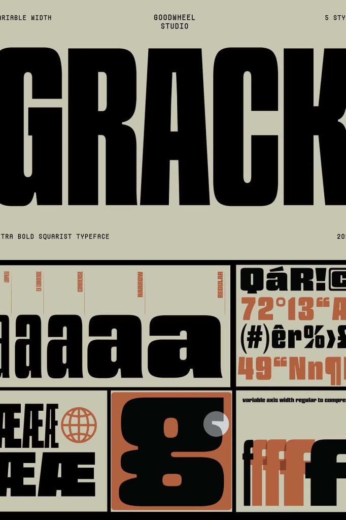
With its variable width capability, Grack allows designers to shift seamlessly from compressed forms to regular proportions. This flexibility adds a new level of creative control while maintaining the font’s distinctive geometric identity.
Bold Geometry That Defines a Modern Typeface
At the core of Grack lies a commitment to strong geometry. Every letterform is constructed with precision, featuring squared edges, solid strokes, and a disciplined structure. The squarist design language gives the typeface a sharp, architectural presence that feels both modern and intentional.
These rigid geometric shapes create a sense of stability and strength, making Grack ideal for designs that need to communicate authority, confidence, and clarity.
Thick Characters with Strong Visual Weight
Grack’s ultrabold weight ensures that text stands out in any context. The heavy strokes provide exceptional contrast against backgrounds, making words instantly visible and memorable. This strong visual weight makes the typeface particularly effective for headlines, titles, and display typography.
The thickness of each character reinforces the font’s modern appeal while delivering a commanding presence.
Variable Width for Creative Flexibility
One of Grack’s defining features is its variable width design. Designers can compress the letterforms for tight layouts or expand them to a more regular width for balanced compositions. This adaptability allows Grack to fit seamlessly into a wide range of design scenarios.
Whether you need compact typography for limited space or broader forms for bold statements, Grack responds with consistency and style.
From Compressed to Regular with Consistent Character
Even when adjusting width, Grack maintains its core identity. The geometric structure and ultrabold weight remain intact, ensuring visual consistency across different uses. This makes the typeface especially useful for dynamic branding systems and flexible layouts.
The ability to control width without sacrificing character gives designers greater freedom and precision.
Perfect for Impact-Driven Design Projects
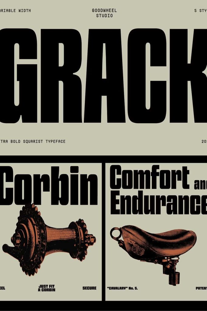
Grack excels in projects that demand attention and clarity. Its bold and modern design makes it an excellent choice for branding, logos, posters, and advertising materials. The strong geometry ensures that messages feel direct and confident.
In digital environments, Grack performs equally well. Its thick strokes and clean shapes render clearly on screens, making it suitable for web headers, app interfaces, and digital campaigns.
Strong Presence in Print and Digital Media
The rigid construction of Grack translates effectively across print and digital formats. In print, the ultrabold strokes create striking visual impact, while on screens the font remains sharp and readable. This versatility allows designers to maintain consistency across multiple platforms.
Grack adapts to modern workflows while retaining its distinctive visual strength.
A Typeface Built for Modern Expression
Grack is more than a bold font; it is a statement typeface designed for modern expression. Its squarist geometry, ultrabold weight, and variable width functionality combine to create a tool that empowers designers to communicate with confidence and authority.
For projects that require thick characters, rigid geometric shapes, and a bold modern presence, Grack delivers a typeface that stands firm, performs reliably, and leaves a lasting impression.