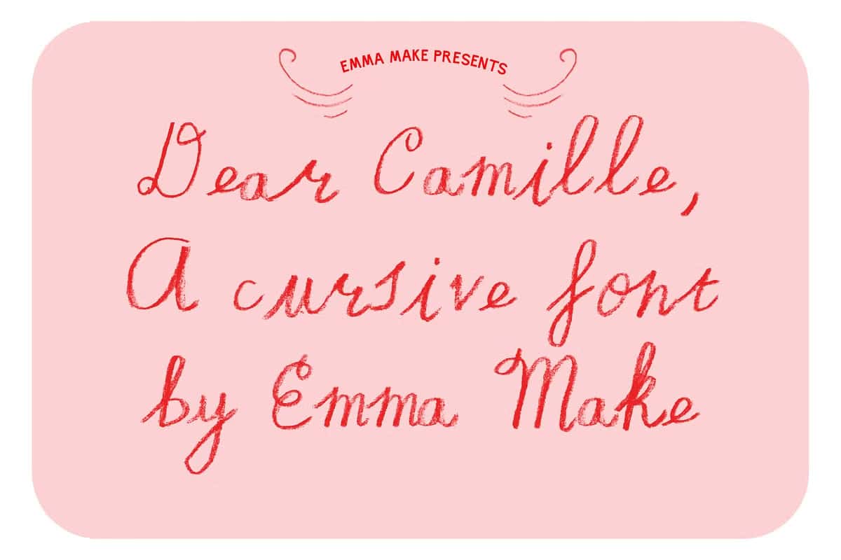

Dear Camille: A Truly Cursive Handwritten Font with Tender Personality
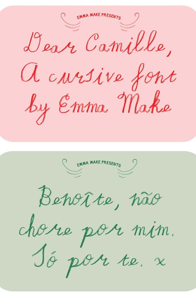
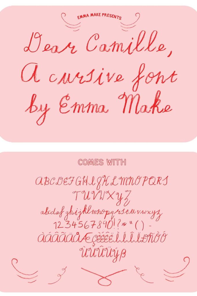
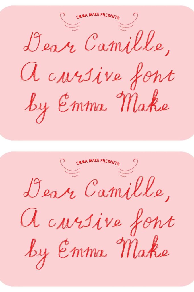
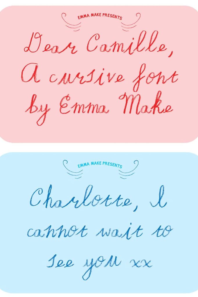
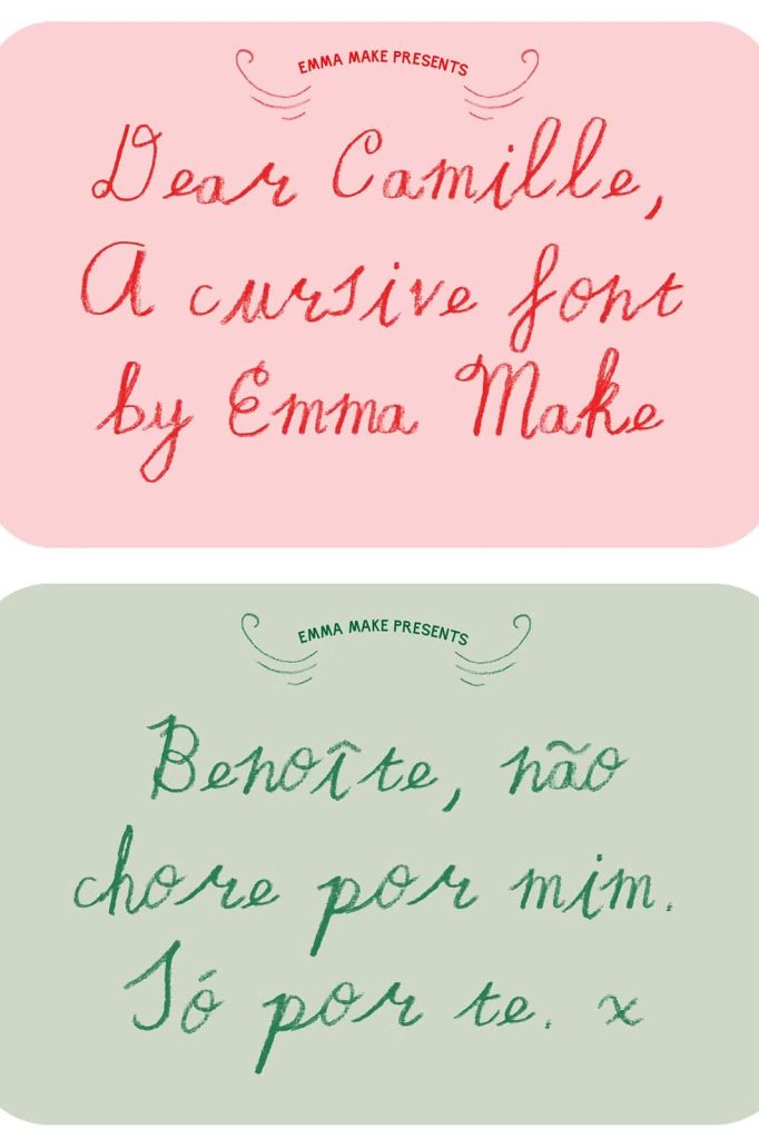
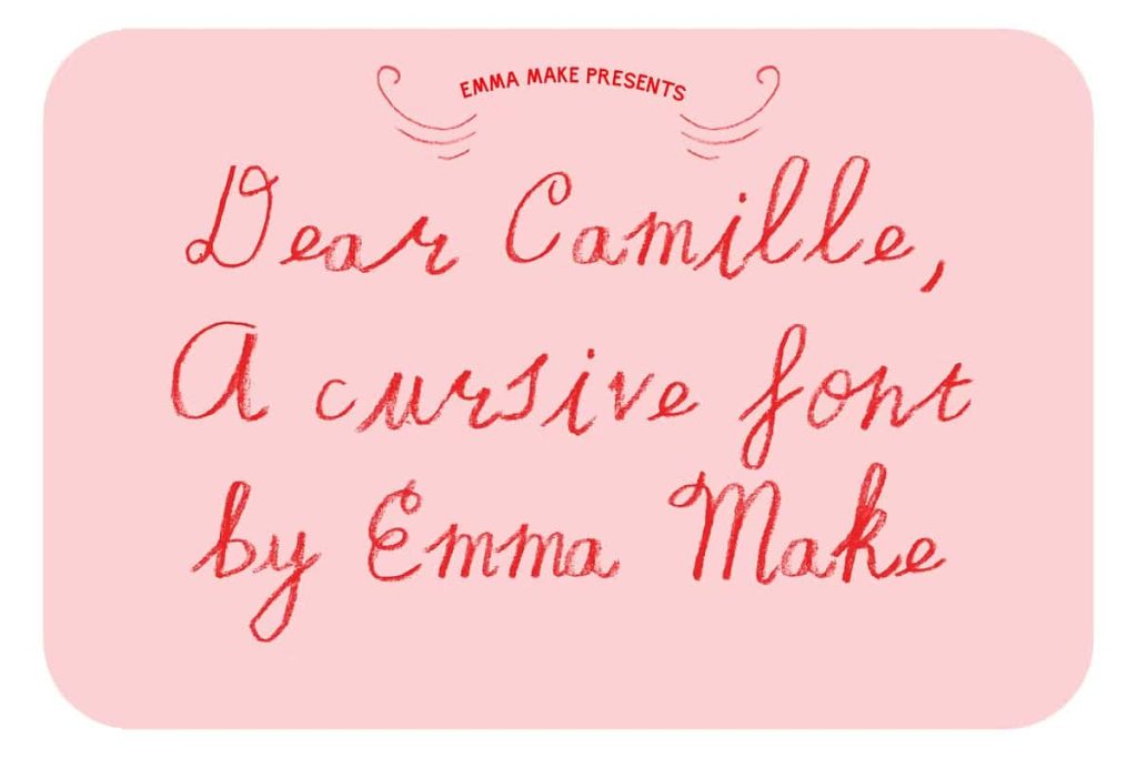
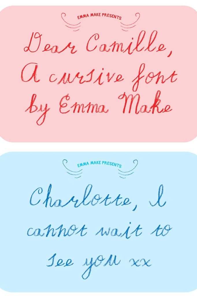
Dear Camille is a truly cursive handwritten font designed to capture the softness, emotion, and intimacy of a handwritten love letter. Inspired by pencil crayon textures and natural writing flow, this typeface feels personal, gentle, and deeply expressive. Every stroke carries warmth, making the font feel less like a digital tool and more like a handwritten message shared with care.
This font is crafted for designers who want to communicate emotion through typography. Dear Camille delivers character without exaggeration, allowing words to feel sincere and heartfelt. Its natural cursive motion brings authenticity to designs that rely on human connection rather than bold visual impact.
A True Cursive Style with Natural Flow
Dear Camille stands out because it is genuinely cursive. Each letter connects naturally to the next, following the rhythm of real handwriting. The flowing strokes create smooth word shapes that feel effortless and organic, avoiding the disconnected or artificial look often found in imitation cursive fonts.
The consistent flow between characters enhances readability while preserving a handwritten charm. This balance allows the font to work beautifully in longer text passages such as letters and notes, where comfort and clarity are just as important as style.
Handwritten Motion That Feels Personal
The cursive motion in Dear Camille reflects how people naturally write when expressing emotion. Letters lean and curve gently, creating a visual rhythm that guides the reader through the text. This motion adds a sense of intimacy, as if the words were written specifically for the reader.
This quality makes the font especially effective in personal communication and storytelling-focused design.
Pencil Crayon Texture with Soft Character
Dear Camille draws inspiration from pencil crayon writing, giving the font a subtle texture that feels soft and familiar. The strokes show gentle variation, mimicking the pressure and movement of a real hand on paper. This texture adds depth without overpowering the letterforms.
The pencil crayon influence enhances the tender nature of the font. It suggests care, thoughtfulness, and sincerity, making the typography feel emotionally rich and approachable.
Delicate Details That Enhance Warmth
Small imperfections and natural inconsistencies give Dear Camille its unique charm. These details prevent the font from feeling overly polished or mechanical. Instead, the lettering feels honest and human.
This softness helps designs communicate warmth and emotion, which is especially important in personal and romantic contexts.
Perfect for Letters, Stationery, and Invitations
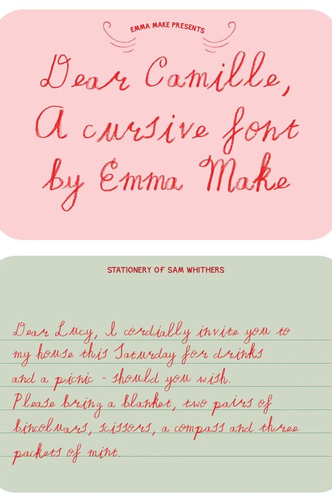
Dear Camille is perfectly suited for letters, stationery, and invitation designs. Its cursive flow and gentle texture create an intimate tone that enhances handwritten-style communication. Whether used for personal notes or formal invitations, the font adds elegance without feeling stiff.
Wedding invitations, greeting cards, and thank-you notes benefit greatly from Dear Camille’s tender appearance. The font supports meaningful messages and special moments with grace and sincerity.
Ideal for Websites with a Human Touch
Beyond print, Dear Camille performs beautifully on websites that aim to feel personal and welcoming. It works well for headings, quotes, and highlighted text where emotional connection matters. The font brings warmth to digital spaces, helping brands and creators communicate authenticity.
Used thoughtfully, Dear Camille can elevate storytelling, lifestyle blogs, and creative portfolios by adding a handwritten voice that feels genuine.
A Handwritten Font That Communicates Emotion
Dear Camille is more than a cursive font. It is a tool for expressing tenderness, care, and personality. Its handwritten pencil crayon style allows designers to convey emotion without relying on excessive decoration or visual noise.
The font supports a wide range of creative projects that prioritize sincerity and human connection. From personal letters to curated stationery collections, Dear Camille brings softness and authenticity to every word.
A Typeface Inspired by Love Letters and Thoughtful Words
Dear Camille captures the feeling of writing something meaningful by hand. Its flowing cursive structure, gentle texture, and expressive character combine to create a font that feels intimate and timeless. It reminds viewers of handwritten notes, quiet moments, and thoughtful communication.
For designers seeking a cursive handwritten font that delivers warmth, emotion, and natural beauty, Dear Camille offers a refined and heartfelt typographic solution.