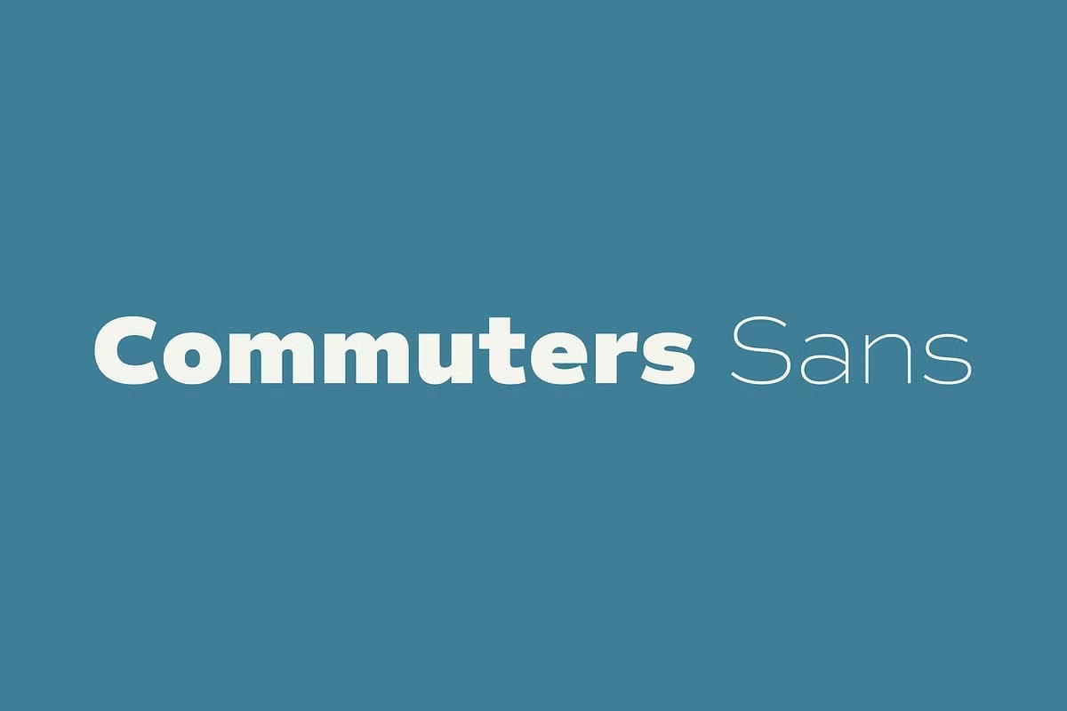

Commuters Sans: A Modern Sans-Serif Typeface Designed for Everyday Use
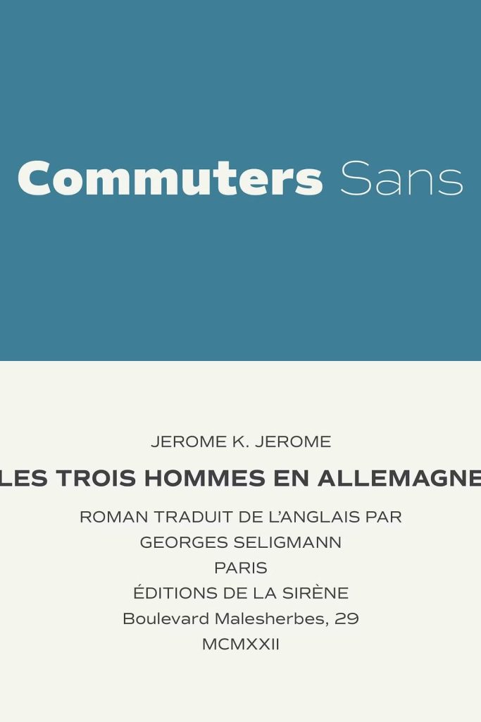
Commuters Sans is a thoughtfully designed sans-serif typeface created for daily communication. It balances classic typographic principles with a modern sensibility, resulting in a font that feels familiar, reliable, and contemporary at the same time. Built for frequent use across a wide range of applications, Commuters Sans delivers clarity, consistency, and visual comfort in every setting.
This typeface focuses on functionality without losing character. Its clean construction, simple geometry, and warm presence make it an excellent choice for designers who need a dependable font that performs well in both text-heavy layouts and bold typographic statements.
Classic Foundations with a Modern Perspective
Commuters Sans draws inspiration from classic sans-serif traditions while refining them for modern design needs. The letterforms feel grounded and familiar, yet they avoid stiffness or rigidity. Subtle contemporary adjustments give the typeface a fresh look that fits naturally into today’s visual landscape.
This balance allows Commuters Sans to adapt effortlessly to different contexts. It feels equally at home in editorial layouts, digital interfaces, corporate branding, and creative projects. The typeface communicates professionalism without appearing cold or impersonal.
Simple Geometry That Supports Readability
At the heart of Commuters Sans lies simple, intentional geometry. Each letter is built from clear shapes that enhance recognition and flow. The geometric structure provides consistency, while subtle variations prevent the font from feeling mechanical.
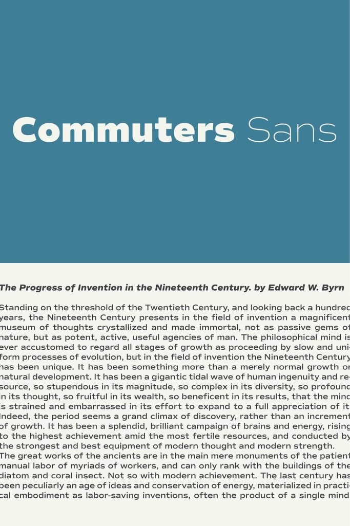
This approach improves legibility, especially in longer passages of text. Readers can move through content comfortably, making Commuters Sans a strong choice for articles, user interfaces, and informational materials.
Slightly Wide Proportions for Visual Comfort
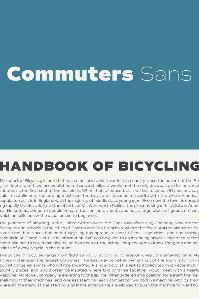
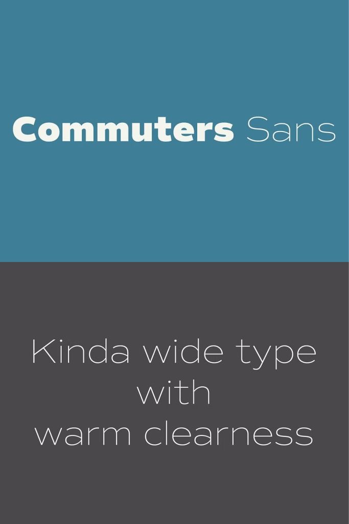
One of the defining features of Commuters Sans is its slightly wide proportions. This design choice opens up the letterforms, creating a sense of space and ease. The added width improves readability at small sizes and helps text breathe in dense layouts.
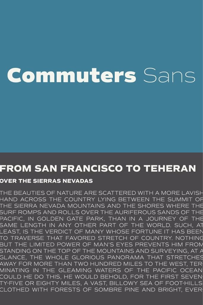
These proportions also contribute to the font’s confident presence in headlines and titles. Text feels stable and balanced, allowing messages to stand out without appearing forced or overly bold.
Warm Clarity for Everyday Communication
Commuters Sans delivers warm clarity through thoughtful spacing, smooth curves, and clean stroke endings. The typeface avoids harsh angles and extreme contrasts, which helps maintain a friendly and approachable tone.
This warmth makes it especially effective for daily-use applications such as websites, mobile apps, presentations, and printed materials. The font supports communication by staying out of the way while still looking polished and intentional.
Minimalist Letterforms with Strong Structure
The minimalist design of Commuters Sans focuses on what matters most: clarity and structure. Unnecessary details are stripped away, leaving letterforms that feel clean and purposeful. Despite this simplicity, the typeface retains enough character to remain visually engaging.
The strong structure ensures consistent performance across different sizes and mediums. Whether used in small body text or large display settings, the font maintains its integrity and readability.
Equally Effective for Body Text and Titles
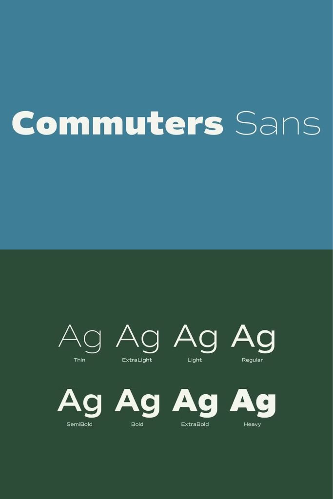
Versatility defines Commuters Sans. Its balanced design allows it to function beautifully as body text, where comfort and legibility are essential. At the same time, its eye-catching structure gives it enough presence to shine in titles and headings.
Designers can build entire typographic systems using Commuters Sans alone, simplifying workflows while maintaining visual cohesion. This makes it an efficient and reliable choice for long-term projects.
A Reliable Typeface for Modern Design Systems
Commuters Sans is designed to support modern design systems that demand consistency and flexibility. It integrates seamlessly into branding guidelines, editorial layouts, and digital platforms. The font’s neutrality allows other design elements to stand out while ensuring text remains clear and readable.
This reliability makes Commuters Sans an excellent foundation for projects that require long-term use and frequent updates.
A Sans-Serif Typeface Built for Everyday Life
Commuters Sans proves that a daily-use typeface can be both practical and refined. Its classic roots, modern geometry, warm clarity, and versatile proportions combine to create a font that works effortlessly across a wide range of applications.
For designers seeking a modern sans-serif typeface that delivers comfort, consistency, and clarity every day, Commuters Sans offers a dependable and elegant solution.