Vintage Varsity Typography: A Classic Style That Never Loses Its Edge
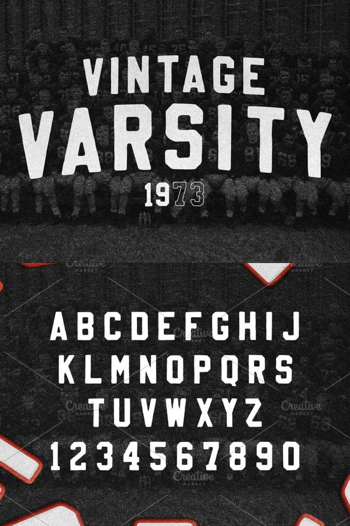
Vintage Varsity is inspired by the unmistakable iron-on lettering found on classic American letterman jackets. You know the one—the jacket your “cool” uncle wore in high school and, if we’re being honest, probably still wears with pride today. This style carries decades of attitude, nostalgia, and confidence, making it a powerful choice for designers who want their work to feel timeless, bold, and instantly recognizable.
The Roots of Vintage Varsity Design
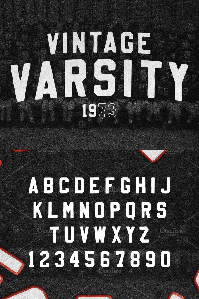
The Vintage Varsity look comes straight from school hallways, locker rooms, and Friday night games. Thick block letters, strong outlines, and confident shapes define this aesthetic. These designs were never meant to be subtle. They were created to stand out from a distance, announce identity, and project pride. When you bring this typography into modern design work, you tap into that same energy.
Letterman jackets relied on iron-on letters made from felt or chenille. Those materials added depth, texture, and warmth. Vintage Varsity typography recreates that feeling digitally, using bold fills, sharp strokes, and carefully balanced spacing. The result is lettering that feels solid, physical, and built to last.
Why Fuzzy Felt Textures Make the Perfect Match
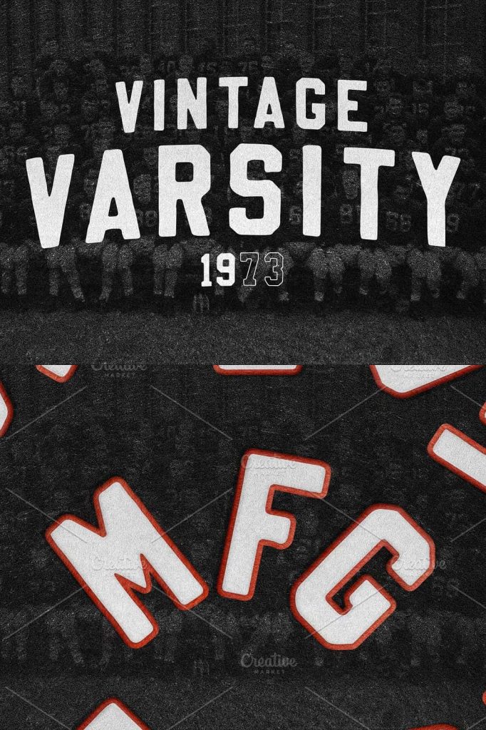
Pairing Vintage Varsity lettering with fuzzy felt textures creates a powerful visual combination. The clean, strong letter shapes give structure, while the soft textures add character and authenticity. This contrast keeps designs from feeling flat or generic.
Felt textures work especially well when used inside the letter fill. Once the fill is in place, adding a stroke around each letter helps define the shape and increase readability. This technique mirrors the real construction of varsity patches and reinforces the retro feel.
Building Depth with Fill and Stroke
One of the most effective techniques in Vintage Varsity design is striking the fill and applying a confident stroke. The fill carries the texture and personality, while the stroke adds clarity and strength. Together, they create lettering that commands attention without relying on excessive decoration.
This approach works beautifully for t-shirt designs, hoodies, posters, and branding projects. The letters feel bold and intentional, making slogans and phrases easy to read and hard to ignore.
Perfect for Retro-Slogan T-Shirts
Vintage Varsity typography shines when used for retro-slogan t-shirts. Short phrases, team-style names, and motivational slogans all benefit from this style. The lettering gives even simple words a sense of history and confidence.
This is the kind of design that feels like it belongs on a worn-in favorite shirt. It connects emotionally with audiences because it reminds them of sports culture, school pride, and a simpler era of design. That emotional pull is what makes Vintage Varsity such a strong choice for apparel.
Modern Design with Old-School Confidence
While the inspiration comes from the past, Vintage Varsity fits perfectly into modern design trends. Clean layouts, limited color palettes, and intentional texture use keep the look fresh rather than outdated. Designers can push the style further by experimenting with color contrasts, layered strokes, and distressed effects.
The key is confidence. Vintage Varsity design does not whisper. It speaks clearly, boldly, and without apology. That is why it works so well across different platforms and products.
A Style That Feels Like a Classic Infomercial Hit
At this point, Vintage Varsity almost sells itself. Bold letters, nostalgic textures, and proven design techniques combine into a style that feels instantly familiar yet endlessly usable. It may sound like a cheesy infomercial pitch, but the results speak for themselves.
If you want typography that delivers impact, personality, and timeless appeal, Vintage Varsity is the answer. It draws from decades of visual culture and transforms it into a design language that still feels powerful today.