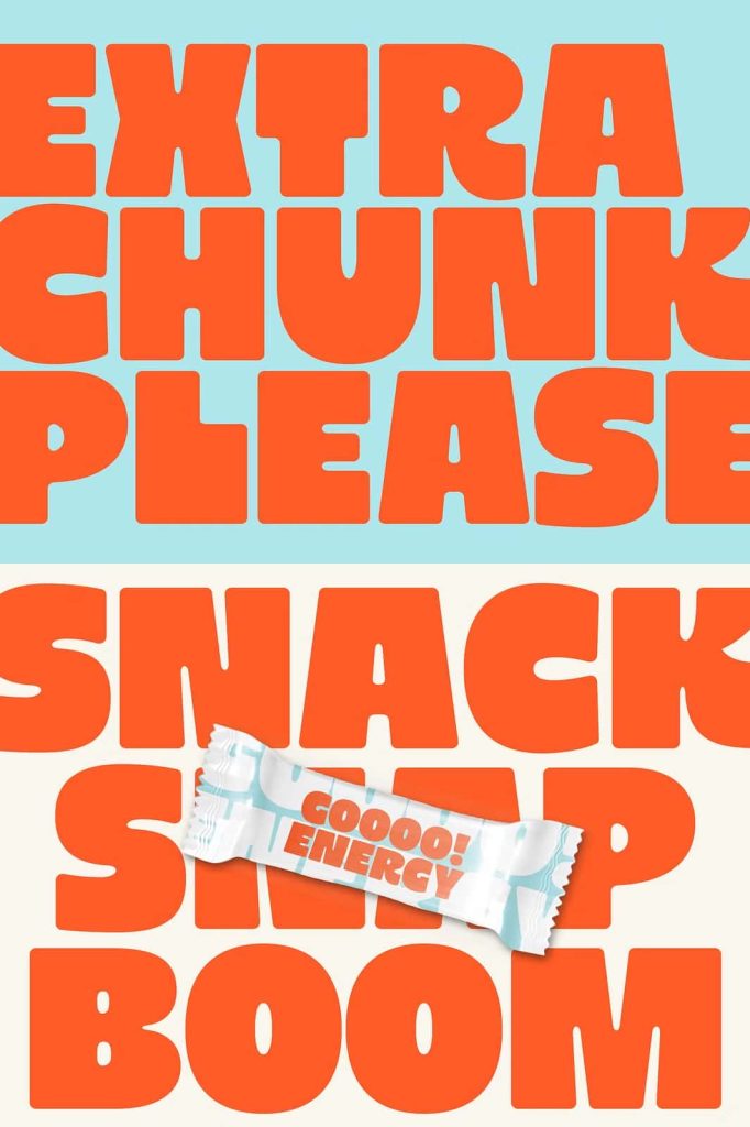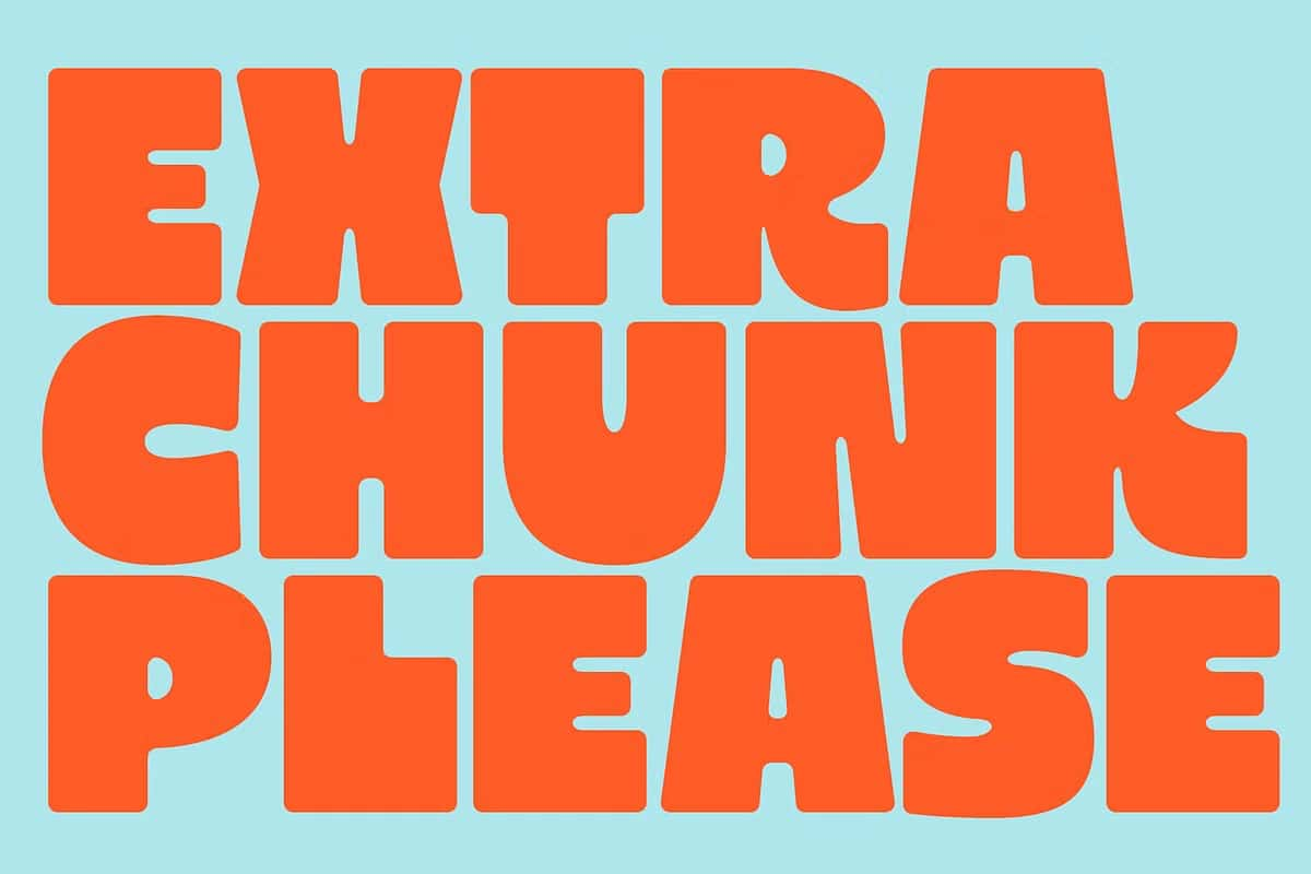

Extra Chunk Please: A Bold Modern Display Font with Playful Minimalism
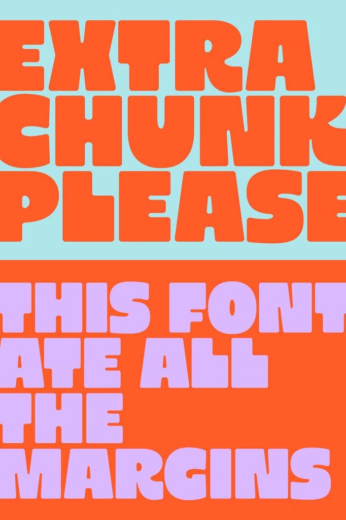
Extra Chunk Please is a modern display font designed to make an immediate visual impact. It combines bold geometric forms with a playful minimalist approach, creating letterforms that feel confident, friendly, and highly intentional. This font does not rely on unnecessary decoration. Instead, it uses strong structure, rounded edges, and clean proportions to deliver clarity and personality in every character.
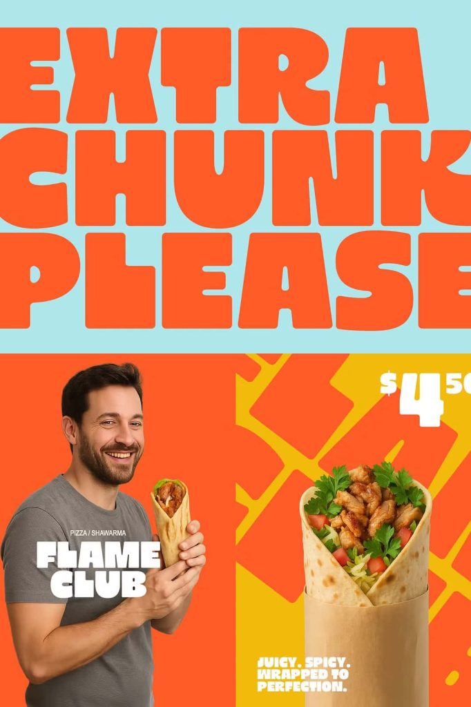
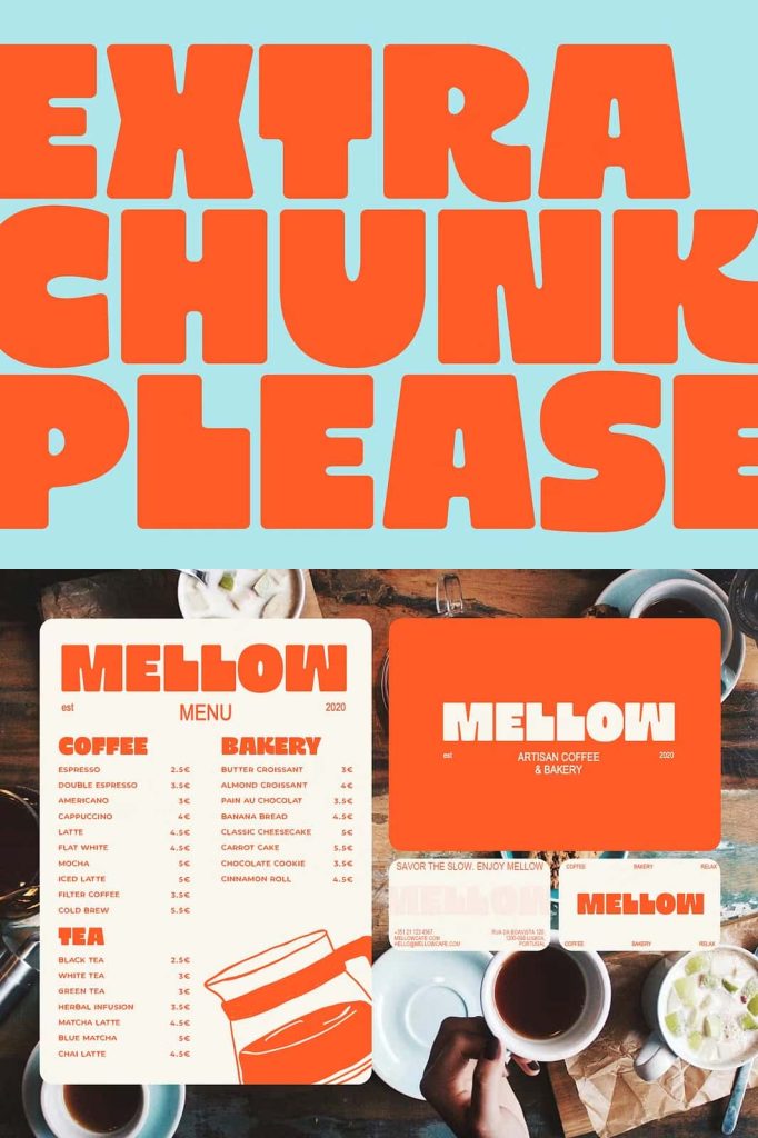
Built for designers who value simplicity without sacrificing character, Extra Chunk Please works exceptionally well in typography-focused layouts. Its bold presence draws attention instantly, making it an excellent choice for headlines, branding, packaging, posters, and digital interfaces where readability and style must work together.
The Power of Bold Geometry
At the core of Extra Chunk Please lies bold geometry. Each letter is constructed using strong, simple shapes that feel stable and balanced. These geometric foundations give the font a modern edge while ensuring consistency across the entire character set. The weight of the letters creates visual authority, allowing text to stand on its own without relying on additional graphic elements.
Bold geometry also improves legibility. The clear shapes make letters easy to recognize, even at smaller sizes or from a distance. This makes Extra Chunk Please especially effective for display purposes where clarity and impact are essential.
Strong Structure with Purpose
Every curve and angle in Extra Chunk Please serves a purpose. The font avoids unnecessary complexity and instead focuses on clean construction. This disciplined approach gives designers confidence that the typography will remain visually consistent across different layouts and formats.
Whether used in print or digital environments, the structured geometry ensures that the font retains its strength and clarity. This reliability makes it a practical tool for professional design projects.
Rounded Edges for a Friendly Personality
One of the defining characteristics of Extra Chunk Please is its rounded edges. These soft curves balance the bold weight of the font, preventing it from feeling too rigid or aggressive. The rounded corners introduce warmth and approachability, making the typeface feel inviting and modern.
This combination of boldness and softness gives the font a playful personality without compromising professionalism. It feels confident but not intimidating, making it suitable for a wide range of creative applications.
Playful Minimalism in Action
Extra Chunk Please embraces playful minimalism by reducing letterforms to their essential shapes while maintaining expressive character. The playful aspect comes from subtle details in curves and spacing, while minimalism ensures the design remains clean and uncluttered.
This balance allows designers to create layouts that feel fresh and engaging without overwhelming the viewer. The font adds personality to the design while leaving enough space for other visual elements to breathe.
Ideal for Typography-Focused Layouts
Extra Chunk Please shines brightest in layouts where typography takes center stage. Its bold weight and distinctive shapes allow it to function as the primary visual element. Headlines, titles, and key messaging benefit from the font’s ability to command attention instantly.
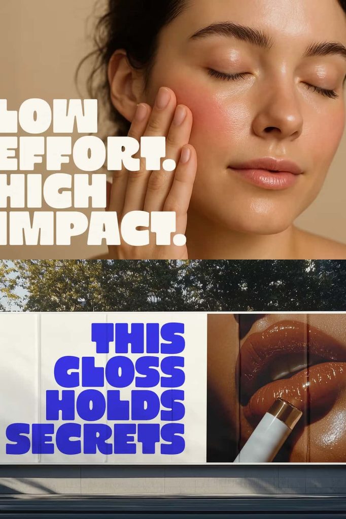
In branding projects, the font helps establish a strong visual identity. Its modern yet playful tone works well for creative brands, startups, lifestyle products, and contemporary marketing campaigns. The clarity of the letterforms ensures that brand messages remain readable and memorable.
Versatility Across Media
Despite being a display font, Extra Chunk Please adapts well to various design contexts. It performs effectively in print materials such as posters, packaging, and editorial layouts. At the same time, it translates smoothly to digital platforms, including websites, social media graphics, and user interfaces.
The font’s clean construction ensures consistent performance across different screen sizes and resolutions. This versatility makes it a dependable choice for designers working across multiple mediums.
A Modern Typeface Built for Impact
Extra Chunk Please delivers impact through simplicity, strength, and thoughtful design. It blends modern geometric principles with playful minimalism to create a display font that feels current, confident, and highly usable. The bold weight ensures visibility, the rounded edges add warmth, and the clean structure supports clear communication.
For designers seeking a typeface that elevates typography-focused designs, Extra Chunk Please offers a powerful solution. It proves that strong character design does not require complexity, only intention and balance.