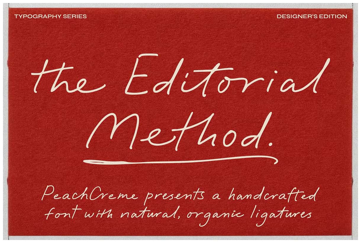

The Editorial Method: A Refined Script Font with Fluid Elegance
The Editorial Method is a sophisticated script font designed to balance fluid movement with structured elegance. Created for designers who value clarity, refinement, and expressive detail, this typeface delivers a confident handwritten aesthetic without sacrificing control or readability. Its carefully crafted letterforms move naturally across the page while maintaining a polished rhythm that suits both formal compositions and expressive creative work.
A Script Typeface Built on Balance and Precision
At the core of The Editorial Method is a thoughtful balance between organic flow and typographic structure. Each letterform connects smoothly, guiding the eye forward with confident motion. Unlike overly decorative scripts, this font maintains discipline in its construction, ensuring that text remains legible and composed even in complex layouts.
The smooth curves and consistent stroke behavior give the font a refined presence that feels intentional and controlled. This balance allows The Editorial Method to function as a reliable design tool rather than a purely decorative accent. Designers can use it to elevate layouts while preserving clarity and hierarchy.
Natural Ligatures for Organic Expression
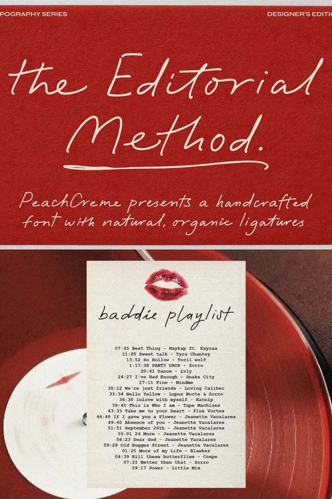
The Editorial Method features natural, organic ligatures that enhance the handwritten quality of the typeface. These ligatures allow letters to interact gracefully, creating a seamless flow between characters. Instead of rigid connections, the font introduces subtle variations that make each word feel more personal and expressive.
These organic connections bring warmth and authenticity to typography, helping designs feel human and approachable. At the same time, the ligatures are carefully designed to avoid clutter, ensuring that text remains clean and visually balanced across different applications.
Two Weights for Flexible Design Systems
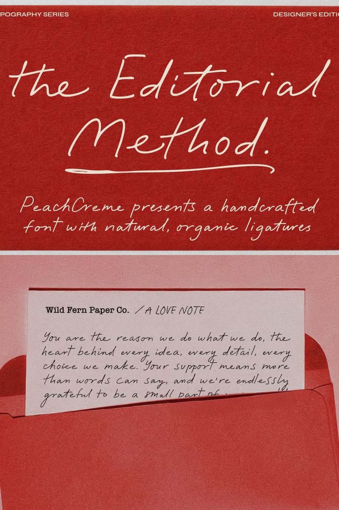
The Editorial Method includes two carefully crafted weights: regular and bold. This dual-weight system provides designers with greater flexibility when building typographic hierarchies. The regular weight delivers elegance and refinement, making it ideal for longer phrases, invitations, and editorial accents.
The bold weight adds strength and emphasis without overpowering the script’s natural flow. It works exceptionally well for headlines, featured quotes, brand names, and key messaging. By combining both weights, designers can create contrast and structure while maintaining a cohesive visual identity.
Ideal for Editorial Design and Branding
The Editorial Method performs beautifully in editorial design, where typography must support storytelling and visual rhythm. It enhances magazine spreads, book covers, pull quotes, and feature headings with a sense of sophistication and calm confidence. The font’s fluid movement adds character, while its structure ensures readability in professional layouts.
In branding projects, The Editorial Method communicates refinement, credibility, and understated luxury. It works well for logos, brand signatures, and supporting typography in industries such as fashion, beauty, publishing, and lifestyle. The script style adds personality without feeling excessive or overly decorative.
Perfect for Invitations and Luxury Aesthetics
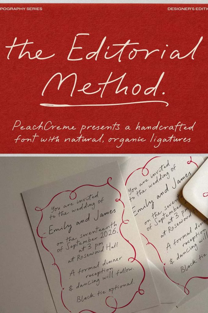
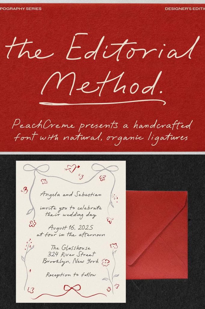
The Editorial Method is especially well-suited for invitation design and luxury-focused projects. Its elegant flow and organic ligatures enhance wedding stationery, event invitations, and formal announcements. The font conveys celebration and intimacy while maintaining a polished and professional tone.
For luxury aesthetics, the font delivers subtle sophistication rather than loud ornamentation. It pairs well with minimalist layouts, high-quality photography, and refined color palettes. This makes it an excellent choice for designers who want to express exclusivity and taste through typography.
Designed for Print and Digital Excellence
The Editorial Method adapts seamlessly to both print and digital environments. Its carefully balanced letterforms maintain clarity across different sizes and resolutions. In print, the script highlights its elegant curves and thoughtful ligatures. On screen, it remains smooth and readable, even in responsive layouts.
Designers can confidently use this font across websites, social media graphics, packaging, and promotional materials. Its versatility ensures consistent performance across platforms while preserving its refined character.
A Script Font for Modern Elegance
The Editorial Method is designed for creatives who seek elegance without excess. By combining fluid script movement, organic ligatures, and structured refinement, it offers a timeless typographic solution for modern design challenges. Its two-weight system further expands creative possibilities while maintaining consistency and balance.
If you are looking for a script font that supports editorial sophistication, branding clarity, and understated luxury, The Editorial Method is an excellent choice. Use it to create typography that feels confident, expressive, and beautifully composed.