
Ratio Typeface – A Fusion of Modernism and Timeless Design
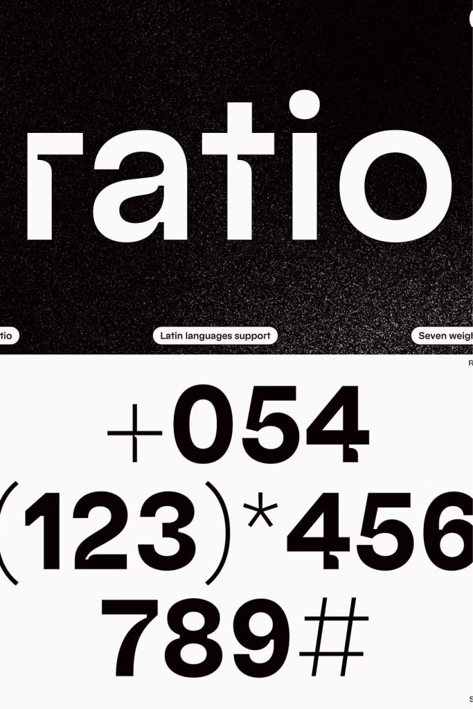
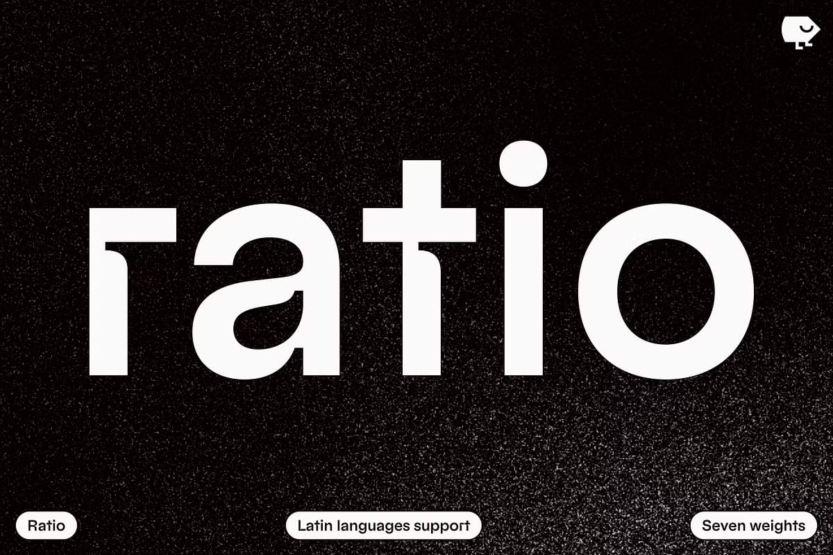
Ratio Typeface beautifully bridges the gap between the enduring sophistication of mid-century modernism and the bold innovation of contemporary typography. Designed with pronounced inktraps and refined geometric precision, Ratio captures the essence of balance, clarity, and modern artistry. Its inspiration stems from the iconic Bauhaus movement and the distinctive lowercase forms of Futura, resulting in a typeface that is both classic and refreshingly modern.
The Perfect Balance of Classic and Contemporary
Ratio is more than a typeface—it is a visual narrative of design evolution. Every curve, line, and angle reflects a deep understanding of typographic harmony. Drawing from mid-century aesthetics, Ratio embraces clean geometry, simplicity, and order. Yet, it enhances these qualities with contemporary details such as bold inktraps that add depth, texture, and personality to every character.
The result is a typeface that feels both nostalgic and forward-thinking. Ratio maintains the timeless appeal of modernist design while introducing new forms that adapt effortlessly to digital and print applications. Its balance between structure and expression makes it suitable for a wide range of creative projects—from sleek editorial layouts to cutting-edge branding systems.
Inspired by Bauhaus and Futura
The Bauhaus influence is evident in Ratio’s geometric purity and minimalist composition. Each letterform is constructed with mathematical precision, echoing the design principles that defined the early 20th century modernist movement. At the same time, the influence of Futura adds warmth and familiarity through its distinctive lowercase forms and smooth transitions.
Ratio reinterprets these historical influences to fit today’s visual language. Its bold inktraps are not just functional—they are expressive, adding rhythm and contrast that catch the eye while improving legibility in both large and small formats. This thoughtful combination of form and function makes Ratio a powerful tool for designers who value aesthetics and practicality in equal measure.
Versatile Design for Modern Applications
Whether used for branding, editorial design, web typography, or packaging, Ratio adapts gracefully to every environment. Its geometric proportions and sharp details ensure high readability, while its strong character gives every project a distinctive voice. The typeface works beautifully in bold headlines, minimalist layouts, and dynamic logo designs, making it a go-to choice for modern visual identities.
Ratio’s flexibility lies in its ability to convey both precision and emotion. It can be commanding or subtle, depending on how it’s applied. This versatility allows designers to experiment with scale, color, and layout without sacrificing clarity or cohesion. Every use of Ratio reflects a sophisticated design sensibility rooted in modernism yet attuned to today’s creative trends.
Technical Excellence and Aesthetic Precision
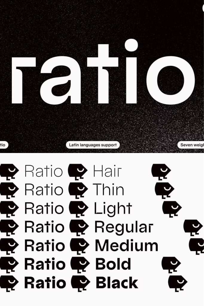
Beyond its visual charm, Ratio boasts technical mastery. Its refined spacing, optical adjustments, and intelligent kerning ensure consistent performance across all mediums. The inktraps not only enhance the visual texture but also prevent blurring in smaller text sizes, giving the typeface exceptional readability. Ratio’s carefully calibrated weights and styles provide creative flexibility, supporting a wide range of typographic hierarchies and moods.
Each version of Ratio has been crafted to deliver visual impact and usability. The result is a typeface that maintains harmony, legibility, and elegance in every setting—from minimalist poster designs to sleek digital interfaces. This technical reliability makes Ratio not just a beautiful typeface, but a practical and dependable one for professionals who demand quality and performance.
Why Choose Ratio Typeface
- Inspired by mid-century modernism and Bauhaus design
- Features pronounced inktraps for distinctive visual style
- Geometric forms balanced with modern readability
- Perfect for branding, editorials, and digital design
- Combines elegance, structure, and expressive personality
Ratio Typeface invites designers to explore the intersection of geometry and creativity. Its carefully constructed letterforms offer a sense of timeless proportion and rhythm, while its modern details create a distinctive visual voice that stands out in any context.
Conclusion
Ratio is not just a revival of modernist ideals—it is their evolution. By blending the clarity of Bauhaus geometry with the innovation of contemporary design, Ratio achieves a rare harmony between past and present. Its refined structure, expressive inktraps, and elegant proportions make it a must-have for designers who value both artistry and precision. Whether you’re crafting bold headlines or subtle body text, Ratio delivers beauty, balance, and versatility in every letter.