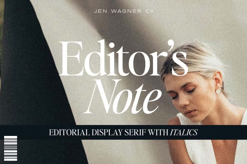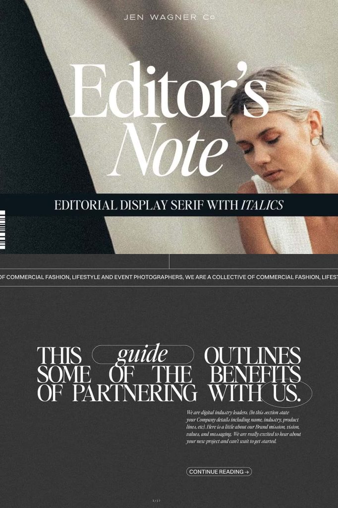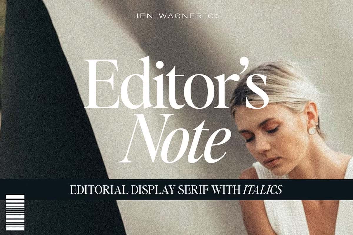

Editor’s Note Font: A Crisp and Elegant Typeface for Modern Design
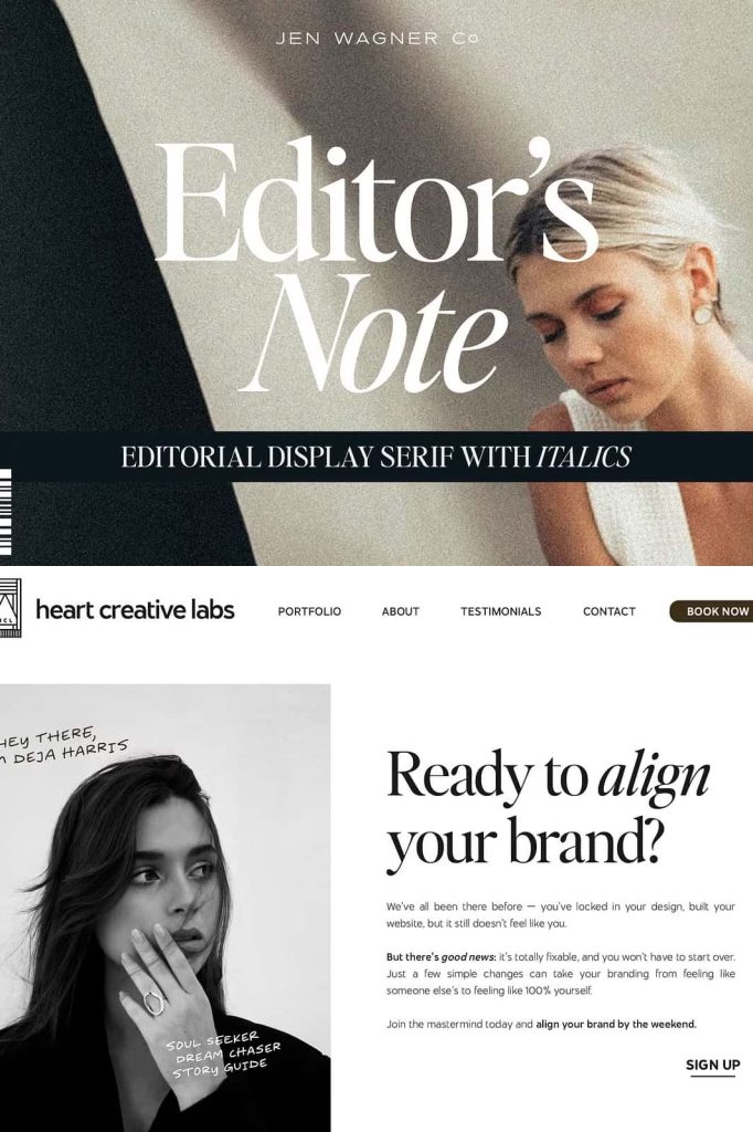
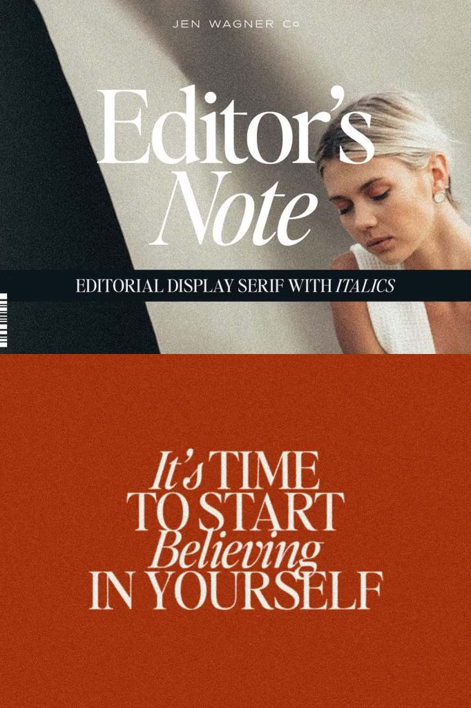
Editor’s Note Font is a beautifully balanced upper and lowercase typeface that blends sophistication with clarity. Designed to perform effortlessly in both large and small text settings, it stands out for its clean lines, refined shapes, and editorial grace. Whether used for magazine layouts, branding systems, website headers, or packaging design, Editor’s Note brings a level of precision and elegance that elevates every project.
This stunning serif typeface delivers the kind of versatility every designer dreams of—equally striking as a bold headline or as a legible, stylish body text. Its modern construction and timeless appeal make it the ideal choice for professional projects that demand both readability and character.
Precision and Clarity in Every Letterform
Editor’s Note Font was created with one goal in mind: to achieve perfect clarity without sacrificing personality. Every curve, stroke, and serif has been carefully crafted to produce a harmonious rhythm across text. The result is a font that feels crisp, confident, and effortlessly readable. It captures the refined quality of traditional editorial typography while introducing a modern sensibility that fits seamlessly into contemporary design.
Each letter demonstrates balance and proportion, offering designers a tool that feels both luxurious and functional. From elegant uppercase characters that command attention to graceful lowercase letters that maintain legibility in smaller settings, Editor’s Note offers unmatched versatility and visual harmony.
Versatility Across Media and Applications
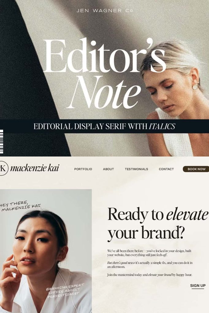
One of the defining strengths of Editor’s Note Font is its adaptability. It performs beautifully across print and digital media, giving designers complete control over tone and presentation. Its crisp lines and subtle contrast make it ideal for projects where both style and substance matter. Whether it’s for luxury branding, editorial publishing, or digital content creation, Editor’s Note delivers consistent sophistication.
Use it to create:
- Magazine headlines and editorial layouts
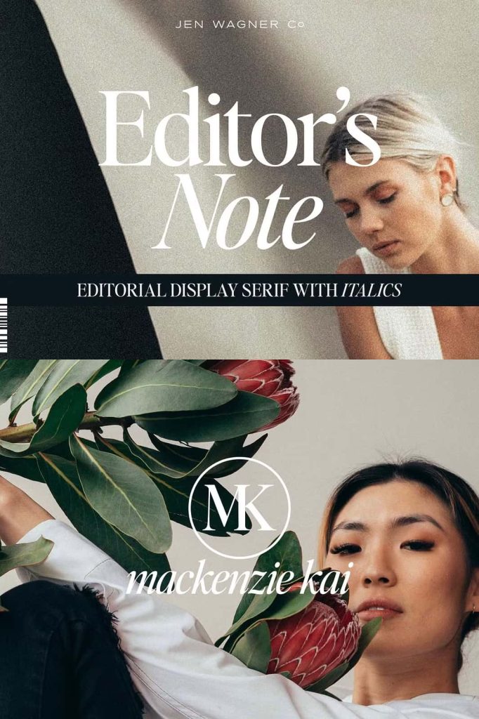
- High-end branding and logo design
- Web and app interfaces with refined typography
- Stylish posters, book covers, and product packaging
- Invitations, brochures, and marketing materials
Its flexibility allows designers to maintain a cohesive visual identity across all touchpoints. In large display sizes, it feels commanding and modern. In smaller text blocks, it remains crisp and highly legible—making it an excellent choice for editorial projects that require consistency and visual finesse.
Inspired by Editorial Elegance
The inspiration behind Editor’s Note Font lies in the world of editorial design. It echoes the sophistication of classic publishing typography while adding a fresh, modern tone that feels current and relevant. This makes it particularly effective for fashion magazines, lifestyle brands, and creative agencies that want to capture the essence of elegance without appearing outdated.
The typeface’s balanced weight and sharp details give it a high-end aesthetic, while its open forms ensure excellent readability. This combination makes Editor’s Note not just a beautiful font, but also a practical design tool that enhances communication without distraction.
Modern Style, Timeless Appeal
Editor’s Note Font is built to stand the test of time. Its clean geometry, elegant proportions, and refined serifs give it a timeless charm that can adapt to evolving design trends. Whether you’re designing a classic print layout or a sleek digital interface, this typeface ensures your typography feels relevant, readable, and refined.
In branding contexts, it communicates confidence and sophistication. In editorial layouts, it reinforces hierarchy and flow. The font’s versatility and clarity make it an essential addition to any designer’s toolkit—especially for those who value the power of elegant, precise typography.
Conclusion: A Typeface That Defines Clarity and Style
Editor’s Note Font stands as a celebration of modern editorial design. With its crisp letterforms, balanced structure, and versatile nature, it offers everything a designer needs to create polished, professional, and visually stunning layouts. It’s more than just a font—it’s a statement of craftsmanship and attention to detail.
Whether you’re creating a luxurious magazine spread, a sophisticated brand identity, or a minimal digital design, Editor’s Note Font brings refinement, confidence, and style to every project.
Editor’s Note Font – where precision meets elegance for a new era of design.